---
title: "R Workshop"
author: "Chayce Baldwin"
date: "10/1/2020"
output:
html_document:
theme: cerulean
toc: TRUE
toc_float: TRUE
number_sections: TRUE
---
```{r loading packages 9, include=FALSE}
library(tidyverse) # For dplyr, ggplot2, etc.
library(magrittr) # for pipes
```
# Non-Parametric Regression
*Want to follow along in R? [Download this workshop as an R Markdown file](05c-R-Workshop-9.rmd).*
## Before we get started
*Having trouble remembering what exactly an R Markdown is? Want some more resources for learning R?*
- Review what an R Markdown is [here](#markdown-nonparam).
- Explore further resources for learning R [here](#resources-nonparam).
### Recap: What we learned in the previous tutorial
In the last tutorial, we learned a few things about mediation and moderation, two very useful techniques to multivariatly assess the relationships between variables.
- Mediation looks at questions of mechanism, while moderation looks at when is an effect stronger or milder.
- We used functions mediate and lavaan to run mediation
- We used `lm()` to run moderation analyses.
- We learned why we need to center our predictors
- We saw how to plot these two statistical methods.
### Overview: What we'll learn here
So far, our approach at regression has assumed that we are working with well-behaved, continouous, normal variables. We now turn into certain situations where regular regression won't work, such as binary outcomes and count data.
What we'll look at here:
1. **Why regular regression won't work**
2. **Regression with binary outcomes: logistic regression**
3. **Poisson regression**
4. **Negative binomial regression**
Let's get started.
## Why regular regression won't work
Regular regression makes no special assumptions on how the outcome variable works. It has the full catersian coordinate system to work with: the response variable can take any value between $-\infty$ and $+\infty$. A standard linear regression could make a prediction of -24.34, +34.555555, $\pi$, 99999, and so on.
While this is **definitely** useful, it is not always realistic. Sometimes, our outcome variable is not a continuous variable. Lets see some examples.
1. We want to predict whether or not a student will graduate, based on his self-control score and his SAT score. Graduation, or not, is a binary variable, that is it is either `TRUE` (1), or `FALSE` (0). If we used a linear model we could see the following problems.
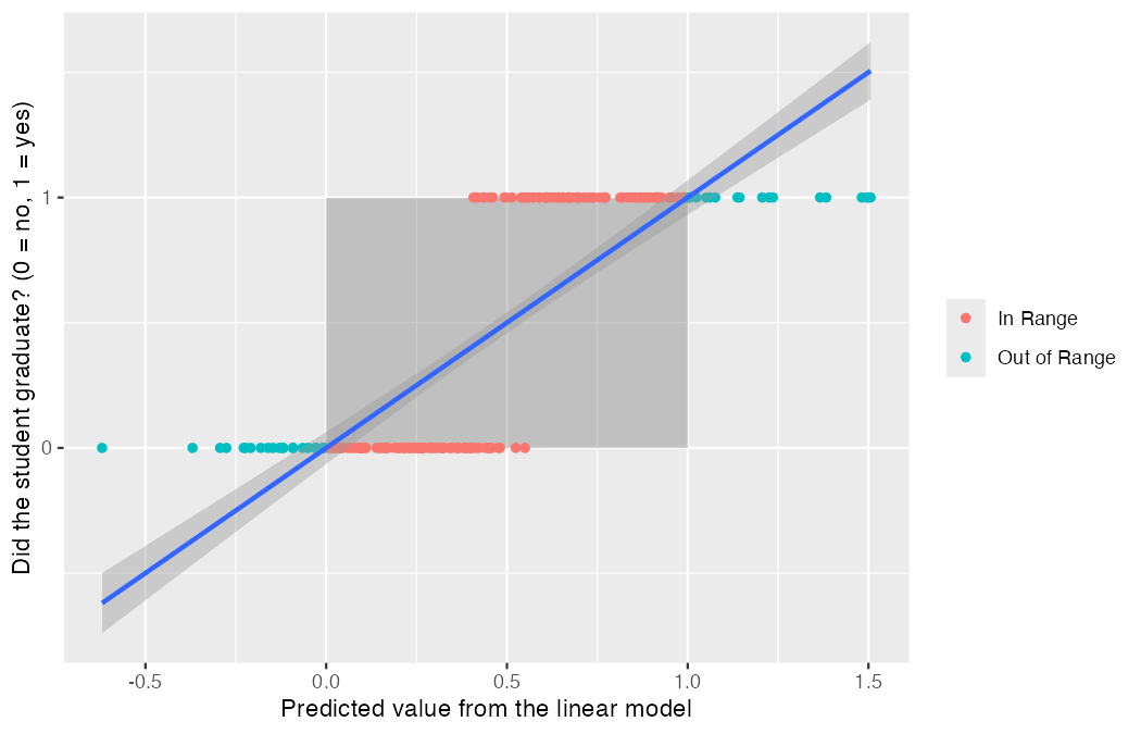
Each dot is one student. Their actual outcome is on the vertical axis: 0 if they did not
graduate, 1 if they did. What the linear model *predicts* for them is on the horizontal axis.
Since the outcome can only ever be 0 or 1, a sensible prediction should sit inside the shaded
box.
It does not. In teal, we see a lot of points where the model estimated negative numbers (Does that mean that there is a negative chance that that person would graduate?), or values greater than one (How can it be more than certain that somebody will graduate)?
As you can see, this makes NO sense at all!
Logistic regression solves this issue by fitting a special S shaped curve that can never exceed 0 or 1.
2. We want to predict the amount of times a student raises his hand during a lesson. This is a count variable, and as such, it has two important characteristics that differentiate it from normal regression. It can not take negative numbers (It wouldn't make sense for the model to predict -2 participation in class), and it can only take integer values (Nobody can participate 3 *and a half* times). We use Poisson regression to solve these sorts of data conundrums.
There are a number of different special models to model specific data types. I hope this section has convinced you that linear regression (sadly) can not be a panacea that solves all of our data problems.
## Logistic Regression
Like we described above, we may need to use different types of regression models when we have dependent variables that are not continuous. When our dependent variable is binary (i.e. two categories), we use a type of regression called **logistic regression**.
Why's it called "logistic"? And how does it work?
Before we get to that, let's re-visit why it's even necessary. Logistic regression is necessary because using normal linear regression--which gives us linear, continuous predictions--doesn't make sense when the outcome is either 0 or 1. As we pointed out in the previous section, beside just being illogical to try and put two distinct categories on a linear line, linear predictions can give us predicted values below 0 and above 1. These predictions aren't interpretable because they are outside the range of possible values.
So, to solve this problem, statisticians have created a regression line that is squished between 0 and 1. Here's a comparison between linear and logistic regression:
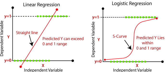
What does this "squished" regression line look like? As you can see above, it is an S-curve that accelerates quickly and then decelerates (i.e. flattens out) as it approaches 1. This curve helps us make more accurate, interpretable predictions of binary dependent variables.
In order to get this S-curve to keep the predicted values between 0 and 1, we take the *log of the odds*, the odds being defined as the probability of getting a 1 over the probability of getting a 0. Now, at this point, don't get too worried about the distinction between odds and probability, just recognize that we have to use a **log function** to get the right curve to model between 0 and 1--hence the name "logistic" regression. Also, this means that once we compute our logistic regression, the regression coefficient we get represents the log odds.
OK, let's try this out in R and see what we get!
First, let's read in our data:
*You will need the following data files for this workshop. Save them in the same folder as your R Markdown file so R can find them:*
* [cwb_399_logistic.rds](cwb_399_logistic.rds)
* [NB data.rds](NB%20data.rds)
```{r}
cwb <- read_rds("cwb_399_logistic.rds")
```
We are interested in whether self-control predicts if adolescents have a part-time job or not.
`sc_4` is a continuous self-control score between 1 and 5. `job` is 0 if the student doesn't have a part-time job and 1 if they do.
Here's what it looks like in R:
```{r eval = FALSE}
cwb %$% glm(job ~ sc_4, family = "binomial") %>% summary
```
Not so bad, right? As you can see, we use the same format as linear regression (DV \~ IV), but with the function `glm()` instead of `lm()`. Also, notice we have this `family =` argument. Why do we need that? As you'll see in later sections, `glm()` is actually the function we use for many types of regression that deviate from linear regression. So, to let R know which of those types we want to use, we have to specify the type of distribution (or "family" of distributions, hence the name) for our model. Here, because we are doing *binary* (i.e. two options only) logistic regression, we use the argument `family = "binomial"`. Do note that you do have to quote the input for this argument.
Awesome. So, how we specify logistic regression models in R isn't very different from linear regression, and the output isn't either. Let's check it out:
```{r}
cwb %$% glm(job ~ sc_4, family = "binomial") %>% summary
```
We can see the output is familiar, but uses a few new terms. You can see where we would normally have info on our residuals we have *deviance residuals*--this is calculated differently from residuals in linear regression, but uses the same principle: with our estimation of the regression, we are trying to minimize the residuals. You might also notice that it says "Dispersion parameter for binomial family taken to be 1". We'll talk more about *dispersion parameters* later--they are more important for Poisson models. For now, don't worry about these terms too much. Instead let's focus on the coefficient of our effect.
It looks as though the effect of self-control on whether adolescents have part-time jobs is significant, as represented by the very, very small p-value. The coefficient for this effect is .1699.
Great. And what does that mean?
...I don't know. And pretty much no one else does either.
Why? Because this coefficient, b, is the log of the odds of getting a 1 vs. getting a 0. If you remember, we took the log of the odds to fit the curve between 0 and 1, but this transformation is not intuitive or easy to interpret. Here's how the log of the odds is computed:
$b = log(odds_{hasjob}) – log(odds_{nojob})$
This is a little bit different than b in linear regression, which represents rise/run, or $frac_{Y}{X}$. This is again because we took the log of the odds. If you search the recesses of your memory, you may recall that when you take the log, division turns into subtraction. So,
$b = log(odds_{hasjob}) – log(odds_{nojob})$
is equivalent to
$b = log(frac_{odds_{hasjob}}{odds_{nojob}})$
So, the coefficient is not all that different from linear regression--before taking the log it looks pretty similar. After taking the log, though, it's not easily interpretable.
In our model, a one unit increase in X means an increase of .1699 in the log of the odds. Yeah. We're not even going to try and figure out what that means.
So, what do we do?
To interpret the coefficient, we need to get rid of the log transformation. Once we do, we end up with our measure of effect size: an **odds ratio**.
### Odds Ratios
An **odds ratio** is the ratio of the odds of getting a 1 over the odds of getting a 0:
$OR = frac_{odds_{hasjob}}{odds_{nojob}}$
You'll notice this is exactly the same as our equation above, except without `log()`. This is much more interpretable. In a second, we'll interpret the odds ratio for our data.
But first, how do we get rid of `log()`? Again, reach deep into the recesses of your mind and recall that the reciprocal of the logarithmic function is the exponential function. Sooo if we exponentiate the log of the odds, we end up with the odds ratio. Boom!
So, in sum: In order to accurately model regression models with binary outcomes, we need to squish the prediction line to be between 0 and 1. We can do that by taking the log of the odds. This gives us a coefficient that represents the increase in the log of the odds given a one unit increase in X. Because this is not easily interpretable, we exponentiate the log of the odds, getting rid of the log function, and leaving us with a ratio of the odds of getting 1 to the odds of getting 0: the odds ratio.
In short, do some funky transformations to model your regression correctly and then get rid of those funky transformations to make it interpretable. Not too bad.
Let's check it out with our model. Here's what we did before:
```{r}
mod1 <- cwb %$% glm(job ~ sc_4, family = "binomial")
```
Now, to get the odds ratio, we just have to exponentiate the coefficient from our model. We can do that using the `exp()` and `coef()` functions:
```{r}
exp(coef(mod1))
```
So, what does this mean? We can interpret it directly as the odds rather than as the log of the odds: A one unit increase in self-control corresponds to the odds of having a job being 1.19 times higher than they were at the previous level of self-control--that is, 19% higher. Note what this does *not* say: it is not a comparison between having a job and not having one (that comparison is what the odds themselves already are), but a comparison between two levels of self-control.
Unlike a normal regression, where a coefficient of 0 indicates "no effect", a coefficient of 1 indicates "no effect" for odds ratios. Why? "1" means that the odds of having a job or not having a job are the same; a person is no more likely to have one than not have one.
Because 1 means "no effect", an odds ratio higher than 1 means the odds are higher that a person has a job, and an odds ratio lower than 1 means the odds are higher that they don't have a job.
## Poisson regression
Poisson regression lets us work with count outcomes. As we saw, these are characterized by three important distinctions: 1. they cannot be negative. 2. they are not necessarily normally distributed. 3. they are only discrete values. The following figure shows three Poisson distribution with different values for the gamma parameter. As you can see in the figure, the distribution is represented with discrete points, and the lines are there just as aids in visualization.
`r if (knitr::is_html_output()) '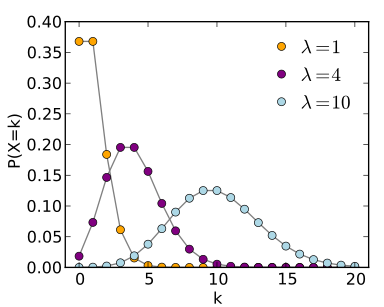' else ''`
How does poisson regression solve these problems? It uses a log link function. This means that instead of predicting the response variable itself, we predict its log.
In other words, while normal regression has the form:
$$ y = \beta_0 + \beta_1*x_1 + \beta_2*x_2+...+\beta_n*x_n$$
poisson regression has the form:
$$ ln(y) = \beta_0 + \beta_1*x_1 + \beta_2*x_2+...+\beta_n*x_n$$ or its equivalent $$ y = e^{(\beta_0 + \beta_1*x_1 + \beta_2*x_2+...+\beta_n*x_n)}$$ \#\# Assumptions
1. The outcome variable is count data. This means: no negative numbers, no decimals.
2. Independence: Observations should be independent of each other
3. The distribution of counts follows a poisson distribution. If observed an expected counts are similar, then this assumption is satisfied.
4. The mean and the variance are equal. This is called equidispersion. When this doesn't hold, a negative binomial model works better.
### An example
Let's model the number of scholarship offers a high school baseball player gets depending on their division (A, B or C) and their SAT score (scaled from 0 - 100)
Here's the data
```{r}
#make this example reproducible
set.seed(1)
#create dataset
# named `offers_data` rather than `data`, because data() is a base R function
offers_data <- data.frame(offers = c(rep(0, 50), rep(1, 30), rep(2, 10), rep(3, 7), rep(4, 3)),
division = sample(c("A", "B", "C"), 100, replace = TRUE),
exam = c(runif(50, 60, 80), runif(30, 65, 95), runif(20, 75, 95)))
```
:::: {.practice}
**Practice**
Use `describe()`, `summarise()` and/or `ggplot()` to get a sense of what the data look like. What is the range of offers students get? What is the mean SAT score for each number of offers? What is the mean number of offers for each division?
```{r}
```
`r if (knitr::is_html_output()) '\nAnswer
' else '**Answer**'`
```{r}
# range of offers
range(offers_data$offers)
# mean exam score for each number of offers
offers_data %>%
group_by(offers) %>%
summarise(n = n(), mean_exam = round(mean(exam), 1))
# mean offers for each division
offers_data %>%
group_by(division) %>%
summarise(n = n(), mean_offers = round(mean(offers), 2))
```
Most students get zero offers, and exam scores climb steadily with the number of offers--which is the pattern the model is about to formalize. Division, by contrast, looks fairly flat.
`r if (knitr::is_html_output()) ' ' else ''`
::::
Fitting the poisson model is simple. Instead of `lm()` we use `glm()` and set `family = "poisson"`. We use the same formula syntax as in logistic regression and `lm()`. As you can see fitting the model is very similar to how you would fit a logistic regression model.
```{r}
#fit the model
model <- glm(offers ~ division + exam, family = "poisson", data = offers_data)
#view model output
summary(model)
```
We get a familiar looking table of coefficients, with estimates, SEs, z-values (rather than t-values), and their corresponding *p* values. How are the estimates interpreted? Remember that poisson regression logs the outcome. This means that the estimates tell us what happens to the log-count of the variable when the predictor is increased by 1 (as in `lm`). For example, the only significant coefficient is exam = .09. This means that a 1 point increase in the exam increases the log(count) of scholarship offers by .09.
An easier way to interpret this is to get rid of the log by exponentiating the estimates.
```{r}
coef(model) %>% exp()
```
Now we can interpret our estimates as likelihoods. We now see that the exponentiated coefficient for exam is 1.09. This means that a 1-point increase in the exam means that you are 9% more likely to get an additional scholarship.
The coefficients on binary predictors (dummy-coded divisions) are interpreted similarly: compared to being in division A (our reference group), being in division B makes you 7% more likely to get a scholarship. The number for division C is 31%. Note that these coefficients are **not significant** though.
#### What is deviance and AIC?
You may have noticed that, as opposed to `lm()`, we don't get an F-statistic testing the whole model, nor an $R^2$ value. We do get two relevant things, that *sorta* do the same thing.
Akaike Information Criterion, AIC, is a measure of model fit with two important charactersitics:
1. They test parsimonious model fit: That is to avoid overfitting, they have a penalty for more complicated models.
2. They are not interpretable by themselves. They are only useful to compare models drawn from the same data.
Ah! If you're wondering... Lower values are good. Larger values are bad!
Residual deviance, on the other hand, can be used in a similar way to an F-Test to assess model fit. However, we have to run a $\chi^2$ test specifying the degrees of freedom. Here's the code.
```{r}
pchisq(model$deviance,model$df.residual,lower.tail = F)
```
We get a p value of .83, which is larger than the cutoff of .05. This means that the model fit is adequate. Remember we are looking for *differences* between the model and the data, so a non-significant result means that there is correspondence between the model and the data.
#### Plotting
Here is a way to plot the model. We will use `broom::augment` to access the fitted values (the values our model predicts), and we will use those to plot our model. We will plot raw data points as, well points, and our model as a line. To visualize our model, we must exponentiate the fitted values so they are correctly scaled.
:::: {.practice}
**Practice**
Add axis labels to the plot below.
```{r}
broom::augment(model) %>%
ggplot(aes(exam,offers,col = division))+
geom_point(position = position_jitter(height = .15))+
geom_line(aes(y = exp(.fitted)))
```
`r if (knitr::is_html_output()) '\nAnswer
' else '**Answer**'`
```{r}
broom::augment(model) %>%
ggplot(aes(exam, offers, col = division)) +
geom_point(position = position_jitter(height = .15)) +
geom_line(aes(y = exp(.fitted))) +
labs(x = "Exam score",
y = "Scholarship offers",
col = "Division")
```
`labs()` works exactly as it did back in the visualization workshops--nothing about Poisson regression changes how you label a ggplot.
`r if (knitr::is_html_output()) ' ' else ''`
::::
#### Testing assumptions
To test for equidispersion, look at the mean and the variance of the response variable to check they are roughly equal.
```{r}
mean(offers_data$offers)
var(offers_data$offers)
```
We can conduct a formal test for equidispersion using the `dispersiontest()` function in the `AER` package.
```{r}
#install.packages("AER")
library(AER)
dispersiontest(model)
```
Here we can see that our data is equidispersed (p > .05).
## Negative binomial regression
What if the data is **over-dispersed**: that is the variance of the data is greater than the mean? Then, we would violate one of poison regression's key assumptions. If we ran regular-old-fashioned poisson regression, our results would be biased.
Luckily, we have a model that is basically poisson regression with an added parameter to model the dispersion in the data. This is a negative binomial model. We can do this using a very simple syntax. We just need to use `glm.nb()` from the `MASS` package instead of regular `glm`.
Let's try and run a negative binomial model on the `nb` dataset. We will use gender, mathematics achievement (`math`) and program type (`track`) to predict the number of days absent (`daysabs`).
```{r}
#install.packages("MASS")
# MASS has its own select(), which would mask dplyr's. We load MASS first and
# exclude that one function, then load the tidyverse on top of it.
library(MASS, exclude = "select")
nb <- read_rds("NB data.rds")
```
First, let's make sure a negative binomial model is actually needed. Remember that we use NB models when the equidispersion assumption is not met. What was equidispersion again? That the mean and the variance are somewhat equal.
:::: {.practice}
**Practice**
Use the `mean()` and `var()` commands to judge equidispersion in this data. Hint: use the outcome variable.
```{r}
```
`r if (knitr::is_html_output()) '\nAnswer
' else '**Answer**'`
```{r}
mean(nb$daysabs)
var(nb$daysabs)
```
The mean is about 6 but the variance is about 50--more than eight times larger. Poisson regression assumes these are equal, so this data badly violates that assumption. That is exactly why we need the negative binomial model.
`r if (knitr::is_html_output()) ' ' else ''`
::::
We can fit a poisson model, and feed that into the `dispersiontest()` function to formally test equidispersion.
```{r}
nb %$% glm(daysabs ~ math + gender + track, family = "poisson") %>% dispersiontest()
```
Here we see that p < .05, meaning that the data is significantly overdispersed. ERGO, we need a negative binomial model! Here's how to run it.
```{r}
#fit the model
model.nb <- glm.nb(daysabs ~ math + gender + track, data = nb)
#view model output
summary(model.nb)
```
As you can see, the resulting model is very similar to the poisson model output, with one extra parameter: The Theta Parammeter. All this number does is model the overdispersion of the data, removing the assumption that the dispersion = 1 required by poisson regression.
As with all models so far, exponentiating the coefficients aids in interpretation. All our odds ratios are lower than 1, meaning that all these variables have a *negative* effect on the outcome variable. Increasing one point in a math test, diminishes the probability of missing an extra day by around 1%. Being male, reduces the likelyhood of missing an extra day by around 19%. Remember, if the exponentiated coefficient equals 1, then that means that there is **no change.**
```{r}
exp(coef(model.nb))
```
:::: {.practice}
**Practice**
Modify the code for the Poisson figure to make a figure for this model. Hint: remember to change the variable names. Hint 2: if the lines look chunky, it's because you need to plot *both* categorical variables--try one in the colour aesthetic and the other as a facet.
```{r}
```
`r if (knitr::is_html_output()) '\nAnswer
' else '**Answer**'`
```{r, warning=FALSE}
broom::augment(model.nb) %>%
ggplot(aes(math, daysabs, col = gender)) +
geom_point(alpha = .5) +
geom_line(aes(y = exp(.fitted))) +
facet_wrap(~ track) +
theme_linedraw() +
theme(legend.position = "bottom", panel.grid = element_blank()) +
labs(title = "Negative Binomial Model",
x = "Math Test Score",
y = "Days Absent",
col = "Gender")
```
You can also use `linetype` instead of faceting to handle the second categorical variable:
```{r, warning=FALSE}
broom::augment(model.nb) %>%
ggplot(aes(math, daysabs, col = track, linetype = gender)) +
geom_point(alpha = .2) +
geom_line(aes(y = exp(.fitted))) +
theme_linedraw() +
theme(legend.position = "bottom", panel.grid = element_blank()) +
labs(title = "Negative Binomial Model",
x = "Math Test Score", y = "Days Absent", col = "Track")
```
And if you want 95% confidence bands around the predicted line, ask `augment()` for standard
errors and multiply by the z-values for 2.5% and 97.5% (roughly +/- 1.96):
```{r, warning=FALSE}
broom::augment(model.nb, se_fit = TRUE) %>%
mutate(high = .fitted - qnorm(.025) * `.se.fit`,
low = .fitted + qnorm(.025) * `.se.fit`) %>%
ggplot(aes(math, exp(.fitted), col = track, fill = track)) +
geom_line() +
facet_wrap(~ gender) +
geom_ribbon(aes(ymin = exp(low), ymax = exp(high), col = NULL), alpha = .2) +
labs(x = "Math Test Score", y = "Predicted Days Absent")
```
`r if (knitr::is_html_output()) ' ' else ''`
::::
## Review: End Notes
Today, we covered:
* Why ordinary linear regression breaks down for binary and count outcomes
* Logistic regression with `glm(family = "binomial")`, and reading odds ratios
* Poisson regression with `glm(family = "poisson")`, and why we exponentiate the coefficients
* Checking model fit with deviance, AIC, and a chi-squared goodness-of-fit test
* Equidispersion--and what to do when it fails
* Negative binomial regression with `glm.nb()` for overdispersed counts
### Quick reference: regression for binary and count outcomes
**Choosing a model**
Your outcome | Model | Code
-------------|-------|------------------------------------------------------------------------
Continuous, roughly normal | Linear regression | `lm(y ~ x)`
Binary (yes/no, 0/1) | Logistic regression | `glm(y ~ x, family = "binomial")`
Counts, mean roughly equal to variance | Poisson regression | `glm(y ~ x, family = "poisson")`
Counts, variance much larger than the mean | Negative binomial | `MASS::glm.nb(y ~ x)`
**Making the coefficients readable**
Function | What It Does
--------------|------------------------------------------------------------------------
`exp(coef())` | Undoes the log. For logistic models this gives **odds ratios**; for Poisson, **rate ratios**
`summary()` | Coefficients on the log scale, with z-values rather than t-values
An odds ratio of 1 means no effect. Above 1 means the odds go up as the predictor goes up,
below 1 means they go down. It compares two levels of the predictor--not the two outcomes.
**Checking the model**
Function | What It Does
-------------------------------|------------------------------------------------------------------------
`pchisq(deviance, df.residual)`| Goodness of fit. A **non**-significant result is good--it means the model matches the data
`AIC()` | Compares models fit to the same data. Lower is better; the value alone means nothing
`mean()` vs `var()` | The equidispersion check. Poisson assumes these are roughly equal
`AER::dispersiontest()` | A formal test for overdispersion. Significant means Poisson is not appropriate
`broom::augment()` | Adds fitted values to your data so you can plot the model. Remember to `exp()` them
If the variance is much bigger than the mean, Poisson will understate your standard errors and
you will find effects that are not really there. Use the negative binomial instead.
### Feedback
As a learner, your superpower is knowing what is and isn't working for your learning. If you have 2 minutes, we would love if you shared your superpower with us!
Scan the QR code below with your phone to provide brief feedback on this workshop:

### Some useful resources to continue your learning {#resources-nonparam}
A useful resource, in my opinion, is the [stackoverflow](http://stackoverflow.com/) website. Because this is a general-purpose resource for programming help, it will be useful to use the R tag (`[R]`) in your queries. A related resource is the [statistics stackexchange](http://stats.stackexchange.com/), which is like Stack Overflow but focused more on the underlying statistical issues.
One of the best resources for learning how to use R well, in a "tidy" way, is [R for Data Science](https://r4ds.hadley.nz/) (R4DS).
### What's an R Markdown again? {#markdown-nonparam}
This is the main kind of document that I use in RStudio, and I think it's one of the primary advantages of RStudio over base R console. R Markdown allows you to create a file with a mix of R code and regular text, which is useful if you want to have explanations of your code alongside the code itself. This document, for example, is an R Markdown document. It is also useful because you can export your R Markdown file to an html page or a pdf, which comes in handy when you want to share your code or a report of your analyses to someone who doesn't have R. If you're interested in learning more about the functionality of R Markdown, you can visit [this webpage](https://rmarkdown.rstudio.com/lesson-1.html)
R Markdowns use **chunks** to run code. A **chunk** is designated by starting with {r}`and ending with` This is where you will write your code. A new chunk can be created by pressing COMMAND + ALT + I on Mac, or CONTROL + ALT + I on PC.
You can run lines of code by highlighting them, and pressing COMMAND + ENTER on Mac, or CONTROL + ENTER on PC. If you want to run a whole chunk of code, you can press COMMAND + ALT + C on Mac, or ALT + CONTROL + ALT + C on PC. Alternatively, you can run a chunk of code by clicking the green right-facing arrow at the top-right corner of each chunk. The downward-facing arrow directly left of the green arrow will run all code up to that point.