Workshop 6 Group testing
Want to follow along in R? Download this workshop as an R Markdown file.
6.1 Before we get started
Having trouble remembering what exactly an R Markdown is? Want some more resources for learning R?
6.1.1 Recap: What we learned in the previous tutorial
In the last tutorial, we learned about some important aspects of preliminary analyses: outliers and psychometrics. Here’s what we went over:
- Univariate and multivariate (i.e., 2+ variables) outliers
- Reliability: Alpha and Omega
- Factor structure: Factor and parallel analyses
6.1.2 Overview: What we’ll learn here
In this workshop, we’ll start our modeling series by learning about group difference testing. As you might guess, group difference tests are modeling methods for assessing average differences between groups or categories.
What we’ll look at here:
-
- single sample t-test
- two sample t-test
- paired t-test
-
- One way ANOVA
- ANCOVA
6.2 A brief overview of hypothesis testing
Before we dig into how and when to run t-tests and ANOVAs in R and how to interpret the output, we need to understand hypothesis testing. Hypothesis testing is an integral part of pretty much all statistical tests we’ll discuss over the coming workshops, and the basis of group difference testing. So, then, what is hypothesis testing?
Hypothesis testing is the way in which we statistically determine the probability that a given hypothesis is true. Generally, the hypothesis we are interested in is whether there is a real difference between a set of two or more populations or between a population and some standard. Determining whether two things are different is the basis of normal statistical testing and the ever-present idea of “statistical significance”. However, we can never be 100% sure whether a difference we observe in our data represents a true difference that exists in the real world, or just some random-chance difference in our data. Unfortunately, science and statistics don’t have the tools to prove things with certainty–this would require having data on absolutely everyone we could possibly study. Without having all possible data, we can’t prove anything. And we never have all the possible data (good luck getting your survey to all 8 billion people on Earth). How, then, do we test whether there is or isn’t a difference, if we can’t prove it? Well, we have to use a couple of workarounds. Our workarounds use some good old-fashioned logic and probability to test whether our results represent true differences that exist in the real world, or just random-chance differences in our data.
Workaround 1: Our first workaround is testing the null hypothesis rather than our alternative hypothesis. The null hypothesis, simply, is that there is no real difference between a set of two or more populations or between a population and some standard. The alternative hypothesis is that there is a real difference. Why test this weird, backwards hypothesis that there is no difference if we are interested in if there really is a difference? Here’s where the logic comes in. Think about it: How would one go about claiming that they found a real difference? How big would the difference have to be for it to be “real”? Because we can’t know the real difference, and it’s fairly arbitrary to try and guess what it is, this doesn’t seem like a promising approach. However, if we test the null hypothesis–that there’s no difference–we just have to know how big “no difference” is. And that’s easy: zero. So, we can better test whether there is no difference (an exact value) rather than if there is a real difference (an uncertain value).
Workaround 2: Our second workaround is testing the probability that there is no difference, rather than testing whether or not there is no difference directly. Why? Well, like we said before, we can’t test it directly to prove it with certainty. But we can test whether it is more or less probable. By testing this probability, we can start to make some headway on providing evidence for or against our hypothesis. If it is really not probable that there is no difference (horrible, horrible double negative), we can reject the null hypothesis that there is no difference, and therein provide some evidence that there is a difference.
How can we test the probability that there is no difference?
First, in line with our hypothesis above, we assume the null hypothesis is true (ie, we assume there is no difference between groups). So, we want to test the probability that we would observe the difference in our data, if the null hypothesis were true. But if the null were true, why would we possibly observe a value other than a difference of zero? Good question. Here’s why: our sample data only approximates the population of people we are studying. Because we are only approximating with our sample what is really happening in the population, it’s unlikely we would hit the true value for the population–there will always be some random error. So, because of random error, even if the null hypothesis is true, we can expect the difference we observe to be somewhere more or less than zero, and that there would be a distribution/range of values we could expect the difference to fall under. Graphically, it would look something like this:
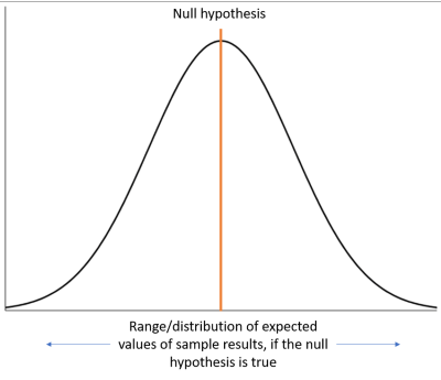
So, we now know that if the null hypothesis is true, our result will probably deviate from the null hypothesis to some extent within an expected range of values. And as you can see from the graph above, our result might vary quite a bit from the true null, even if the null hypothesis is right. Knowing this fact leaves us with two possibilities about the nature of our result:
- the null hypothesis is true, and the result we observed was due to just random chance, or
- the null hypothesis is false, and the result we observed is evidence for a true difference
So, what we can do is test the probability that our null hypothesis is true (and therefore our result is due to random chance). To test the probability, we measure how far above or below our result is from the null hypothesis, and then, based on that expected distribution or range around the null hypothesis (the picture above), we come up with how probable it is that we would see our result that distance out, based on random chance alone.
The probability we come up with is called the p-value. In more exact terms, a p-value is “the probability of obtaining a value at least as extreme as the one from the data, assuming the model assumptions [we’ll talk more about these later] and the null hypothesis are true.” So, “p = .10” would mean “the probability of observing this value or a more extreme value is .10, assuming the null hypothesis, and other assumptions are true.” Another way of thinking about this is in terms of re-sampling. If we were, hypothetically, to re-run our study 100 times, we would probably get slightly different results each time. So, “p = .10” is saying that if the null hypothesis (and other assumptions) is true, and we re-ran our study 100 times, we would get our result or a more extreme result 10 times, just from random chance. With that probability in hand, we can now know with much more certainty the nature of our result: whether it is random chance or is evidence for a real difference.
How can we use these p-values for making conclusions with our data? We use p-value cutoffs to determine whether there is evidence for or against our hypothesis. Thus, if we find that the probability of our result being due to random chance is below our cut-off, then we conclude that there is evidence for a true difference between groups. We call this a result being statistically significant.
But this possibility of random chance results poses us with a problem. The higher our cutoff, the more likely our result is due to random chance, but we conclude it is not. In other words, the more lenient our cutoff, the more likely we make a false conclusion about our results. As scientists, we want to be as sure as we can about our conclusions, and reduce the possibility that our results are random chance. So, in order to confidently reject the null hypothesis that there is no difference, we opt for a pretty small cut-off of the possibility that our result is just random chance: p < .05. “p < .05” means that if we re-ran our study 100 times, we would only observe the result we did, or a more extreme result, 5 times. In general, as a field, we say that’s extreme enough of a result and low enough of a probability to conclude that the null hypothesis is probably not true–and that there likely is some real difference. And here’s about how extreme p < .05 looks on a graph:
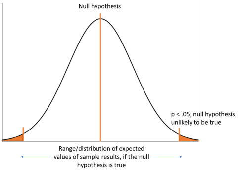
So, we use p < .05 as a standard for whether we judge an effect as statistically significant or not. In all likelihood, you’ve probably heard (and most likely also used) this cut-off before. Importantly, though, even though it feels like a fairly extreme cut-off, it’s still arbitrary and shouldn’t be seen as black and white conclusive evidence for the presence of a true effect. In fact, many people advocate for more extreme cutoffs in some contexts (for example, see this paper). But, at least for now, p < .05 is still standard in the field and accepted as evidence for statistically significant results.
Though many pundits have articulated problems with the assumptions of p values, they are the most generally accepted standard for statistical significance and estimating whether our effect is reliable (beside confidence intervals; we’ll get to those in the next workshop).
There we have it: our method, which is used in nearly any statistical test you will ever do, is to test our hypotheses and assess how likely it is that our results represent a “true” effect or random chance.
So, in summary:
- We use hypothesis tests to test whether there is a real difference between a set of two or more populations or between a population and some standard
- We do this by testing against the null hypothesis that there is no real difference.
- We can test against the null hypothesis using a probability distribution and calculating how far away the results in our data are from the null hypothesis.
- In general, we use the standard p < .05 as a cutoff for what constitutes “extreme enough” to reject the null hypothesis that there is no difference.
And before we move on, why do we care about all of this again? Understanding hypothesis testing is integral to understanding how t-tests (and pretty much all other statistical tests) work. This understanding will inform how we interpret the numbers that R gives us when we run these tests.
6.3 t-tests in R
As we said above, there are 3 things to consider when choosing how to analyze your data:
- What result do you want?
- What type of data is your dependent variable?
- Once finding the test that will get you that result and works with that dependent variable, are the assumptions met?
In line with those questions, each statistical test we run will (1) give us a certain type of result; (2) only take a certain kind of dependent variable (what we’ll call a dependent variable assumption); (3) have other assumptions that need to be met for it to work properly.
The first test we will look at is called a t-test. Let’s looks at each of these three things for t-tests:
What it gives us: Computes the difference between two groups
Dependent variable assumption: Continuous variable
Other assumptions: We’ll get to these in a minute…
6.3.1 What t-tests give us
The t-test is the most basic form of comparing differences across groups. This is generally done by comparing the distribution (or spread) of two groups and seeing how far away they are from each other. The reason its called a “t” test is because it uses a t statistic as a way to assess the differences between groups.
How does it work? How do we use a t statistic to test differences between groups?
OK, don’t get mad at me, but I am going to show you a formula:
\(\frac{m_{1} - m_{2}}{SE}\)
The t-test. Wallah. Or more specifically, the two sample t-test: The two “m”s stand for the means of two groups, and “SE” stands for the standard error.
So, you take the difference of the two groups and divide by the standard error. This gives us an estimate (t statistic) of how far the second mean is from the first mean, taking into account the standard error. Essentially, it asks: “taking into consideration the spread of scores, how far is one group (on average) away from the other group?” Then, we compute a p-value to estimate the probability that this difference is random chance (see hypothesis testing section above).
A p value of .05 means that if we were to repeat this process–collect two samples from the population and take the difference of their means–100 times, we would only observe this difference or more extreme 5 times.
So, we use the t statistic to calculate a p-value and estimate the probability the difference between groups is random chance.
But on top of “t” and “p”, there’s one other letter that’s important for t-tests. Like all other statistical tests, t-tests also have a measure of effect size. The effect size for t-tests is called Cohen’s d. Cohen’s d can be interpreted as the difference in standard deviations between the two groups. For example, a Cohen’s d of 1 would mean that there is a one standard deviation difference between the means of the groups.
CHANGE CHANGE CHANGE This would be quite a large effect, though, in psychology. Here are the normal standards for interpreting Cohen’s d:
- 0.2 - Small effect
- 0.5 - Medium effect
- 0.8 - Large effect
We’ll get into the different kinds of t-tests in a minute, but in general, they all follow this general form: take the difference of two numbers and then divide by a standard error. And importantly, for each type, you get these three pieces of information: t, p, and d.
6.3.2 How to run t-tests in R: single sample, two sample, and paired
While understanding what exactly statistical tests are doing and how to interpret them can take some time, running our basic models in R is a breeze.
First, let’s read in some data:
mtcars is a data set included with R that has some basic data for 32 cars. If you want to learn more about the data set, you can run the code ?mtcars.
Now, back to t-tests.
The basic function for running t-tests is, wait for itttt, t.test(). The arguments of this function can be varied slightly to run different kinds of t-tests.
Also, do you remember that one weird pipe, all those weeks ago, that we’ve never used, %$%? Well, now’s your time to try it out. One of the things that %$% is useful for is piping data into the functions of many of our common statistical tests, including t.test(). So, we’ll use it here!
Now, let’s try running our three kinds of t-tests:
- Single sample t-test
Let’s say that the average miles per gallon (mpg) for all cars everywhere is 30 mpg. We want to know if our sample of cars is about the same or significantly different from this population average. Let’s test it with a single sample t-test:
##
##  One Sample t-test
##
## data:  mpg
## t = -9.3009, df = 31, p-value = 1.757e-10
## alternative hypothesis: true mean is not equal to 30
## 95 percent confidence interval:
##  17.91768 22.26357
## sample estimates:
## mean of x
##  20.09062
single sample t-tests test the mean of a variable against a standard. Sometimes, if known (like in this example), this standard can be a population mean. Because of this, the argument for the standard we are comparing against is mu, which represents the Greek letter \(\mu\). In statistics, mu is used to signify the population mean, whereas “M” or \(\bar{x}\) is generally used to signify the sample mean.
You’ll notice there are a few different pieces of information that R gives us when we run this t-test. On the first line, it gives us the t statistic, “df”, meaning “degrees of freedom” (sample size minus 1; if you haven’t already, you’ll learn more about this in a statistics course), and a p-value. Annoyingly, p-values are often presented in scientific notation. However, if it is in scientific notation (like it is here), it’s usually pretty small and a significant value less than .05.
You’ll also notice that they write out our alternative hypothesis for us–the hypothesis that there is a difference. A significant p-value, like we have here, can be understood as rejecting the null hypothesis and providing evidence for the alternative hypothesis that the “true mean is not equal to 30”.
Notice that the t statistic is negative. Because the formula of the single sample t-test subtracts the population mean from the mean of mpg, this negative value lets us know that the average mpg in our sample is lower than the population average. This can be verified on the last line of the output, where it says “Sample estimates: mean of x”. Here it is 20.09, indicating that the estimated mean of mpg is 20.09–nearly 10 mpg lower than the population average.
So, it looks like mpg of our sample is significantly lower than the population average, but how big is this effect? We know the effect in unstandardized units–the units of measurement of variable mpg. That’s about 10 mpg difference. But, the standardized effect can be helpful to know, too, because it is easily comparable across variables.
Let’s compute Cohen’s d to see what the standardized effect size is for this analysis.
The function we will use for Cohen’s d doesn’t actually compute Cohen’s d for single sample t-tests, but this is easy enough to do by hand. All we need to do is subtract the population average from the average of mpg, and divide this difference by the standard deviation of mpg. Let’s try it out:
## [1] 1.644178It looks like there is a very big difference (d = 1.64) between our sample and the population average–a much larger difference than you would see in most psychology studies. You may have also noticed that I took the absolute value of the Cohen’s d I computed; generally, we present Cohen’s d as a positive value representing only the difference in standard deviations, not the direction of the difference.
- Two sample t-test
Now that we have an understanding of how our sample mpg compares to the population, we’re interested in whether there is a difference in mpg between manual and automatic transmission cars. We can test this using a two sample t-test and the following code:
##
##  Welch Two Sample t-test
##
## data:  mpg by am
## t = -3.7671, df = 18.332, p-value = 0.001374
## alternative hypothesis: true difference in means between group 0 and group 1 is not equal to 0
## 95 percent confidence interval:
##  -11.280194  -3.209684
## sample estimates:
## mean in group 0 mean in group 1
##        17.14737        24.39231
Two sample t-tests are probably the most common type of t-test and test differences in a continuous variable across two groups. You’ll notice here that the code is a bit different than a single sample t-test: rather than a comma, the variables mpg (the outcome) and am (the group variable) are separated by a ~ (pronounced “tilde”). Why? This is the formula format used in R, which we will be seeing in the code for most statistical tests from here on out. The formula format is as follows:
(dependent_variable ~ independent_variables)
This same format will be used for ANOVAs, regressions, and each of their variants, as well. Here, the formula format is used to identify am as the grouping variable by which mpg is split up and then compared.
OK, now what do the results say?
The output format is very similar to a single sample t-test, except for a few things. First, the alternative hypothesis will now always be the same: “true difference in means is not equal to 0”. Rather than testing against a standard, we are testing whether the difference between means is equal to 0. Second, the sample estimates now give us two numbers–the means for each of the groups.
The results indicate that there is a significant difference between the groups (p < .05), and, looking at the sample mean estimates, it looks like automatic cars (am==1) get about 7 mpg more than manual cars (am==0).
Now let’s compute the effect size, Cohen’s d. To do this, we can use the function cohen.d in the effsize package:
##
## Attaching package: 'effsize'
## The following object is masked from 'package:psych':
##
## cohen.d## Warning in cohen.d.formula(mpg ~ am): Cohercing rhs of formula to factor##
## Cohen's d
##
## d estimate: -1.477947 (large)
## 95 percent confidence interval:
## lower upper
## -2.304209 -0.651685Unfortunately, the code isn’t exactly parallel between t.test and cohen.d, such that cohen.d doesn’t use the formula format, but rather a comma to separate the dependent variable and the grouping variable. Otherwise, though, the code is pretty straightforward!
Let’s look at the output. “lower” and “upper” refer to the 95% confidence intervals around the estimate of Cohen’s d; we’ll talk more about confidence intervals next week, so don’t worry too much about this now. The number next to “d estimate” is our estimate of Cohen’s d: 1.48–another very large effect! It’s also nice that they indicate the size of the effect (e.g. “large”) next to the estimate of d. Taking this result together with the t-test, there is a significant difference between the mpg for manual and automatic cars, such that automatic cars get 1.48 standard deviations more mpg than manual cars.
- Paired t-test
Suppose the mpg measurements for am = 0 (manual) and am = 1 (automatic) had been taken from the same cars, say, in comparing earlier versus later models. That is, the mpg when am = 0 is from before the transmission of a model was changed to be automatic; the mpg when am = 1 is from after the transmission was changed. Now, the samples would NOT be independent. Because there are repeated measures for the same cars, the later measurements are dependent on the earlier measurements. In this case, the two samples are paired.
As an example, we have a study in which, for each car, mpg is measured BEFORE the transmission was switched and the year AFTER the transmission was switched, with all cars now being automatic. Let’s read in the data:
You will need this data file for the t-test section. Save it in the same folder as your R Markdown file so R can find it:
This time, since the two groups are paired (i.e., NOT independent), we must indicate that in t.test by specifying paired = TRUE. Otherwise, our results will be incorrect.
##
##  Paired t-test
##
## data:  manual and auto
## t = 17.882, df = 31, p-value < 2.2e-16
## alternative hypothesis: true mean difference is not equal to 0
## 95 percent confidence interval:
##  2.887629 3.631121
## sample estimates:
## mean difference
##        3.259375
The output looks very similar to the two sample t-test, except that “paired t test” is now specified at the top, and the sample estimate at the bottom only has one mean. Why does it only have one mean if we are still comparing two groups? Unlike the two sample t-test which takes the difference of the means between groups, the paired t-test calculates the mean of the differences within pairs; in this was, each car’s later rating is being compared directly to it’s earlier rating.
There is a significant difference between the earlier and later measurements of mpg, such that, on average, cars had about 3.26 more mpg before they switched from manual to automatic. This seems somewhat contradictory to our previous findings that automatic cars, in general, have better gas mileage than manual cars.
Let’s look at the Cohen’s d. Like t.test, we also need to specify paired = TRUE in cohen.d, as well:
##
## Cohen's d
##
## d estimate: 0.6232216 (medium)
## 95 percent confidence interval:
##     lower     upper
## 0.5470886 0.6993546
Taken together with the t-test output, the results suggest that there was a significant difference between earlier and later measurements of mpg, such that cars had about .62 standard deviations more mpg prior to switching their transmission to automatic.
6.3.3 Assumptions
But is it really that easy? We just plug in our data and it spits out beautiful numbers? Yes…and no. There’s one other thing we have to think about.
All statistical analyses have assumptions (like we mentioned in the hypothesis testing section). In general, assumptions are conditions that must be true for an analysis to work properly. By “work properly” we mean that these assumptions make sure that the tests perform in a certain way that we can interpret them as we expect. If the assumptions don’t hold, then the test may not be producing results that are interpretable in the way we would expect. Oftentimes, assumptions are in place to make sure we don’t have biased estimates. This goes back to what we discussed with outliers in the last workshop: we want to do all we can to make sure our tests give us results that accurately represent our sample. Outliers can skew the data in our sample, and unmet assumptions can create problems with the accuracy or preciseness of our estimates.
All statistical tests have at least one type of assumption in common: a dependent variable assumption. A test’s dependent variable assumption is the assumption about what type of data the dependent variable is. For example, is it dichotomous? Continuous?
Before we address the general assumptions of the t-test, we need to take a short detour into an assumption that pops up in many of our statistical tests, including t-tests, ANOVA, and regression: The assumption of normality.
6.3.3.1 The most popular assumption: What’s the normality assumption about?
Ever heard of the normality assumption? Throughout all time and statistics classes, we learn that our basic parametric tests–like t-tests–rely on the assumption that our variables must be normally distributed.
Normally distributed means that if we plot a histogram of all the data points for a given variable (e.g., 300 responses on a well-being question), there will be a bunch of data points distributed around the middle of the variable, and less data points at more extreme values. This makes the histogram shaped like a bell. Exhibit A:
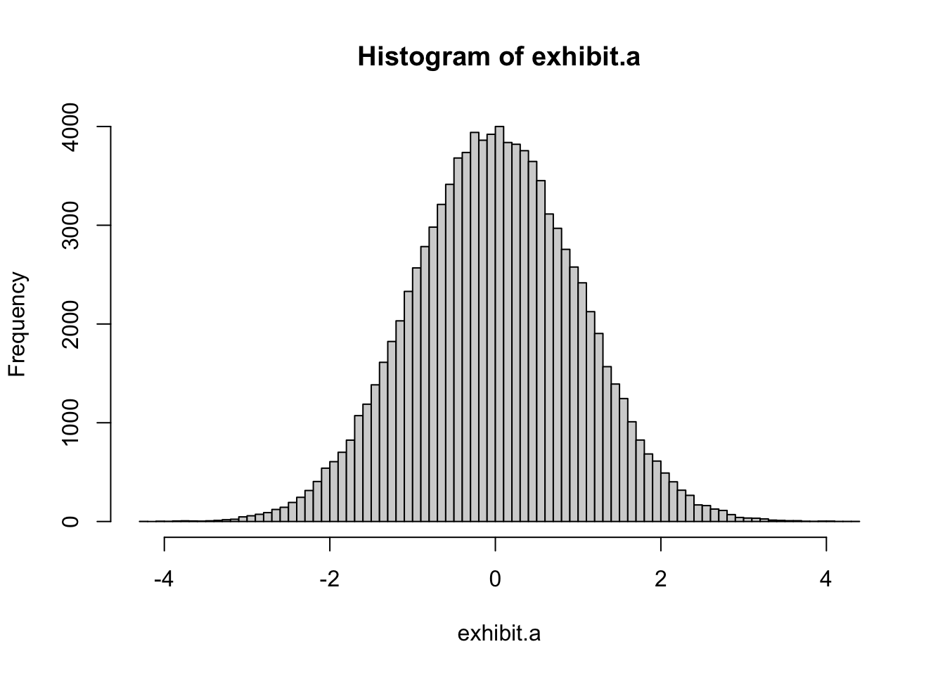
As you can see, the “percent of total” (the Y axis) is much higher in the middle, and less around the sides–that is, normally distributed.
So, we dutifully test for normality with many fancy statistical tests, making sure the big middle part of the distribution isn’t too far to the left or right (what we call skew), or weird in any other way. If our variables aren’t normally distributed enough, we do log transformations, compute special kinds of t tests, and do everything we can to correct it.
This assumption seems to be the one that everyone knows and everyone looks out for.
But…have you ever heard of the Central Limit Theorem?
6.3.3.2 The magic of the Central Limit Theorem
Don’t worry–I won’t whip out any formulas (this time).
First, let’s define two things: a population and a sample. A population is the entire group that you want to draw conclusions about (e.g., we’re studying college students). A sample is the specific group that you will collect data from (e.g., students at Penn). Since we only have access to a small portion of all college students, we study that small portion and generalize conclusions about the population. By and large, that’s how psychological science works.
This is where the Central Limit Theorem comes into play. The Central Limit Theorem deals with the population distribution and the distribution of sample means in that population. The population distribution is the distribution of all people in the population, and the distribution of the sample means is how the means for all samples from that population are distributed. This would be like taking a sample, computing the mean, sticking that mean on a graph, and doing that for all possible samples of the population, until you have a distribution of all of the means. Now, this is all very theoretical; we can’t actually look at either of these distributions when all we have is the measly one sample we put blood, sweat, and tears into collecting. So why does it matter?
Here’s why:
The assumption that t-tests rely on is that the sample mean is normally distributed. This does not mean that your data are normally distributed, it means that the distribution of sample means (the one we talked about a second ago) is normally distributed.
Well, if it’s so theoretical, how will we ever know if it’s normally distributed?
The Central Limit Theorem, that’s how:
The Central Limit Theorem says that “for a large sample size, the mean is approximately normally distributed, regardless of the distribution of the population one samples from.”
What? What is this magic? Listen on:
“The Central Limit Theorem applies to a sample mean from any distribution. We could have a left-skewed or a right-skewed distribution. As long as the sample size is large, the distribution of the sample means will follow an approximate Normal distribution.”
(thanks smart stat people online for these quotes)
In conclusion:
- The assumption is not that our data are normally distributed, but that the sample mean is normally distributed.
- If our sample size is big enough, the sample mean is probably normally distributed, regardless of how the population is distributed.
So, our hypothesis testing does not depend on the shape of our sample’s distribution or the population’s distribution, just on the distribution of the sample mean.
But what sample size is “big” enough for the sample mean to be normally distributed? Generally, if our sample size is greater than 30, the Central Limit Theorem applies.
If you have sample size larger than 30, then the assumption that the sample mean is normally distributed is true and your data do not need to be normally distributed.
If our sample size is less than 30, then it is more important to have normally distributed data.
6.3.3.3 Assumptions of the t-test
So then, what specific assumptions are there for the t-test?
Assumptions of all t-tests:
- normality of the sample means (which we just discussed)
What it means: the means of all possible samples should be normally distributed about the population mean. According to the Central Limit Theorem, this is generally true for samples where n > 30
- sample variance should follow a scaled χ2 distribution
what it means: Don’t worry about it too much, except that it means the variance can’t be negative (makes sense)
For non-normal data (i.e., not normally distributed), the distribution of the sample variance may deviate substantially from a χ2 distribution. However, if the sample size is large, the distribution of the sample variance has little effect on the distribution of the test statistic.
- sample mean and sample variance should be statistically independent
what it means: This means that in a given population, if you were to take all possible samples and plot all of the means of these samples against all of the variances of these samples, the means and variances would not related. This is true if the population is normally distributed.
Normality of the individual data values is not required if these conditions are met.
- A final assumption that needs to be met is that the data are continuous.
what it means: This means that values in your dependent variable should be numbers (like height or weight) and not discrete categories (like race or ethnicity). There are different tests to run if our dependent variable is discrete, rather than continuous.
6.3.3.3.1 Two sample t-test assumptions
Here are a couple of additional assumptions for two sample (independent) t-tests:
- Equality/homogeneity of variance
what it means: The two groups/samples being compared should have the same variance. If the sample sizes in the two groups being compared are equal, though, Student’s original t-test is highly robust to the presence of unequal variances.
Welch’s t-test is insensitive to equality of the variances regardless of whether the sample sizes are similar (we’ll talk about this in a minute).
- The two samples are independent
what it means: This means that the values in your two groups are not dependent on each other. Say, for example, that I am taking a survey at the same time as a friend. I decide that I will respond the opposite of how she responds for every question–if she selects “Strongly Agree” to “I am happy,” then I select “Strongly Disagree”. I think it’s funny, but it has a real, statistical effect: it makes the data dependent. How I answer depends on how she answers. If your two groups are two separate groups of people who answer for themselves, they should generally be independent: the scores in one group are not informed by or do not rely on scores in the other group. However it’s important to recognize that many different kinds of data in the real world are non-independent, and must be analyzed with different types of statistical tests than we discuss here. Here are a few examples of non-independence you may see in your own data:
- data from couples, where we have scores for both people in the relationship
- kids in classrooms, who have the same teacher and go to the same school
- employees in teams at a company
- many samples across the world, each from a different country
- getting two scores for one person, at different time points, such as before and after a treatment
Great! That’s all of our assumptions for two-sample t-tests. While these assumptions are important to know, most two-sample t-tests are robust to all but large deviations from the assumptions.
6.3.3.3.2 Paired t-test assumptions
You might assume that because paired t-tests use two groups–like the two sample t test–it would follow that you also assume there is equality of variance between groups for paired t-tests, as well. But, actually, that’s not that important for the paired t-test. Why? Because assumptions for the paired t-test are assumptions about the distribution of the difference between pairs not the distributions of the separate values of each pair. So, with that, we have one important extra assumption:
- The differences are independent
what it means: the scores within pairs are dependent, but the differences between scores are independent. This means that the difference between your two scores and the differences between Sally’s scores should not depend on each other and should be unrelated.
6.3.3.4 Testing for equal variance
Many of the assumptions of t-tests are fulfilled by the Central Limit Theorem or are not directly testable. But what could we test?
Well, we could take a look at the assumptions of normality and equality of variances. Even though the normality assumption isn’t that our data is normally distributed, it’s always helpful to look at your data anyways, and the distribution of our data can give some insight into whether we may run into problems down the line. The easiest way to do this is to eyeball your data using a boxplot, like this:
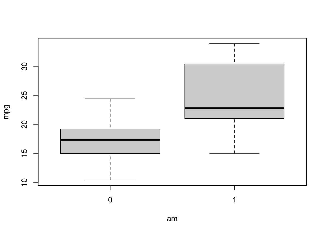
When you look at the boxplot, first look at the symmetry of each box. This gives us a sense of the normality of the distributions. Are they symmetrical? The box for am==0 looks pretty symmetrical: the median (the bold line) is pretty centered and the two whiskers also look equidistant from the box. However, the box for am==1 does not look as symmetric: the whiskers are a bit lopsided, and the median is way closer to the bottom than the top. While this doesn’t prove anything, this lack of symmetry does indicate an uneven distribution and might suggest that the assumption of normality might be violated.
Second, look at the size of the boxes compared to each other. This gives us a sense of how the variances of each group compare to each other. Just eyeballing it, the variance for the am==0 group looks much smaller than the am==1 group, and may suggest that the assumption of equal variances is violated. In this way, you can use boxplots to get a good sense of your data and if any assumptions are violated.
What if you wanted to test more robustly whether the assumption is violated?
Of all of the assumptions, the one we can test for best statistically is the equality of variance assumption for two sample t-tests. Now, recall that even though this assumption is important, the two sample t-test is robust to the presence of unequal variance if the sample size between groups is equal. Also, just in general, the two sample t-test is a pretty robust test.
Also, note that there are some inherent issues with the tests we might use to test this assumption. If you use want to use a statistical test to test an assumption, that test also has it’s own assumptions, and will be sensitive to sample size. That means two things. First, when we attempt to test assumptions, we are taking on even more assumptions, which can be a bit tautological if we want to know for sure if our initial assumptions are met. Second, for samples with more people, these tests will be able to identify differences across samples more precisely, such that we may conclude that a small difference between variances is not statistically different in a small sample, but we do in a large sample, changing the test we use to test our research question, even though the variances did not change.
If we wanted to test for normality in our sample, too, these same issues would apply.
As you can tell…I’m a bit cynical of using statistical tests to test assumptions of other statistical tests. But, even still, we do want to do our due diligence to check our assumptions to the extent possible! So, we will take a deep breath and move forward with a few ways you could do that.
Two common ways of testing for equality of variance are Bartlett’s test and Levene’s test. Let’s try using both of these to get estimates of equality of variance for our data.
We can calculate Bartlett’s test using the base R function bartlett.test. For the Levene test, we need to load in the package car, which contains the function leveneTest (note that “Test”, but not “levene”, is capitalized). Both of these functions use the familiar formula format, but, importantly, leveneTest will only take factors as grouping variables. am, although not a factor, has been operating as a grouping variable for t.test, cohen.d, and bartlett.test. For leveneTest, however, it needs to be a factor–you can see how I transformed it into a factor in the leveneTest code.
##
##  0  1
## 19 13##
## Bartlett test of homogeneity of variances
##
## data: mpg by am
## Bartlett's K-squared = 3.2259, df = 1, p-value = 0.07248## Levene's Test for Homogeneity of Variance (center = median)
## Df F value Pr(>F)
## group 1 4.1876 0.04957 *
## 30
## ---
## Signif. codes: 0 '***' 0.001 '**' 0.01 '*' 0.05 '.' 0.1 ' ' 1Let’s check our equality of variance tests to see if there may be evidence that our assumption of equal variance is not met.
For both of these tests, a significant p-value indicates that variances are NOT equal–we reject the null hypothesis that variances across groups are equal. The p-value for Bartlett’s test was p = .07 and the p-value for Levene’s test was p = .049. It seems that there is some evidence of unequal variance, and we should probably account for this violation of assumption.
How can we account for this? As you may recall from the assumptions section, “Welch’s t-test is insensitive to equality of variances regardless of whether the sample sizes are similar.”
Welch’s t-test is an alternative version of the normal two sample t-test that is robust to inequality of variance, and can be used when that assumption is violated.
But wait…run the normal t-test command one more time…
##
##  Welch Two Sample t-test
##
## data:  mpg by am
## t = -3.7671, df = 18.332, p-value = 0.001374
## alternative hypothesis: true difference in means between group 0 and group 1 is not equal to 0
## 95 percent confidence interval:
##  -11.280194  -3.209684
## sample estimates:
## mean in group 0 mean in group 1
##        17.14737        24.39231
What did you see? It seems like t.test is already computing a Welch t-test!
Let’s check the defaults for t.test to see if we can get any insight into why that is…
If you look at the documentation for t.test, you’ll see that the default is that var.equal = FALSE. That means that t.test by default assumes variances are not equal and it computes a Welch t-test. However, if we test for equality of variance and find that the variance is equal across groups, then we can use the var.equal = TRUE option in t.test, which would look like this:
##
##  Two Sample t-test
##
## data:  mpg by am
## t = -4.1061, df = 30, p-value = 0.000285
## alternative hypothesis: true difference in means between group 0 and group 1 is not equal to 0
## 95 percent confidence interval:
##  -10.84837  -3.64151
## sample estimates:
## mean in group 0 mean in group 1
##        17.14737        24.39231
Practice
Quarter-mile time (qsec) is how long each car takes to cover a quarter mile. Use a one-sample t-test to check whether the average car in mtcars differs from 18 seconds.
Answer
##
##  One Sample t-test
##
## data:  qsec
## t = -0.47881, df = 31, p-value = 0.6354
## alternative hypothesis: true mean is not equal to 18
## 95 percent confidence interval:
##  17.20449 18.49301
## sample estimates:
## mean of x
## 17.848756.4 ANOVA in R
What it gives us: Computes any difference between two or more groups
Dependent variable assumption: Continuous variable
Other assumptions:
ANOVA has the same primary assumptions as a t-test:
- Data are normally distributed
- Equal variance across groups
- Independent observations
Like t-tests, with a large enough sample, the first assumption is fulfilled. Additionally, the third assumption should be true if we independent groups (i.e. not overlapping) from a random sample. The second assumption could be tested directly, just like with t-tests.
ANOVA stands for analysis of variance, and it is the most basic method for comparing more than 2 groups. While t-tests directly compare the difference between two groups, ANOVAs assess whether there is any difference among the groups. Therefore, the null hypothesis when running ANOVAs is that all groups are equal; there are no differences between groups. So, if our ANOVA tells us that there are differences among the groups, what then? If there are differences, then we run post hoc tests to pinpoint where and how the groups are different. Post hoc tests are just follow up t-tests that we run to analyze the pairwise relationships between each level of the groups.
In general, analyzing an ANOVA in R has a few steps:
- Create an ANOVA model object
- Summarize ANOVA model object
- Computed post hoc follow up tests
Let’s see how we can analyze one way ANOVAs and ANCOVAs in R.
First, let’s read in some data I’ve made up, which you can get here:
bl <- read.csv("belonging study_cleaned.csv")

bl %<>% mutate(

  # pin the order so Control stays the reference level (alphabetical order would not)
  group_f = factor(group_f, levels = c("Control", "Belonging", "Self-esteem")),
  school_f = factor(school_f),
  gender_f = factor(gender_f)
)
Notice that I made each of our grouping variables into factors. While some functions (like t.test) don’t really care if the grouping variable is specified as a factor, the ANOVA functions do. It will analyze the data differently and give you different results if your grouping variables are not properly specified as factors.
To orient you to the data, here’s a quick overview of the type of study it would come from (if it were real). We have kids from different high schools and we are testing an intervention to see if helping students develop self-esteem or a sense of belonging will improve their GPA. In addition to GPA, we also collected data on their gender, age, academic self-efficacy (their belief in their own ability to succeed at school, which we’d expect a belonging intervention to raise), and subjective well-being.
6.4.1 One way ANOVA
First, let’s try a one way ANOVA. A one way ANOVA tests whether there are any differences among the groups of one independent variable.
For our belonging study, this is a perfect way to test our primary research question: are there any differences in GPA one year later across intervention groups?
Let’s check it out!
First, like with the t-tests, we could assess whether our data maintain the assumption that the variance across groups is equal:
##
##  Bartlett test of homogeneity of variances
##
## data:  gpa by group_f
## Bartlett's K-squared = 0.25013, df = 2, p-value = 0.8824## Levene's Test for Homogeneity of Variance (center = median)
## Df F value Pr(>F)
## group 2 0.058 0.9437
## 297The p-value for each of these tests was well above .05, providing support for the notion that there is no difference in the variance across groups. Great.
Here’s how to run an ANOVA. Similar to t.test(), our ANOVA function aov() (another acronym for “analysis of variance”) uses the formula format, in the form of “dependent variable ~ grouping variable”. This sets up our ANOVA model. We then save the aov model to an object (what I’m naming “mod1” for “model 1”), because we will be using it for lots of things later. OK, now that we have created our model, let’s call it and see what the output looks like:
## Call:
##    aov(formula = gpa ~ group_f)
##
## Terms:
##                  group_f Residuals
## Sum of Squares  1565.537  2850.711
## Deg. of Freedom        2       297
##
## Residual standard error: 3.098121
## Estimated effects may be unbalanced
Hm. Unlike t.test, aov does not seem to give us the results of the hypothesis test for our ANOVA–it provides some information on the sum of squares, etc. but does not directly test the null hypothesis that there is no difference between groups.
To get the full results of the analysis for the model, we need to pass our model object, mod1, to the summary() function:
##              Df Sum Sq Mean Sq F value Pr(>F)
## group_f       2   1566   782.8   81.55 <2e-16 ***
## Residuals   297   2851     9.6
## ---
## Signif. codes:  0 '***' 0.001 '**' 0.01 '*' 0.05 '.' 0.1 ' ' 1
The added information that the summary() function gives us is in the F Value and Pr(>F) columns. ANOVAs, rather than using a t-statistic, use an F-statistic (given in the F Value column) to compute a p-value to test the null hypothesis. Then, the p-value is given in the Pr(>F) column.
It looks as though the results of our test are highly significant, with the scientific notation indicating that the p-value is so small it’s practically 0. So what does this tell us again? This tells us that the differences in GPA across intervention groups are large enough that we can reject the null hypothesis that there is no difference across groups. So now that we know there are differences somewhere between our groups, how do we find out where those differences are?
There are a few different methods I like to use to look at differences between groups:
- Tukey’s post hoc test using
TukeyHSD() emmeans()andpairs()to get estimated means and then do pairwise contrasts
How are these two methods different? Well, they are actually pretty similar, but TukeyHSD() is specifically well-suited to be a follow up to an ANOVA, whereas emmeans() is a flexible function that can be used to get the estimated values from a wide range of statistical models.
Let’s try them both out and see what they tell us:
##   Tukey multiple comparisons of means
##     95% family-wise confidence level
##
## Fit: aov(formula = gpa ~ group_f)
##
## $group_f
##                            diff       lwr       upr     p adj
## Belonging-Control      5.380103  4.348052  6.412154 0.0000000
## Self-esteem-Control    1.358167  0.326116  2.390218 0.0059963
## Self-esteem-Belonging -4.021936 -5.053987 -2.989886 0.0000000
We can see that the output says it is giving us a “95% confidence limit” (aka confidence interval) for multiple comparisons of means. It also reports (following Fit:) the model that we specified and fed into the function. Then, there are a number of comparisons–it is computing t-tests between every two-level combination. In this case, there are three possible combinations. When it says “Belonging-Control”, for example, it literally means “The mean of the Belonging Condition minus the mean of the Control Condition.” We can see how big that difference is in the diff column. Because the difference in the first comparison is positive, that means the belonging mean on GPA is higher than the control condition. In contrast, as we see in the third comparison, the negative difference means that the self-esteem condition mean is lower than the belonging mean.
The next two columns after diff, lwr and upr, give us the lower and upper limits of a 95% confidence interval. And finally, the p adj column gives us adjusted p-values for each comparison. These adjusted p-values are in large part the reason why we run a Tukey test, rather than just a ton of individual t-tests. The Tukey test is a conservative test of these relationships, in that it corrects for the increased probability of finding a random-chance effect the more tests we run. Remember that if we ran our study 100 times, p < .05 means we would get an effect 5 times just by random chance? The Tukey test (and other corrections, like the Bonferroni correction), tries to reduce the likelihood of finding fake, random effects when we run many tests at once.
## Welcome to emmeans.
## Caution: You lose important information if you filter this package's results.
## See '? untidy'## group_f emmean SE df lower.CL upper.CL
## Control 81.6 0.31 297 81.0 82.2
## Belonging 87.0 0.31 297 86.4 87.6
## Self-esteem 82.9 0.31 297 82.3 83.6
##
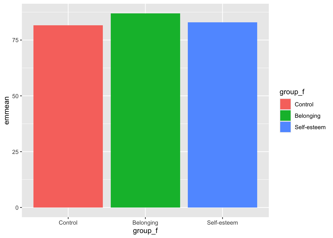
## Confidence level used: 0.95emmeans() gives us something that TukeyHSD() didn’t: it gives us the estimated means for each of the groups, not just the differences between those means. We can see that the estimated mean for the belonging condition is much higher (87) than the self-esteem (82.9) or control (81.6) conditions.
Now, similar to TukeyHSD() we can compute the difference between each of these means to see if the differences are statistically significant. We do this by adding the pairs() function to emmeans():
##  contrast                  estimate    SE  df t.ratio p.value
##  Control - Belonging          -5.38 0.438 297 -12.279 <0.0001
##  Control - (Self-esteem)      -1.36 0.438 297  -3.100  0.0060
##  Belonging - (Self-esteem)     4.02 0.438 297   9.180 <0.0001
##
## P value adjustment: tukey method for comparing a family of 3 estimates
If you compare this output to the TukeyHSD() output, it’s very similar! In fact, at the bottom of the output for pairs() they note that the contrasts/comparisons are even done using the Tukey method for corrections. One difference in presentation, however, is that pairs() gives information on the standard error (SE), degrees of freedom (df), and t-value (t.ratio), whereas TukeyHSD() gives information on the confidence intervals. The method of computation is very similar–just slightly different outputs!
Now, while those tests are necessary, it can sometimes be hard to internalize and “get” the main result by staring at a million different comparisons. This is where the power of visualization comes in! Let’s use ggplot to create a graph representing these results.
Remember how we used group_by() and summarise() in our ggplot workshop to create group means which we could then plot? (like this:)
## # A tibble: 3 × 3
##   group_f      mean    sd
##   <fct>       <dbl> <dbl>
## 1 Control      81.6  3.05
## 2 Belonging    87.0  3.19
## 3 Self-esteem  82.9  3.05
Well, when we want to plot model results (as opposed to raw means), emmeans() can give us similar information, estimated from the model, that we can then use to plot. Just like we did above, we use the function emmeans(), but then convert it into a data table using as_tibble(). We then save that new table into an object:
## # A tibble: 3 × 6
##   group_f     emmean    SE    df lower.CL upper.CL
##   <fct>        <dbl> <dbl> <dbl>    <dbl>    <dbl>
## 1 Control       81.6 0.310   297     81.0     82.2
## 2 Belonging     87.0 0.310   297     86.4     87.6
## 3 Self-esteem   82.9 0.310   297     82.3     83.6
You can see that we now have information on estimated means, standard errors, and confidence intervals for each group.
Now let’s use that new data table to create a ggplot. If you haven’t learned about the magic of ggplots or don’t remember what the commands below mean, review the previous ggplot workshops in this workshop series.
Remember, geom_col() is the function we use to compare means across groups:
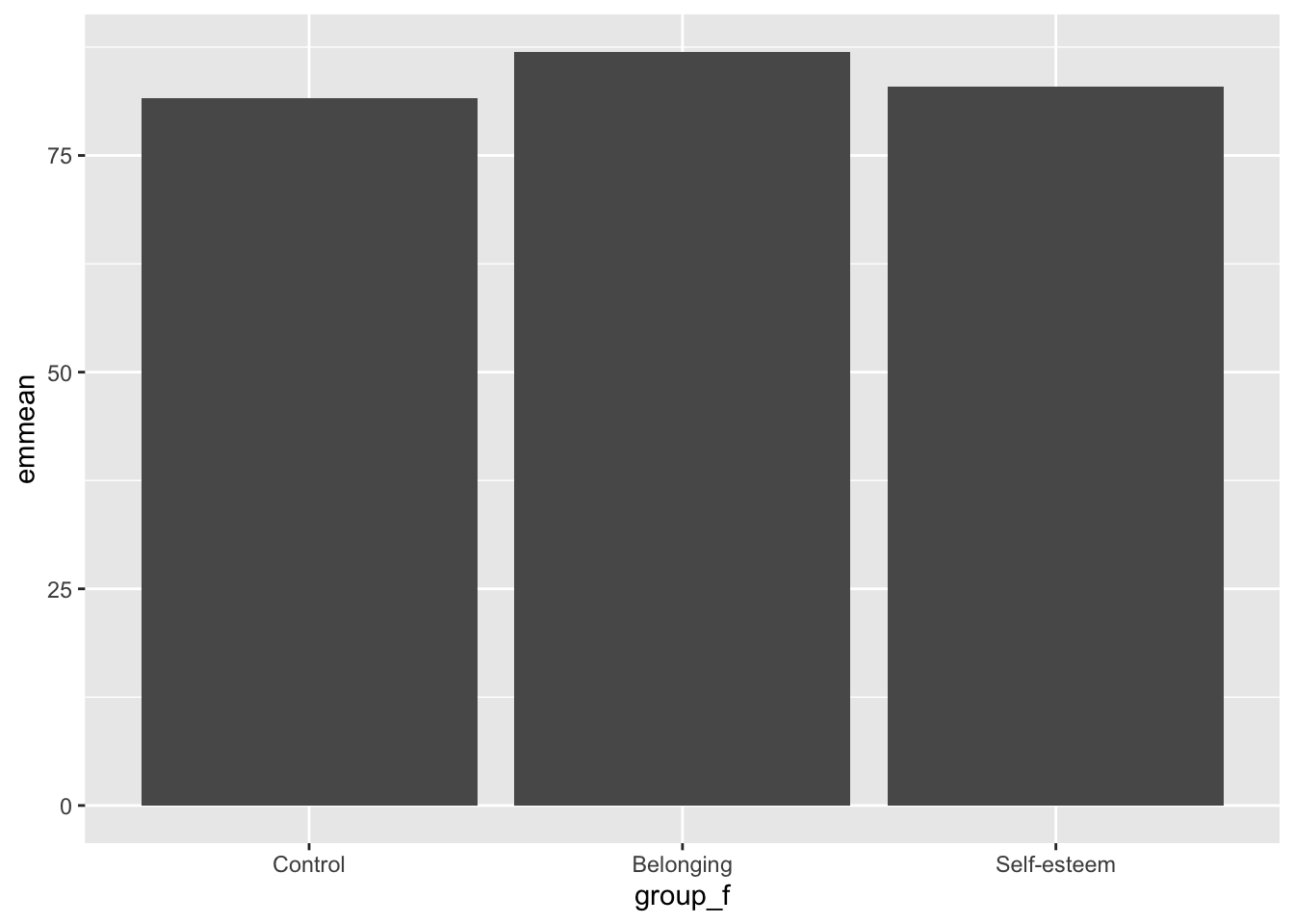
Since that graph is super boring, let’s add a fill argument to indicate that we want the bars to change colors depending on the group:
Now, the best part: let’s add errorbars so that we can see if the differences between groups are significant. If you add confidence intervals to the graph, and they don’t overlap, that indicates that there is a significant difference between groups. This is a great and easy way to visualize differences between groups.
Fortunately, our emmeans table also has information on our confidence intervals, and we can plug them right into geom_errorbar():
emmeans_anova %>%
  ggplot(aes(y = emmean, x = group_f, fill = group_f)) +
geom_col() +
geom_errorbar(aes(ymin = lower.CL, ymax = upper.CL), width = .3)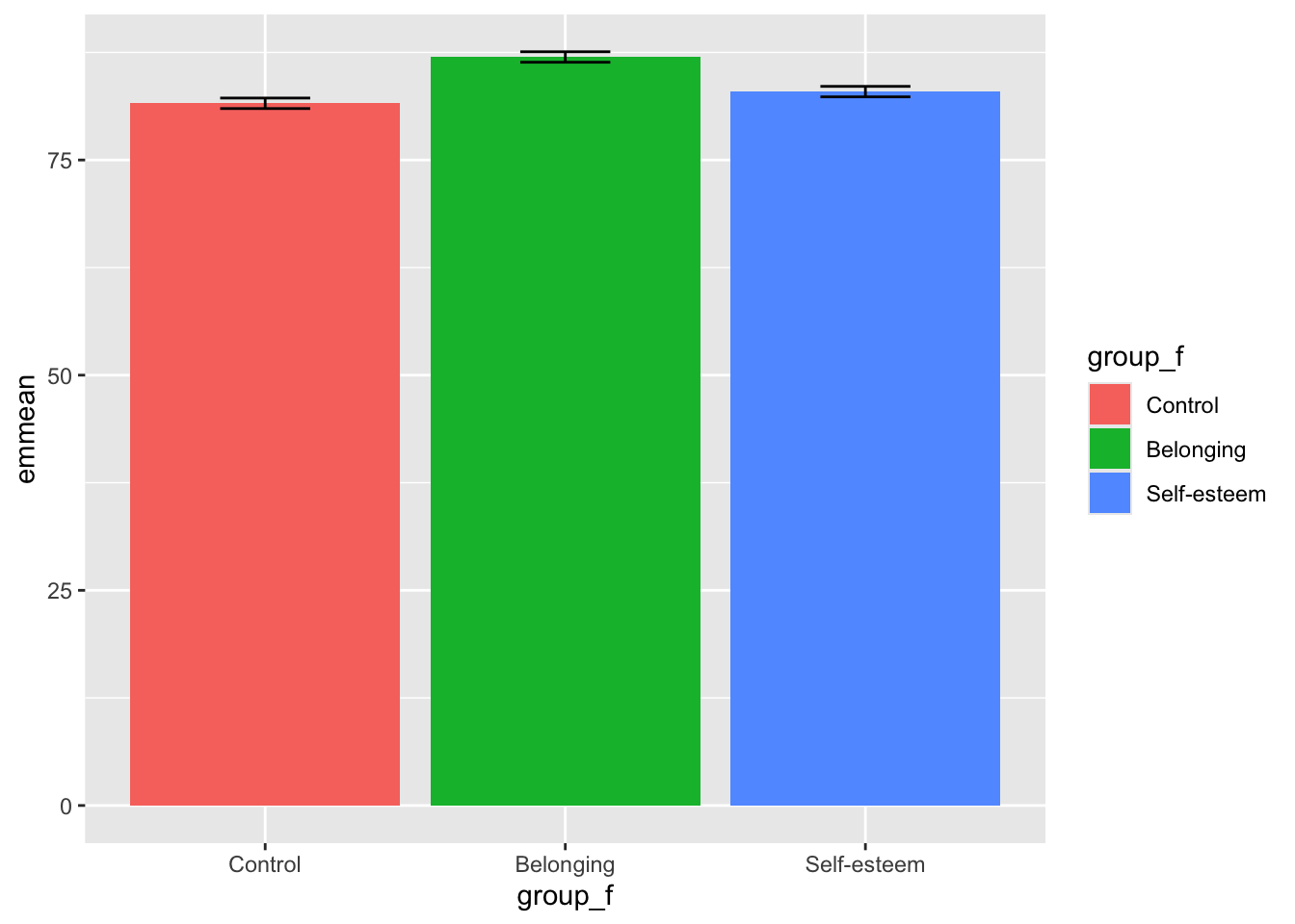
Last, but not least, let’s make the graph a little bit easier to look at by adding a label for the y-axis and zooming in using coord_cartesian():
emmeans_anova %>%
  ggplot(aes(y = emmean, x = group_f, fill = group_f)) +
  geom_col() +
geom_errorbar(aes(ymin = lower.CL, ymax = upper.CL), width = .3) +
ylab("GPA") +
coord_cartesian(ylim = c(50, 95))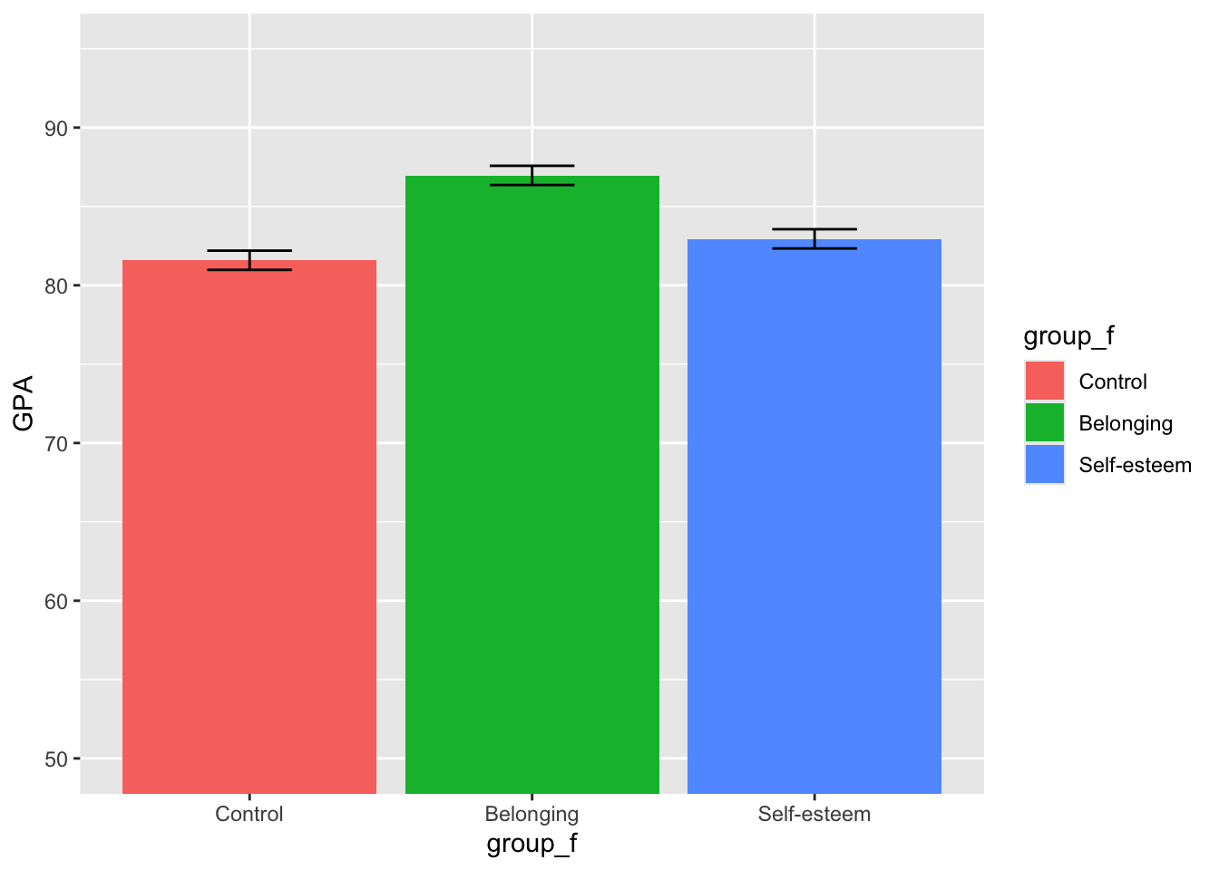
Awesome. Now we have a great way to visualize our ANOVA results!
6.4.2 ANCOVA
Another common type of ANOVA is an ANCOVA. This stands for analysis of covariance, and is a normal ANOVA plus covariates. Covariates are other variables we want to control for in our analyses that might also affect our outcome. For example, maybe gender and age also significantly impact GPA, and we want to see if the intervention has an affect on GPA above and beyond these other predictors.
Here’s how we would specify that model:
##              Df Sum Sq Mean Sq F value  Pr(>F)
## group_f       2 1565.5   782.8  83.792 < 2e-16 ***
## gender_f      1    0.6     0.6   0.063 0.80199
## age           1   94.3    94.3  10.094 0.00165 **
## Residuals   295 2755.8     9.3
## ---
## Signif. codes:  0 '***' 0.001 '**' 0.01 '*' 0.05 '.' 0.1 ' ' 1
To add more variables to the model, we simply add each with a + sign. When we analyze the model in summary(), we see that there is still a difference across groups, but there is also a significant effect for age.
Now, let’s look at the comparisons between groups:
##  contrast                  estimate    SE  df t.ratio p.value
##  Control - Belonging          -5.24 0.435 295 -12.052 <0.0001
##  Control - (Self-esteem)      -1.38 0.432 295  -3.193  0.0044
##  Belonging - (Self-esteem)     3.86 0.436 295   8.853 <0.0001
##
## Results are averaged over the levels of: gender_f
## P value adjustment: tukey method for comparing a family of 3 estimates
Just like before, we only need to specify ~group_f because we are not interested in looking at mean differences across gender_f or age; we are simply accounting for these in our analysis.
How do these differences compare to the differences in the normal one way ANOVA? We can see that the estimated differences change a bit when we control for gender_f and age.
To make a graph for an ANCOVA, we follow the same process:
emmeans_anova2 %>%
  ggplot(aes(y = emmean, x = group_f, fill = group_f)) +
  geom_col() +
  geom_errorbar(aes(ymin = lower.CL, ymax = upper.CL), width = .3) +
  ylab("GPA") +
  coord_cartesian(ylim = c(50, 95))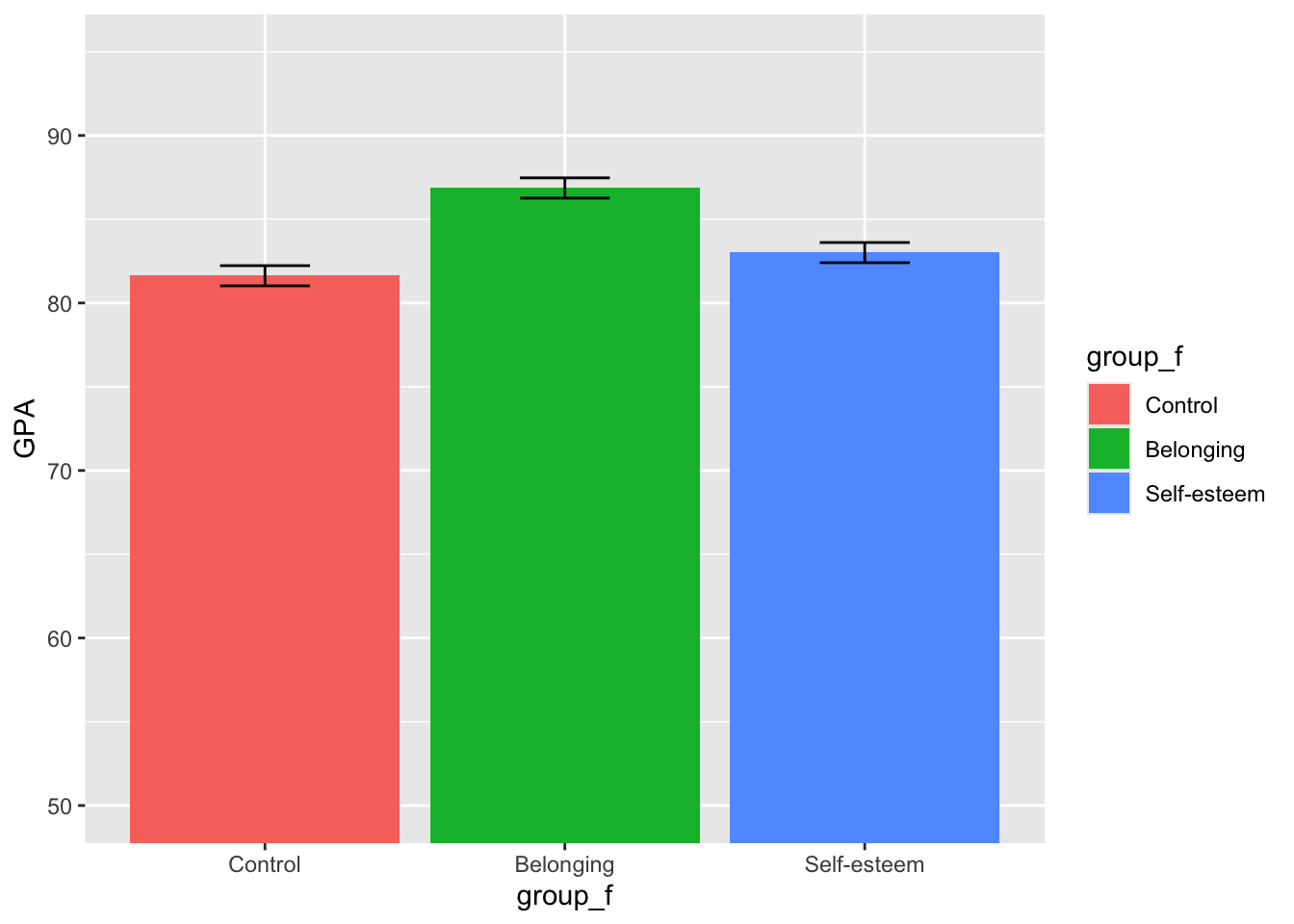
We can see the graph looks pretty similar. However, it’s important to note that in real analyses, we’ll almost always want to control for covariates, so analyzing and visualizing ANCOVAs is probably something you will do more often than basic ANOVAs.
Practice
We just tested whether GPA differs across intervention groups. Now run the same one-way ANOVA for efficacy, and follow it up to see which groups differ.
Answer
##              Df Sum Sq Mean Sq F value Pr(>F)
## group_f       2  53.92  26.961   136.3 <2e-16 ***
## Residuals   297  58.74   0.198
## ---
## Signif. codes: 0 '***' 0.001 '**' 0.01 '*' 0.05 '.' 0.1 ' ' 1## Tukey multiple comparisons of means
## 95% family-wise confidence level
##
## Fit: aov(formula = efficacy ~ group_f, data = bl)
##
## $group_f
## diff lwr upr p adj
## Belonging-Control 0.9961499 0.8480036 1.1442963 0.0000000
## Self-esteem-Control 0.2439345 0.0957881 0.3920809 0.0003798
## Self-esteem-Belonging -0.7522155 -0.9003618 -0.6040691 0.00000006.5 What to do when assumptions are violated: Non parametric/robust variants of group testing
What if your assumptions are violated and you can’t use the normal t-tests and ANOVAs? For cases like this, smart stats people have developed what we call non-parametric or robust approaches to group difference testing.
What do we mean by robust? We call something robust if it doesn’t break easily, right? Robust analyses are thus called because they are more resistant to violations of assumptions than our normal tests.
When would we use robust variants to t-tests and ANOVAs?
- Mainly: your sample is really small. With small samples, (n < 30), our beloved central limit theorem doesn’t hold, so our normal tests stop working. If you are working with smaller datasets, and your data don’t look normally distributed, you may want to use nonparametric tests.
- Secondly: You might be working with ordinal, rather than continuous data. Ordinal scores are scores you can order from less to more, but you can’t know if they are equidistant from each other; continuous scores are ones that always have a fixed difference between each other. Here’s an example to illustrate the difference: age is continuous because the year between 21 and 22 year-olds is the same year if its between 78 and 79 year-olds–it’s 365 days either way. In contrast, if you for amount of education, you can know that a graduate student has recieved more education than a highschool graduate and a highschool graduate has recieved more education than someone who didn’t finish high school, but there is no way to know exactly how much more. Because nonparametric tests work with rankings, they are robust to ordinal data.
Robust variants of classical tests let us solve these problems. At this point, you might be thinking, why don’t we use robust analyses for everything? If they are more resistant to violation of assumptions, doesn’t that mean they are just better versions of the same tests? BEWARE! robust tests have a differnet interpretation, because most robust tests make an important transformation to the data: instead of using the raw values, robust tests use ranks.
Take a look at this.
## [1] 9 15 5 17 6 16 8 12 20 2 3 4 18 19 10 11 1 14 7 13exhibit.b %>% rank() %>% hist #Since every rank is likely to ocurr once (ties can ocurr, but they are not usual), the extremeness of the data is solved.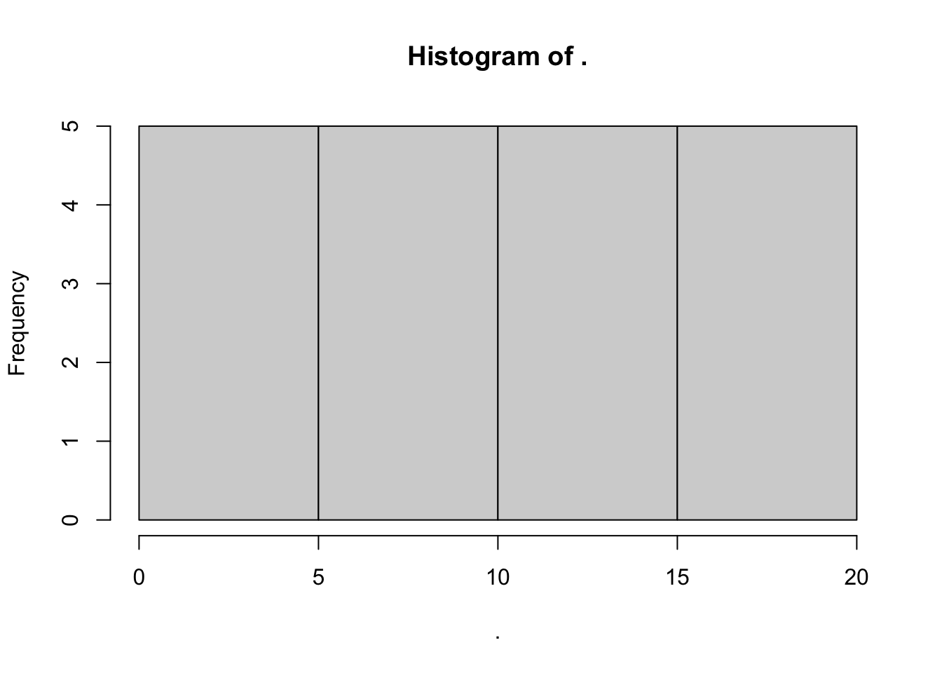
So while parametric (non-robust) T.Tests and ANOVAS compare means, robust variants compare mean ranks.
We will see now two variants. Mann-Whitneys U (which is basically a t-test run on the ranks rather than te values themselves) and Kruskall-Wallis Multiple Group Comparison Test (which is basically one-way ANOVA run on ranks).
6.5.1 Mann Whitney’s U
Let’s use our trusted old friend-dataset mtcars, to try Mann-Whitney’s U.
##
##  Wilcoxon rank sum exact test
##
## data:  mpg by am
## W = 42, p-value = 0.001159
## alternative hypothesis: true location shift is not equal to 0
As you can see we get two pieces of output: The W statistic (equivalent to the t statistic in the t test), and its significance (the p value). If the significance is less than .05, then we know that the mean RANKS of mileage of automatic cars is significantly different than that of manual cars.
What about paired samples? We just need to specify that the samples are paired with the paired = TRUE argument. Let’s look at how chickens grow (I wonder where does R get these weird datasets). We need to do some data manipulation, as the function takes as input two vectors of data from the same subjects. To make the sample smaller, also, let’s look only at those with experimental diet # 1.
##
##  Wilcoxon signed rank exact test
##
## data:  20 and 21
## V = 19.5, p-value = 0.00946
## alternative hypothesis: true location shift is not equal to 0
As before, we get the V statistic and it’s associated p-value. In this case, since p < .05, the chickens significantly increased in weight from day 20 to day 21.
6.5.2 Kruskall Wallis
If we had more groups, and wanted to compare them ala ANOVA, we would use the Kruskal-Wallis rank sum test. Once again, let’s see if there are significant differences in the ranks of mileage depending on the number of cylinders of cars.
##
##  Kruskal-Wallis rank sum test
##
## data:  mpg by cyl
## Kruskal-Wallis chi-squared = 25.746, df = 2, p-value = 2.566e-06
In this case, our p-values are less than .05. This suggests that… there are significant differences in mileage between cars with different number of cylinders.
Practice
Suppose you were worried that efficacy is too skewed for ANOVA. Re-run the comparison across group_f using the non-parametric alternative, and see whether your conclusion changes.
Answer
##
##  Kruskal-Wallis rank sum test
##
## data:  efficacy by group_f
## Kruskal-Wallis chi-squared = 143.92, df = 2, p-value < 2.2e-166.6 Review: End Notes
6.6.1 Quick reference: comparing groups
Choosing a test
| Groups | Parametric test | Non-parametric alternative |
|---|---|---|
| One sample against a fixed value | t.test(x, mu = value) |
– |
| Two independent groups | t.test(y ~ group) |
wilcox.test() (Mann-Whitney U) |
| Two paired measurements | t.test(a, b, paired = TRUE) |
wilcox.test(paired = TRUE) |
| Three or more groups | aov(y ~ group) |
kruskal.test() |
| Three or more groups, with a covariate | aov(y ~ group + covariate) |
– |
Running and following up the tests
| Function | What It Does |
|---|---|
t.test() |
All three t-tests, depending on the arguments you give it |
aov() |
Analysis of variance. Wrap it in summary() to see the F table |
TukeyHSD() |
Post hoc pairwise comparisons after an ANOVA, corrected for multiple tests |
emmeans() |
Estimated marginal means–group means adjusted for the other terms in the model |
Checking assumptions and reporting effects
| Function | What It Does |
|---|---|
bartlett.test() |
Tests equal variances across groups. Sensitive to non-normality |
leveneTest() |
Also tests equal variances, but is more robust than Bartlett’s |
cohen.d() |
Cohen’s d, the effect size for a group difference. Roughly: .2 small, .5 medium, .8 large |
A significant test tells you a difference exists; the effect size tells you whether it is large enough to care about. Report both.
6.6.2 Feedback
As a learner, your superpower is knowing what is and isn’t working for your learning. If you have 2 minutes, we would love if you shared your superpower with us!
Scan the QR code below with your phone to provide brief feedback on this workshop:

6.6.3 Some useful resources to continue your learning
A useful resource, in my opinion, is the stackoverflow website. Because this is a general-purpose resource for programming help, it will be useful to use the R tag ([R]) in your queries. A related resource is the statistics stackexchange, which is like Stack Overflow but focused more on the underlying statistical issues. Add other resources
6.6.4 What’s an R Markdown again?
This is the main kind of document that I use in RStudio, and I think its one of the primary advantage of RStudio over base R console. R Markdown allows you to create a file with a mix of R code and regular text, which is useful if you want to have explanations of your code alongside the code itself. This document, for example, is an R Markdown document. It is also useful because you can export your R Markdown file to an html page or a pdf, which comes in handy when you want to share your code or a report of your analyses to someone who doesn’t have R. If you’re interested in learning more about the functionality of R Markdown, you can visit this webpage
R Markdowns use chunks to run code. A chunk is designated by starting with {r}and ending with This is where you will write your code. A new chunk can be created by pressing COMMAND + ALT + I on Mac, or CONTROL + ALT + I on PC.
You can run lines of code by highlighting them, and pressing COMMAND + ENTER on Mac, or CONTROL + ENTER on PC. If you want to run a whole chunk of code, you can press COMMAND + ALT + C on Mac, or ALT + CONTROL + ALT + C on PC. Alternatively, you can run a chunk of code by clicking the green right-facing arrow at the top-right corner of each chunk. The downward-facing arrow directly left of the green arrow will run all code up to that point.