Workshop 4 Visualization with ggplot II
Want to follow along in R? Download this workshop as an R Markdown file.
4.1 Before we get started
Having trouble remembering what exactly an R Markdown is? Want some more resources for learning R?
4.1.1 Recap: What we learned in the previous tutorial
In the last tutorial, we started our ggplot adventure and covered:
- The basic structure of a ggplot
- Common aesthetics
- Common geoms for multivariate plots–
geom_point(),geom_col()andgeom_line() - How to change the presentation of your ggplot
4.1.2 Overview: What we’ll learn here
What we’ll look at here:
Visualization
- Geoms for univariate and descriptive plots
- Common aesthetics, and which geoms they apply to
- Faceting a plot by group
- Coordinate systems and axis scaling
- Non-data elements: labels, legends and themes
Let’s start by reading in our data:
You will need the following data files for this workshop. Save them in the same folder as your R Markdown file so R can find them:
4.2 Picking up where we left off: adding a third variable
…And picking up right where we left off.
Not really, we should start with something we missed from last week: using a third variable in a bar plot. Say you want to make a bar chart for the mean level of gas mileage mpg on the y axis, and the number of gears gear in the x axis, but you want to compare these results between automatic transmission vs. manual transmission cars am. To do that, we need to do a bar chart like the ones we’ve seen previously, but including another aesthetic for the third variable. Here’s how you do it. Try changing position = "dodge" for position = "stack" and see what happens.
d %>%
  group_by(gear, am) %>%
  summarise(mpg = mean(mpg), .groups = "drop") %>%
  ggplot(aes(gear, mpg, fill = am)) + geom_col(position = "dodge")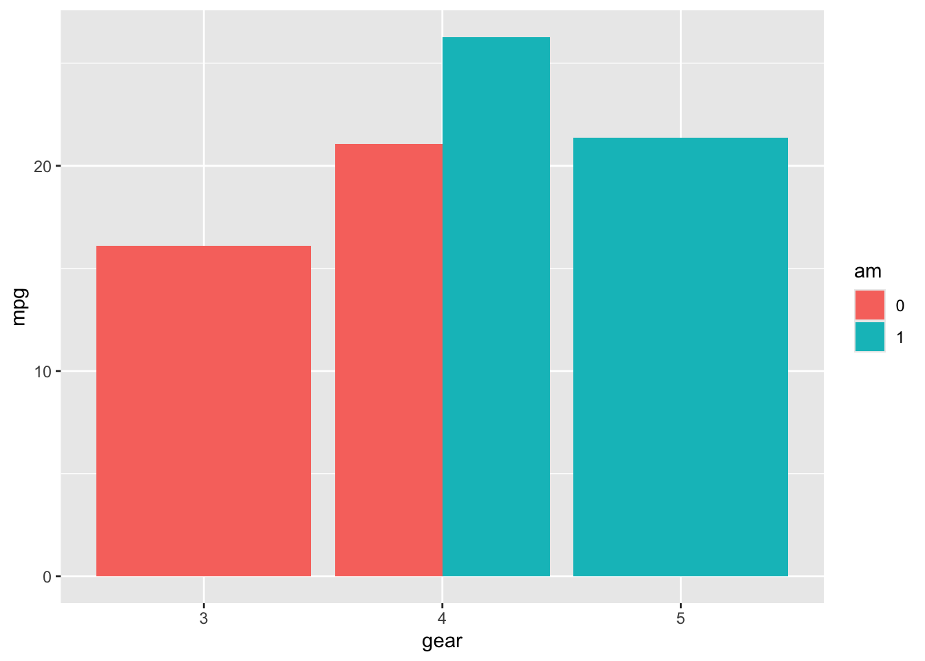
4.3 Geoms for univariate or descriptive plots
| Geom | What It Does |
|---|---|
| Univariate or descriptive plots | |
geom_bar() |
To plot a bar graph/histogram for a single categorical variable |
geom_freqpoly() |
To plot frequencies by class of a variable |
geom_histogram() |
To plot distribution/frequencies of single continuous variable |
geom_density() |
To plot distribution of single or various continuous variables |
geom_violin() |
To plot distributions. Similar to a density plot, but on both sides. Useful for comparing distributions among factors |
geom_qq() |
To plot residuals with a QQ plot |
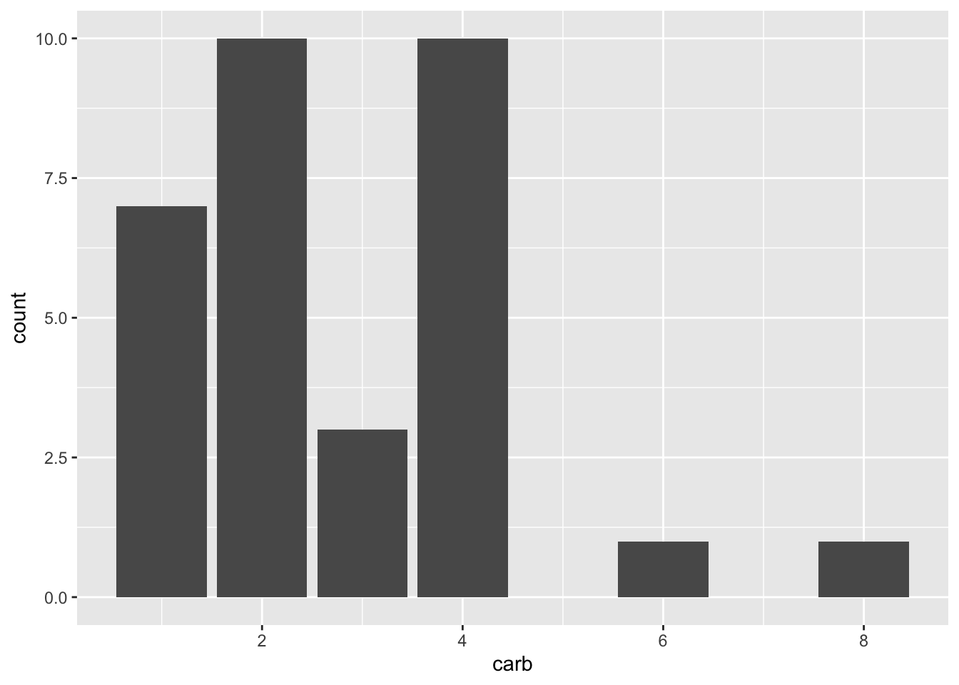
geom_bar() plots the count of a single factor variable, whereas geom_histogram() plots the count of a single continuous (i.e. numeric) variable.
## `stat_bin()` using `bins = 30`. Pick better value `binwidth`.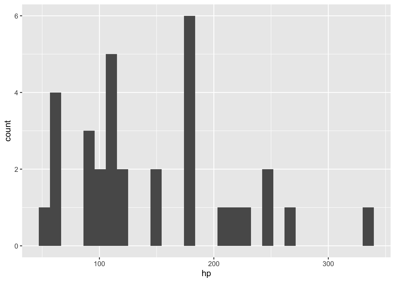
Practice
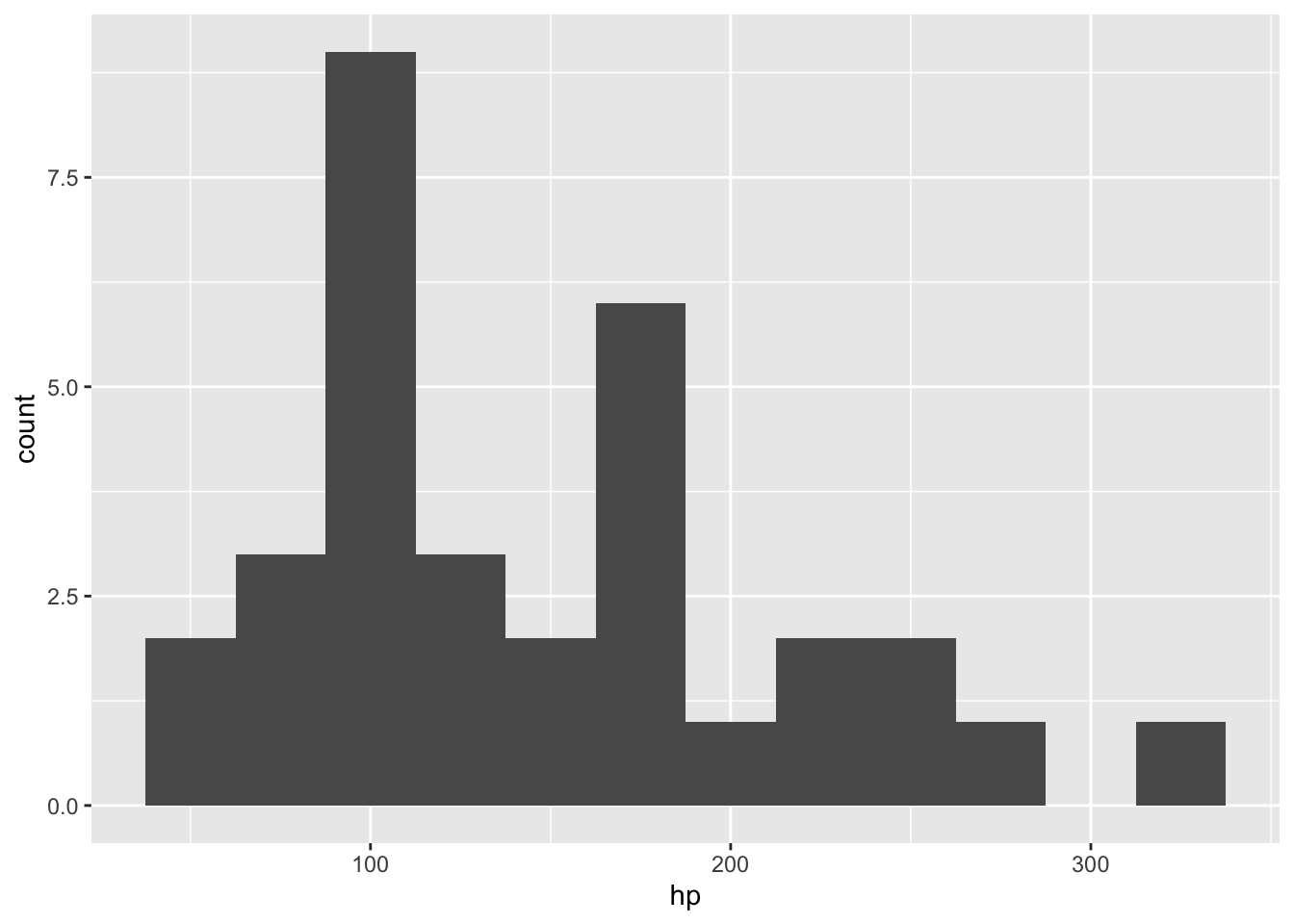
Note the warning message: “stat_bin() using bins = 30. Pick better value binwidth.” Redo the plot using different values for binwidth = , inside the geom_histogram() call.
Here are some other geoms for descriptive plots:
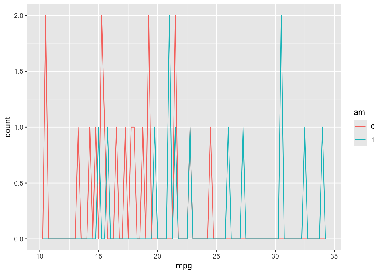
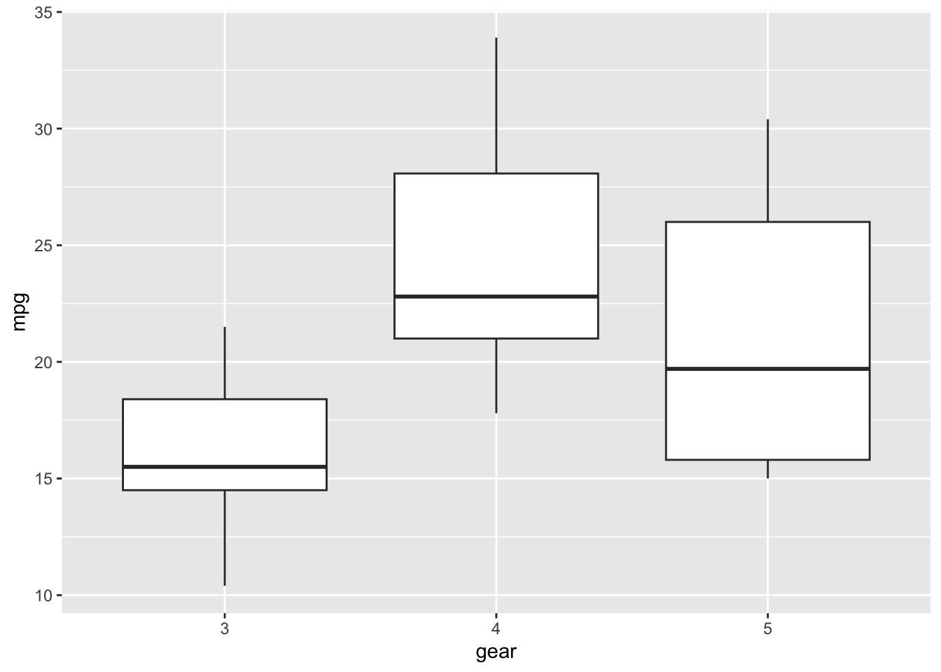
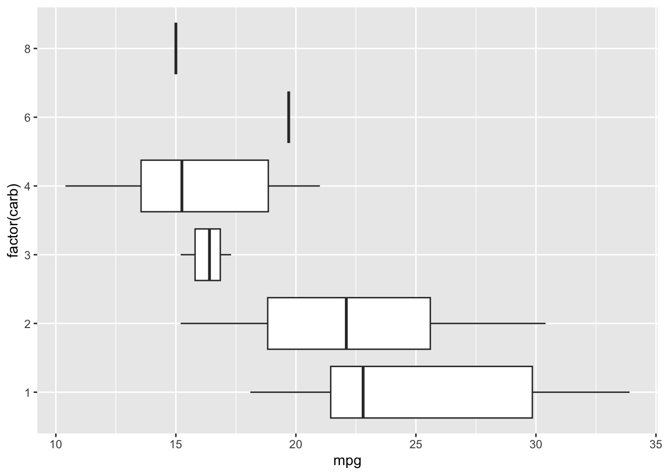
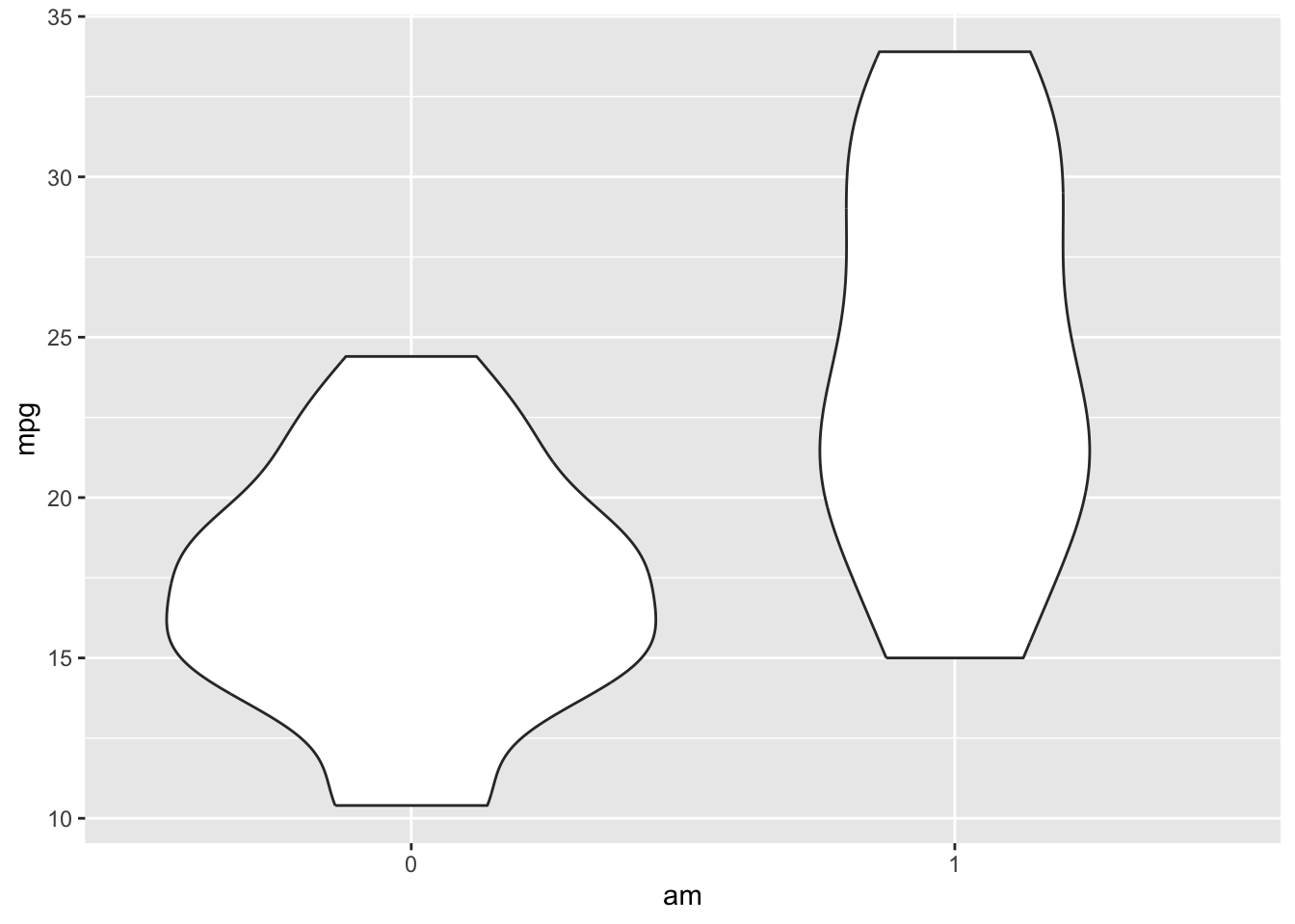
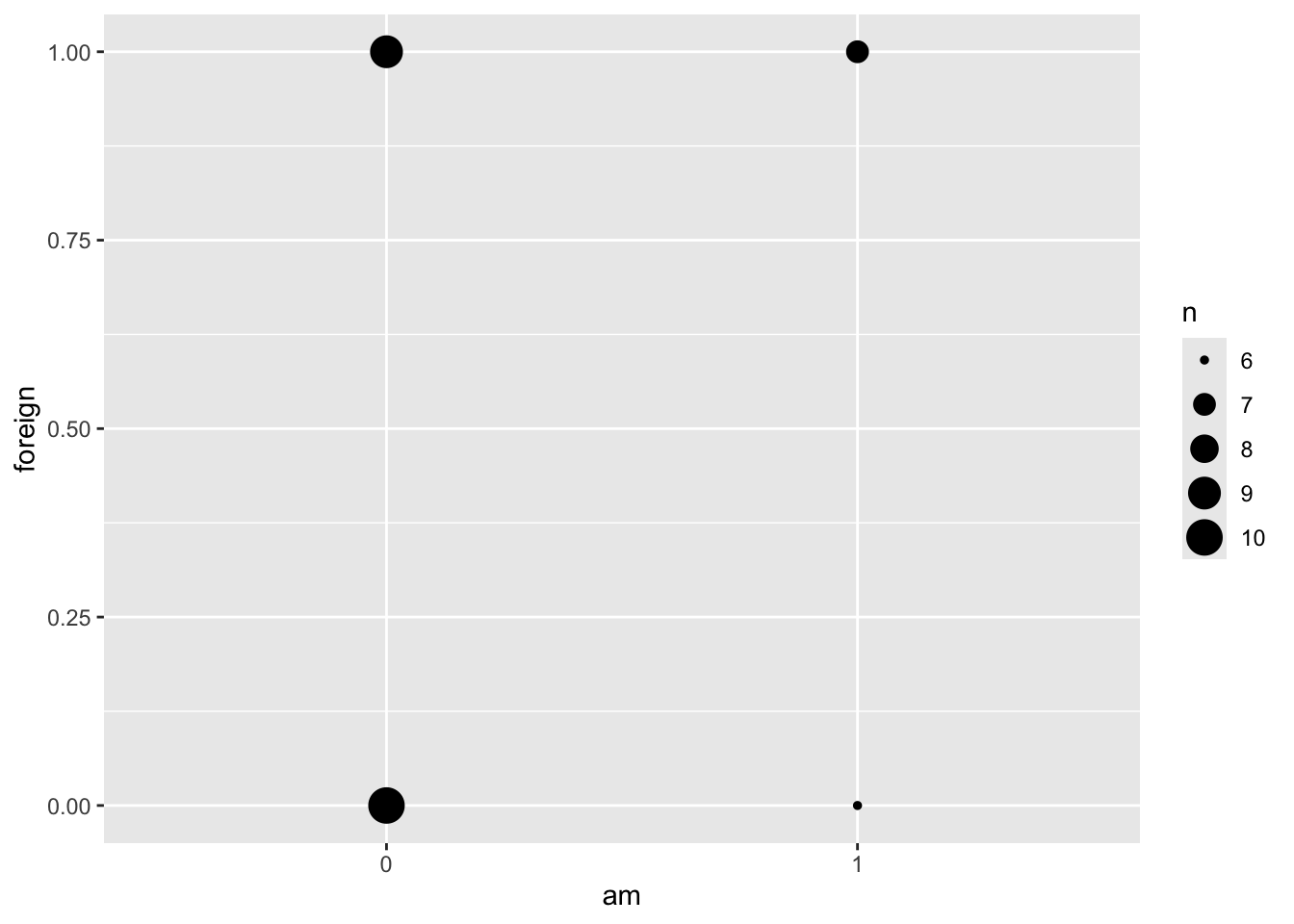
# you can rewrite this plot more concisely:
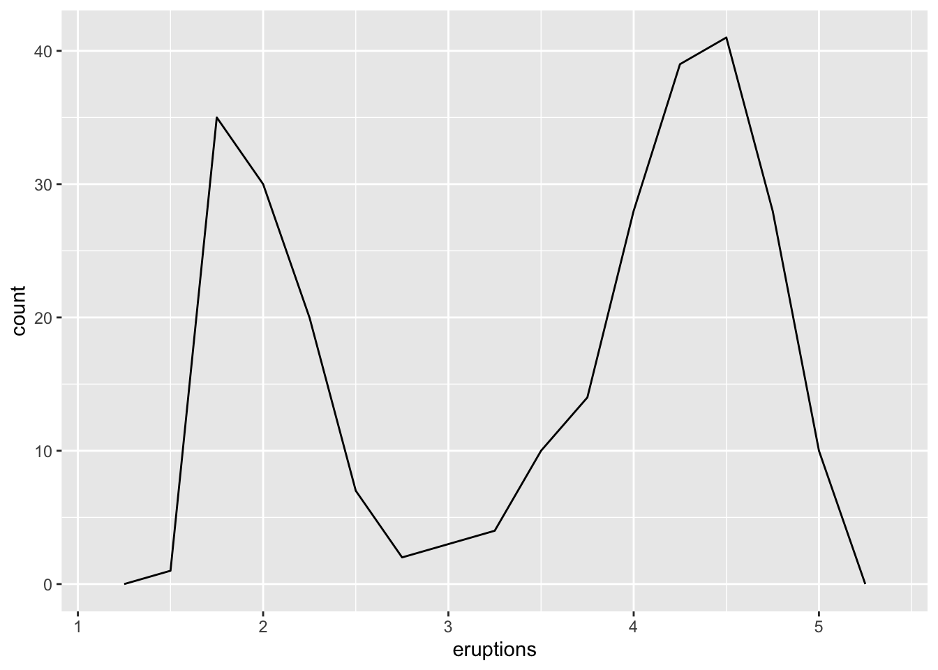
# faithful dataframe holds the eruption times in minutes for the Old Faithful geiser in Yellowstone National Park
ggplot(data = faithful, aes(x = eruptions)) +
  geom_freqpoly(binwidth = 0.25)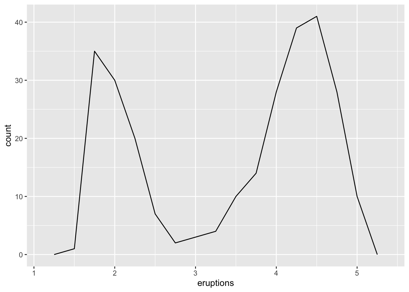
4.4 Common aesthetics
| Aesthetic | What It Does |
|---|---|
color = |
Separates groups by color of the observations. On bars, colors the border |
shape = |
Separates groups by shape of the observations. Does not apply to geom_smooth() |
size = |
Separates groups by size of the observations |
alpha = |
In datasets with many overlapping data points, makes less overlapping observations more transparent and more overlapping observations more solid, in order to see where your data clusters most heavily |
linetype = |
Separates groups with different line types: solid, dotted, etc. |
fill = |
For bars, the color of the inside of the bar. Color would do the border |
Here are some common aesthetics you might try using. As you see below, if you apply aesthetics as global aesthetics in ggplot() they will apply to all layers. As we saw, changing features outside of aes(), though, (e.g. color), need to be specified in each layer.
## `geom_smooth()` using formula = 'y ~ x'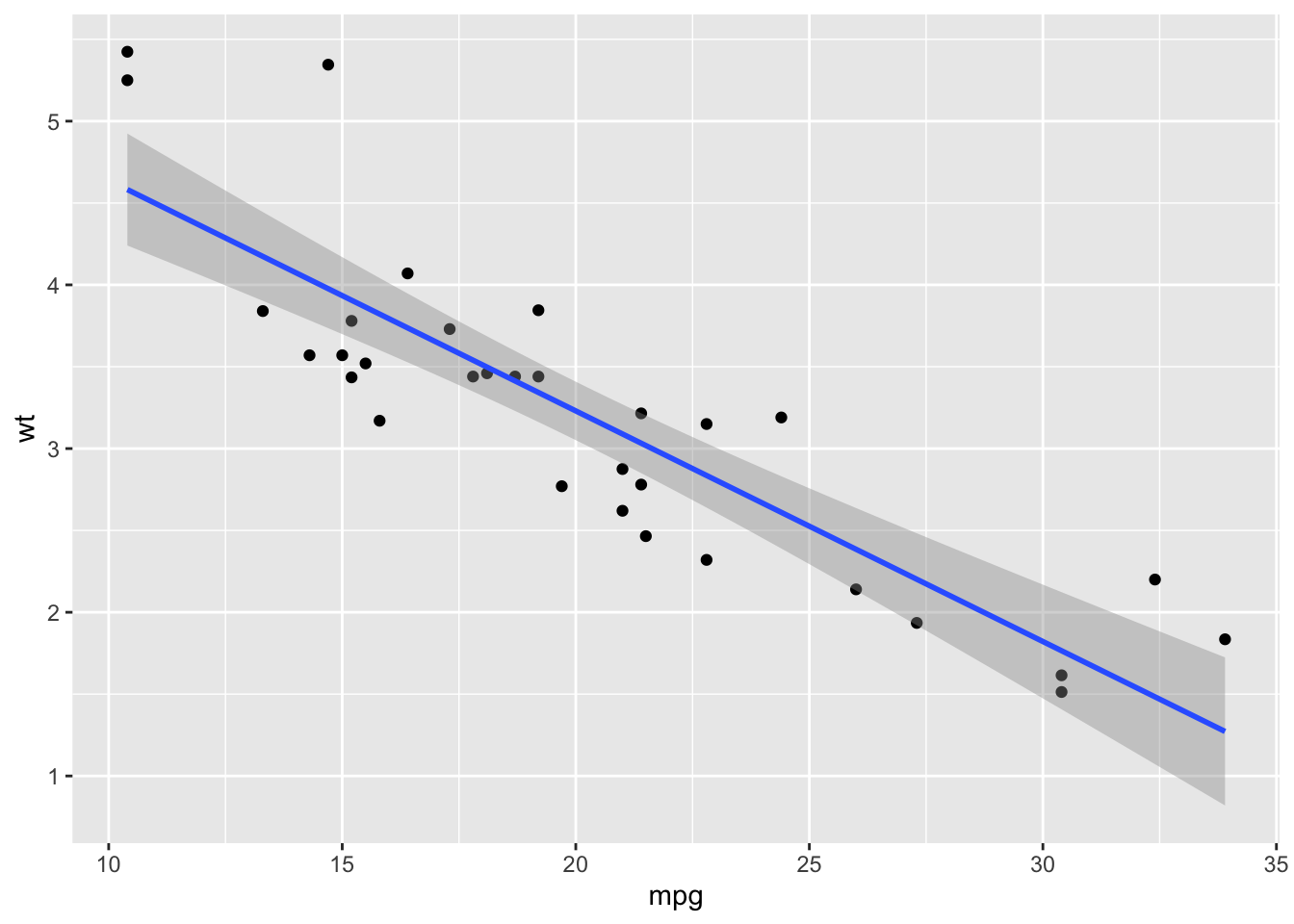
## `geom_smooth()` using formula = 'y ~ x'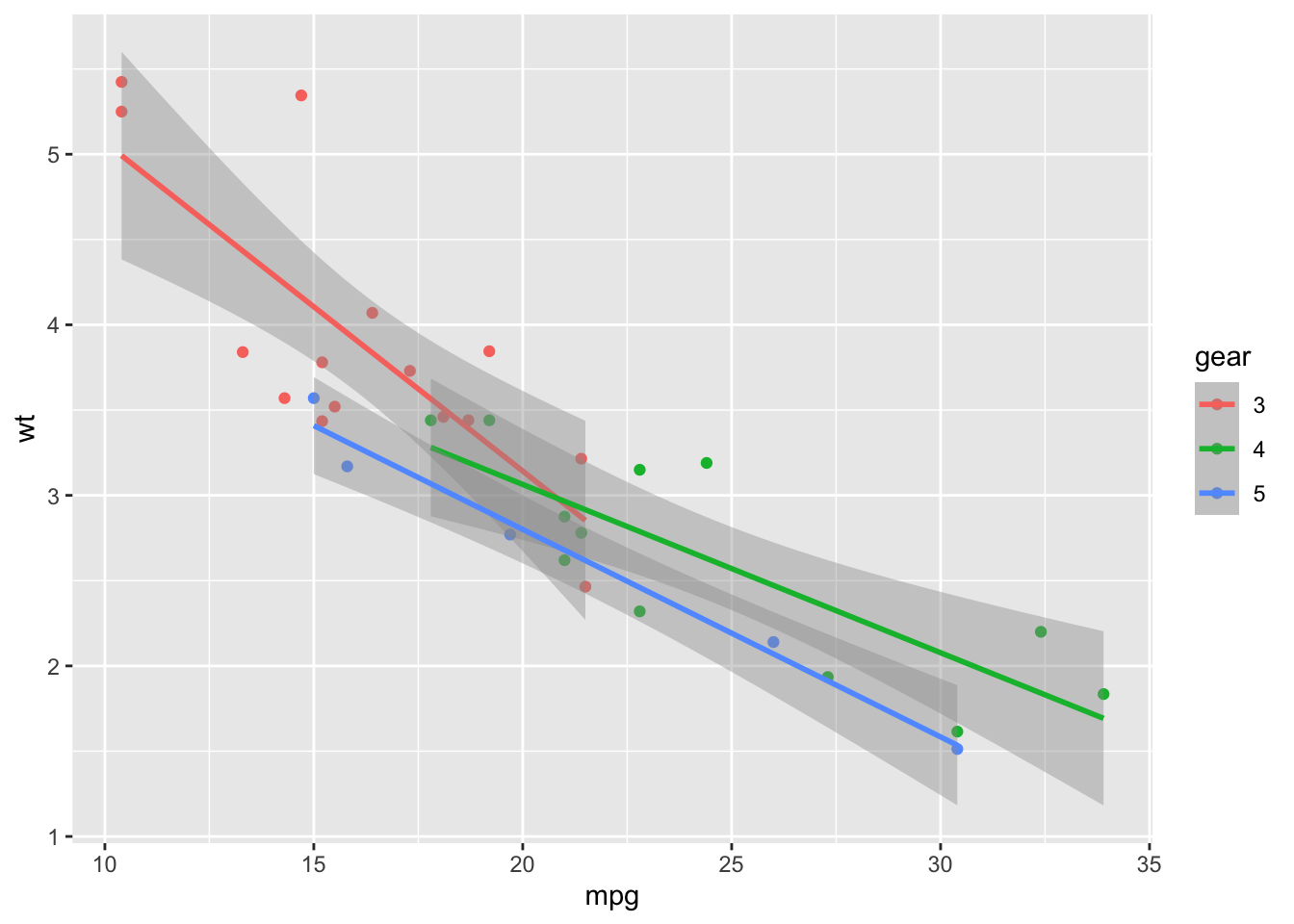
d %>%
  ggplot(aes(x = mpg, y = wt)) +
  geom_point(color = "red") +
  geom_smooth(method = "lm", color = "red")
## `geom_smooth()` using formula = 'y ~ x'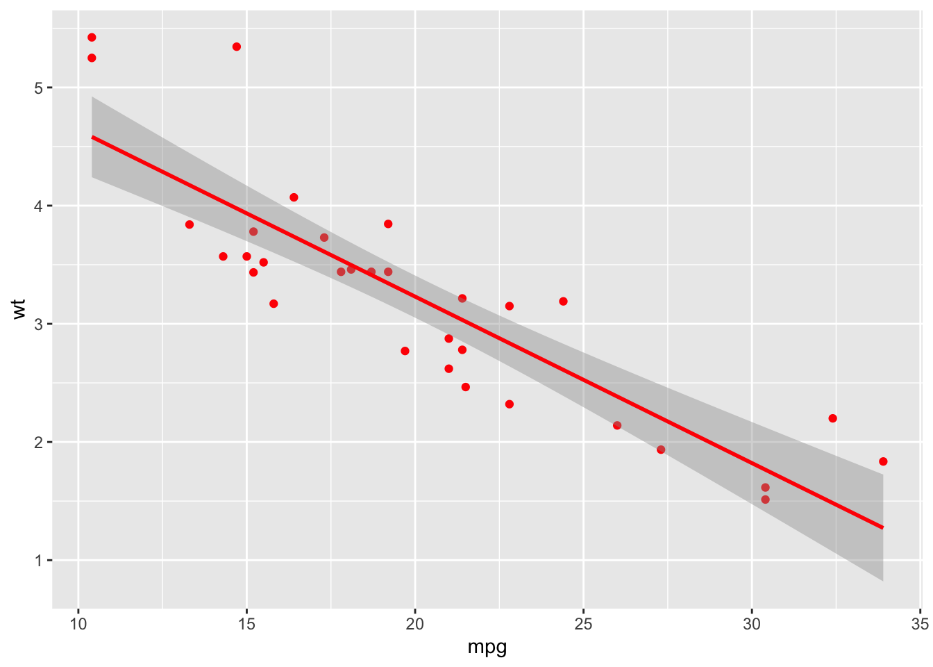
Also notice that not all aesthetics work for all types of geoms–“shape”, for example, doesn’t work with geom_smooth, so the global aesthetic shape = gear ignores that layer. You can, however, add another aesthetic that does apply to geom_smooth(), such as “linetype”.
## `geom_smooth()` using formula = 'y ~ x'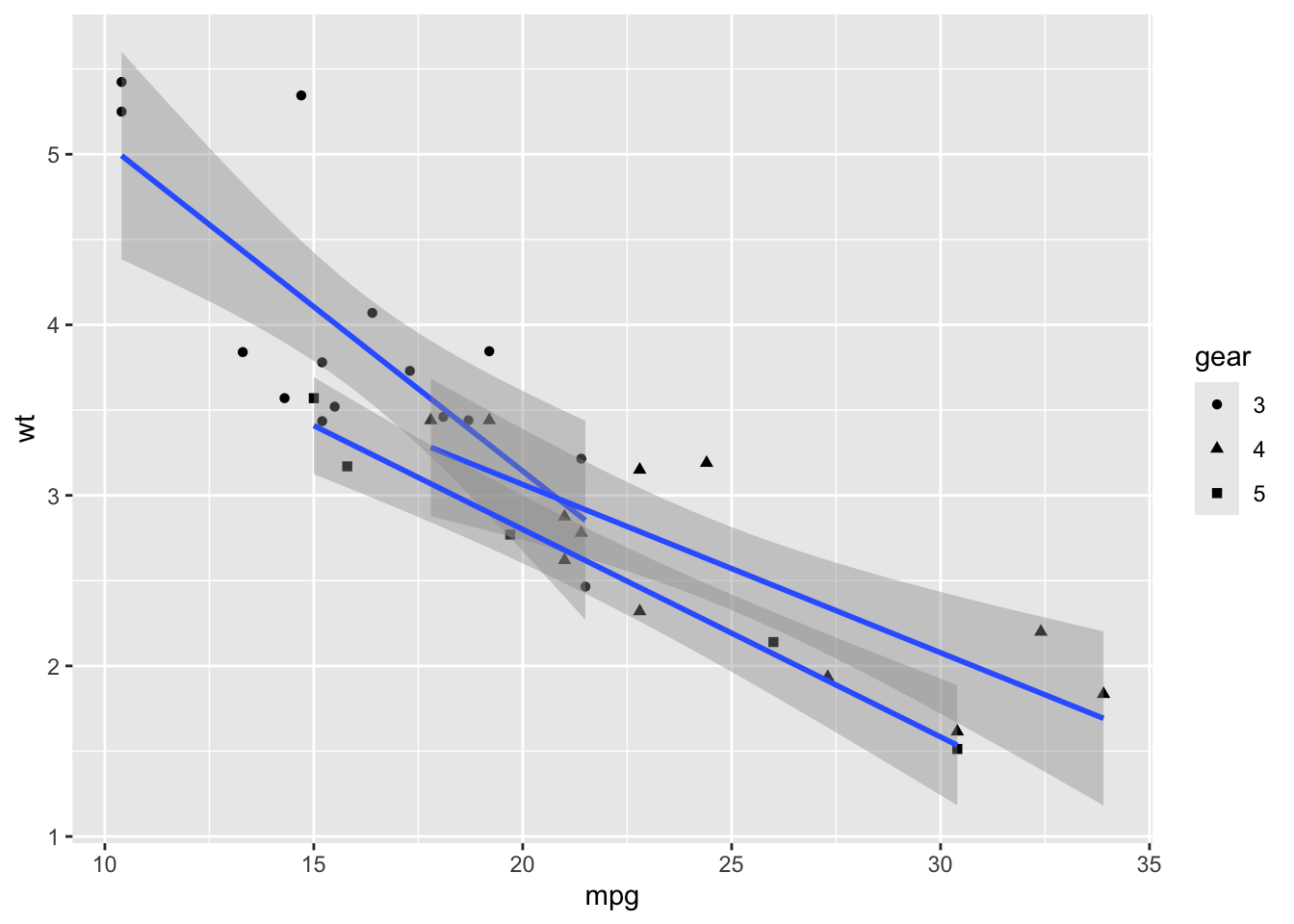
d %>%
  ggplot(aes(x = mpg, y = wt, shape = gear, linetype = gear)) +
  geom_point() +
  geom_smooth(method = "lm")
## `geom_smooth()` using formula = 'y ~ x'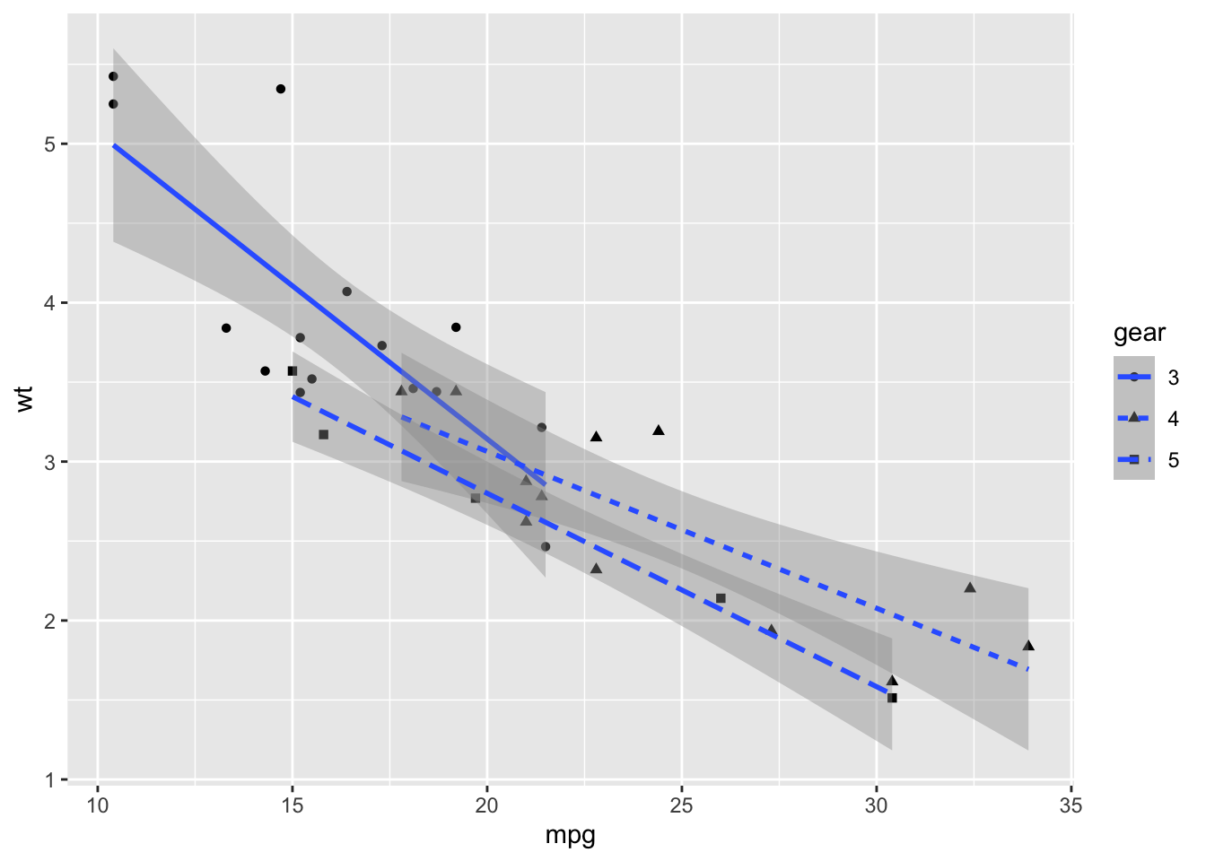
## `geom_smooth()` using formula = 'y ~ x'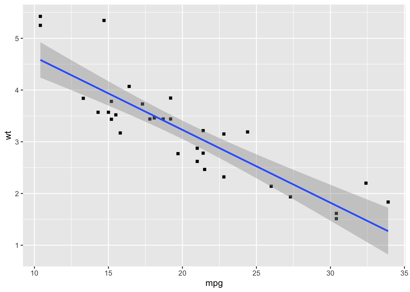
Practice
Build a scatterplot of horsepower (hp) and quarter-mile time (qsec). Set alpha to 0.5 so you can see where points overlap. Then color the points by number of cylinders (cyl), and try it again with factor(cyl). Why does the legend change?
Answer
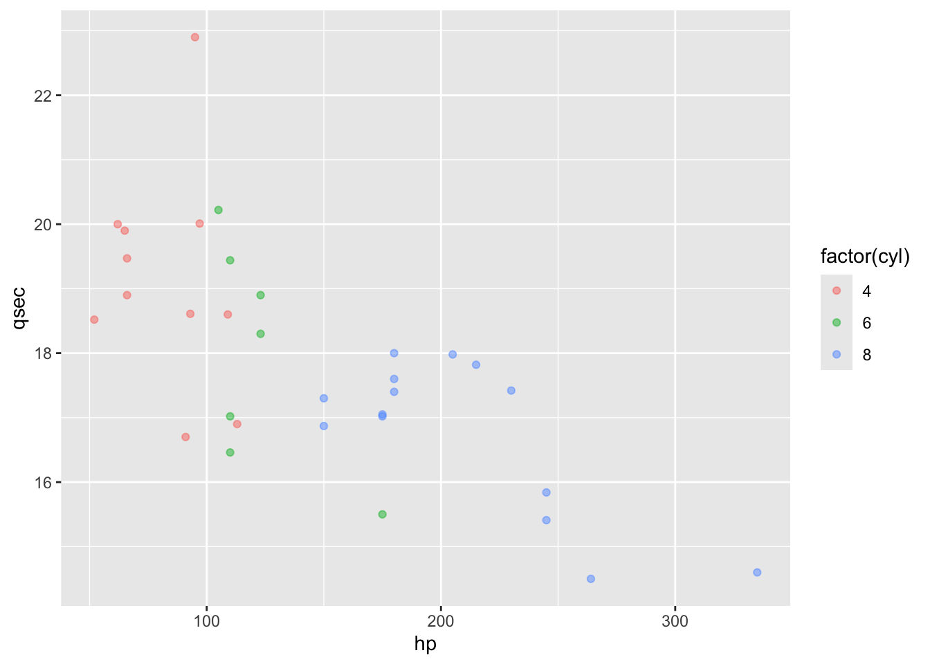
alpha sits outside aes() because we are fixing it to one value for every point, not
mapping it to a variable. cyl is stored as a number, so color = cyl gives you a
continuous color gradient; wrapping it in factor() makes it discrete, so each level gets
its own color and its own legend key.
4.5 Faceting
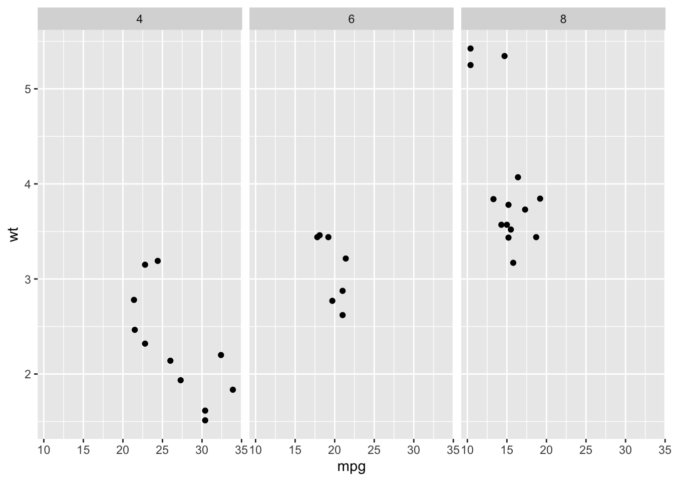
Sometimes, you want to break down a graph based on groups. When using colors or other graphical devices is not possible (they are already mapped to other variables) or the resulting graph would look too crowded, you can use faceting to repeat the graph subsetted by each level of the faceting variable.
#Makes three scatterplots, one for each gear category.
d %>%
ggplot() +
  geom_point(aes(x = mpg, y = wt)) +
  facet_wrap(~ gear, nrow = 1)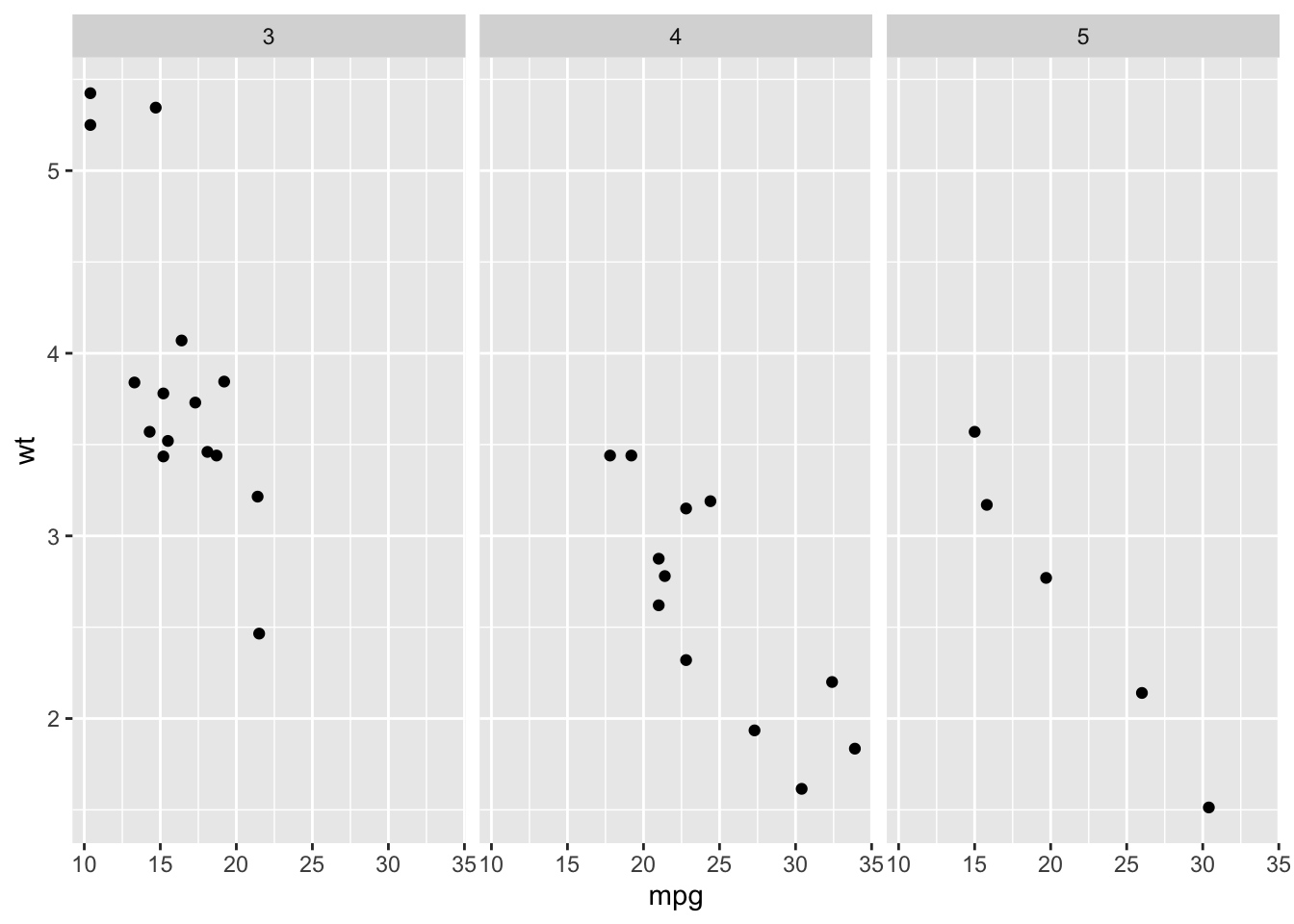
#Makes six scatterplots, resulting from all the possible combinations of am (2) and cyl (3).
d %>%
ggplot() +
  geom_point(aes(x = mpg, y = wt)) +
  facet_wrap(am ~ cyl)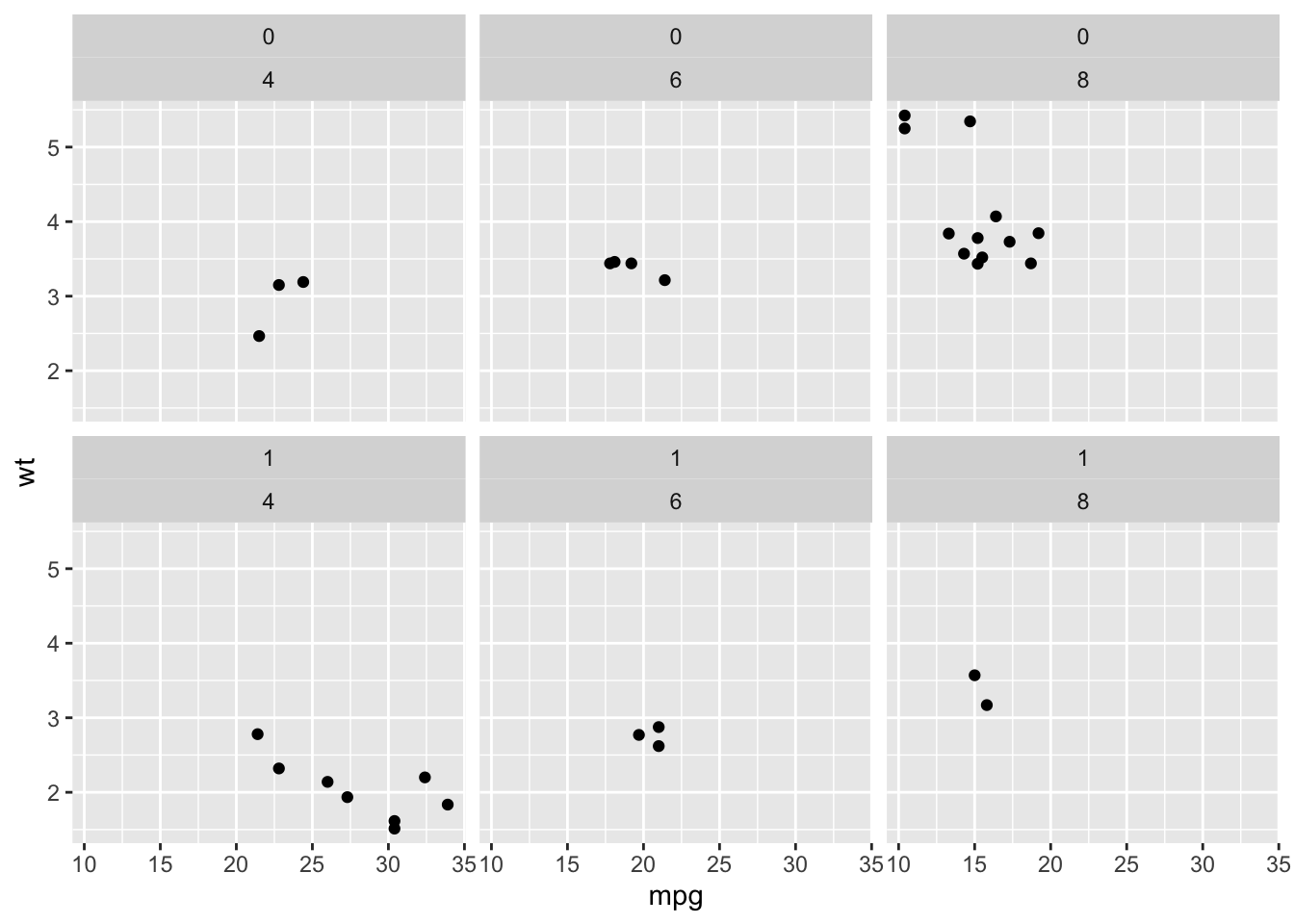
#facet_grid organizes the information better when using two variables for faceting.
d %>%
ggplot() +
  geom_point(aes(x = mpg, y = wt)) +
  facet_grid(am ~ cyl)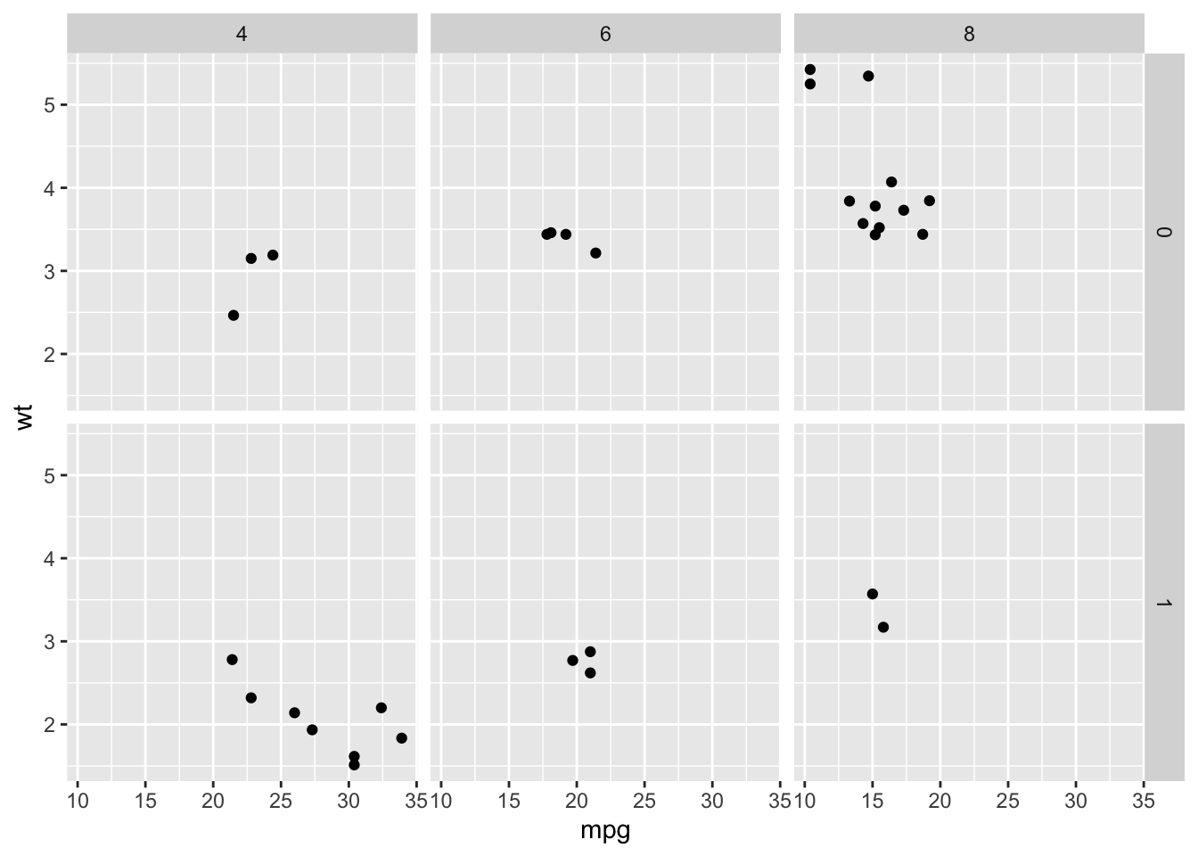
Practice
Take the scatterplot of mpg and wt and break it into one panel per cylinder count (cyl). Then facet by cyl and foreign together–first with facet_wrap(), then with facet_grid(). Which is easier to read, and why?
Answer
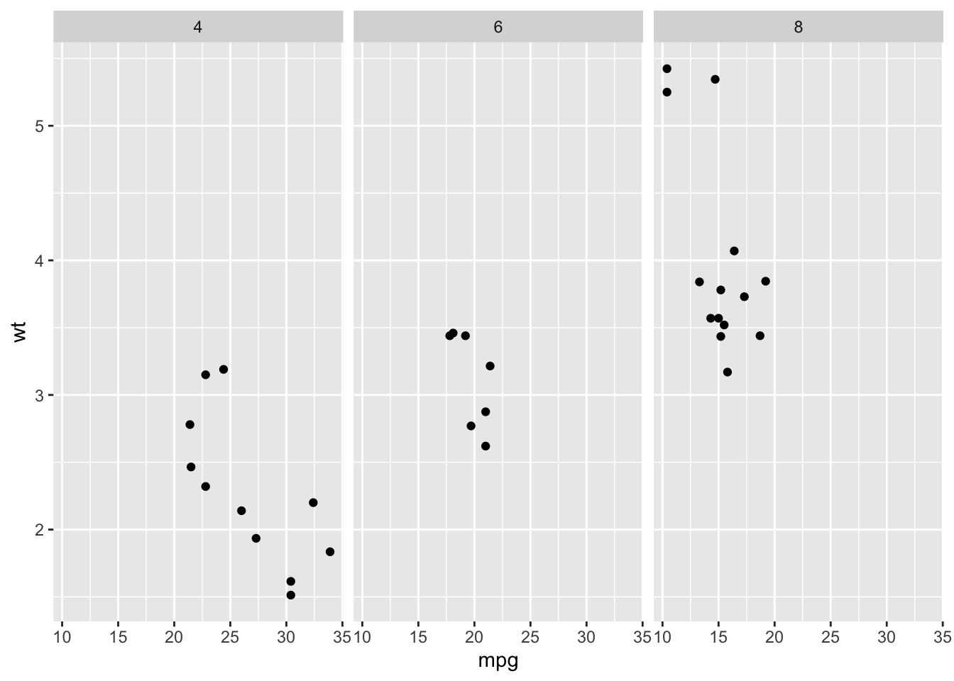
# two variables, wrapped
d %>%
ggplot() +
  geom_point(aes(x = mpg, y = wt)) +
  facet_wrap(cyl ~ foreign)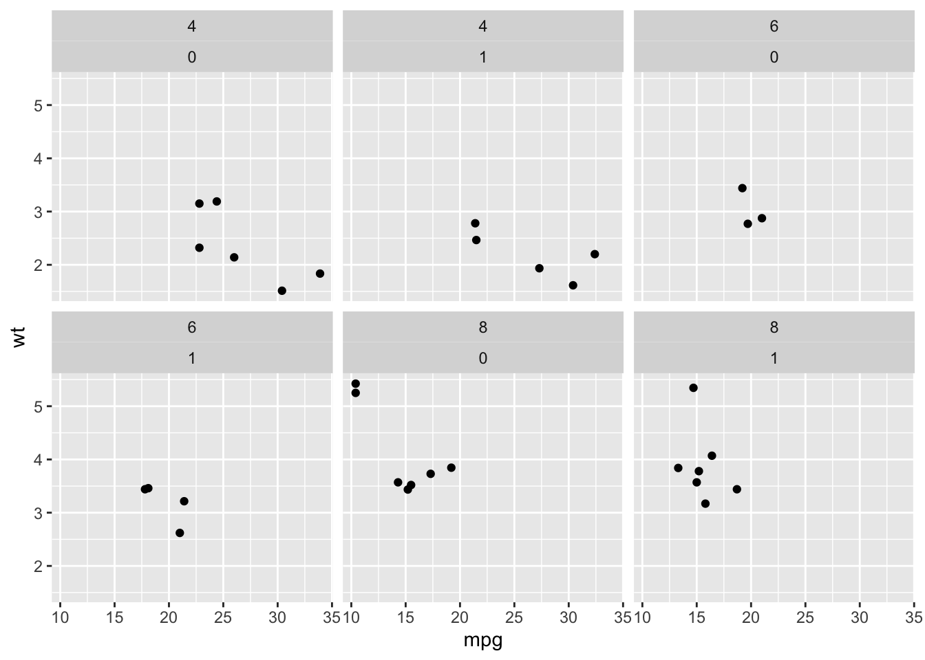
# two variables, gridded
d %>%
ggplot() +
  geom_point(aes(x = mpg, y = wt)) +
  facet_grid(cyl ~ foreign)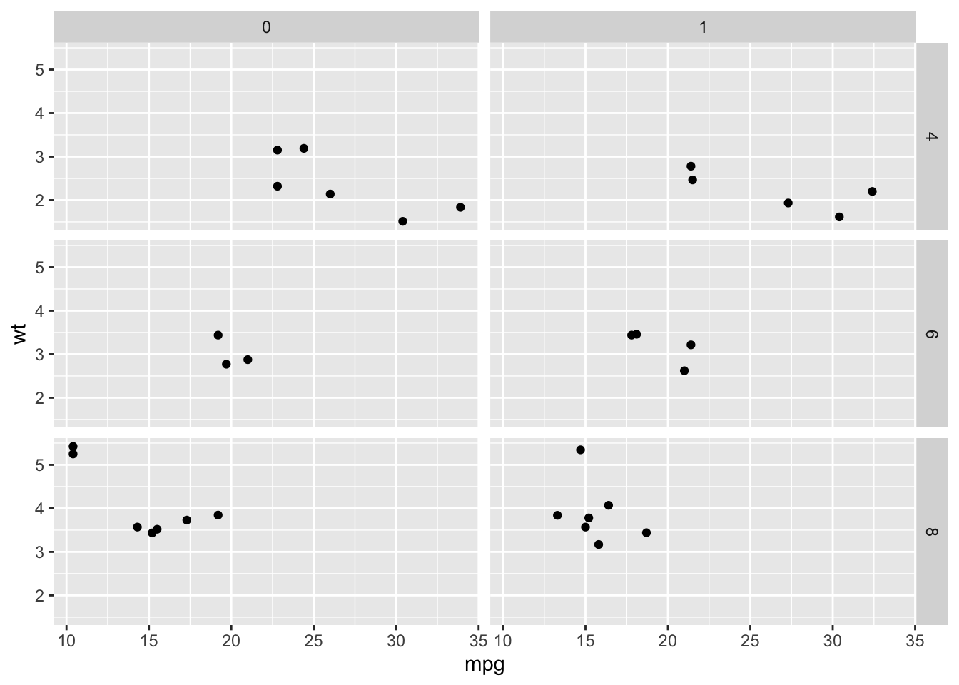
facet_grid() is usually easier to read with two variables: it puts one variable down the
rows and the other across the columns, so every panel shares an axis with its neighbors.
facet_wrap() just lays the combinations out in a line and wraps them, so you have to read
each panel’s label to know where you are.
4.6 Manipulating your axes and scaling
Sometimes, you will want to manipulate the way your graphs look. You might want to flip the graph 90 degrees to make stuff look better, or use a transformation in the axis to show your data. Here’s how
4.6.1 Coordinate Systems
For flipping the axes you can use coord_flip. This is particularly useful when you have a lot of text on the variables in the x axis. See the following example.
mtcars %>% #Cars Dataframe
  rownames_to_column("Name") %>%  #Makes the name of the car a variable
  sample_frac(.50) %>%  # Keeps only 50% of randomly selected cases (just to plot less cars)
  ggplot(aes(Name,mpg))+
  geom_col()+
  coord_flip()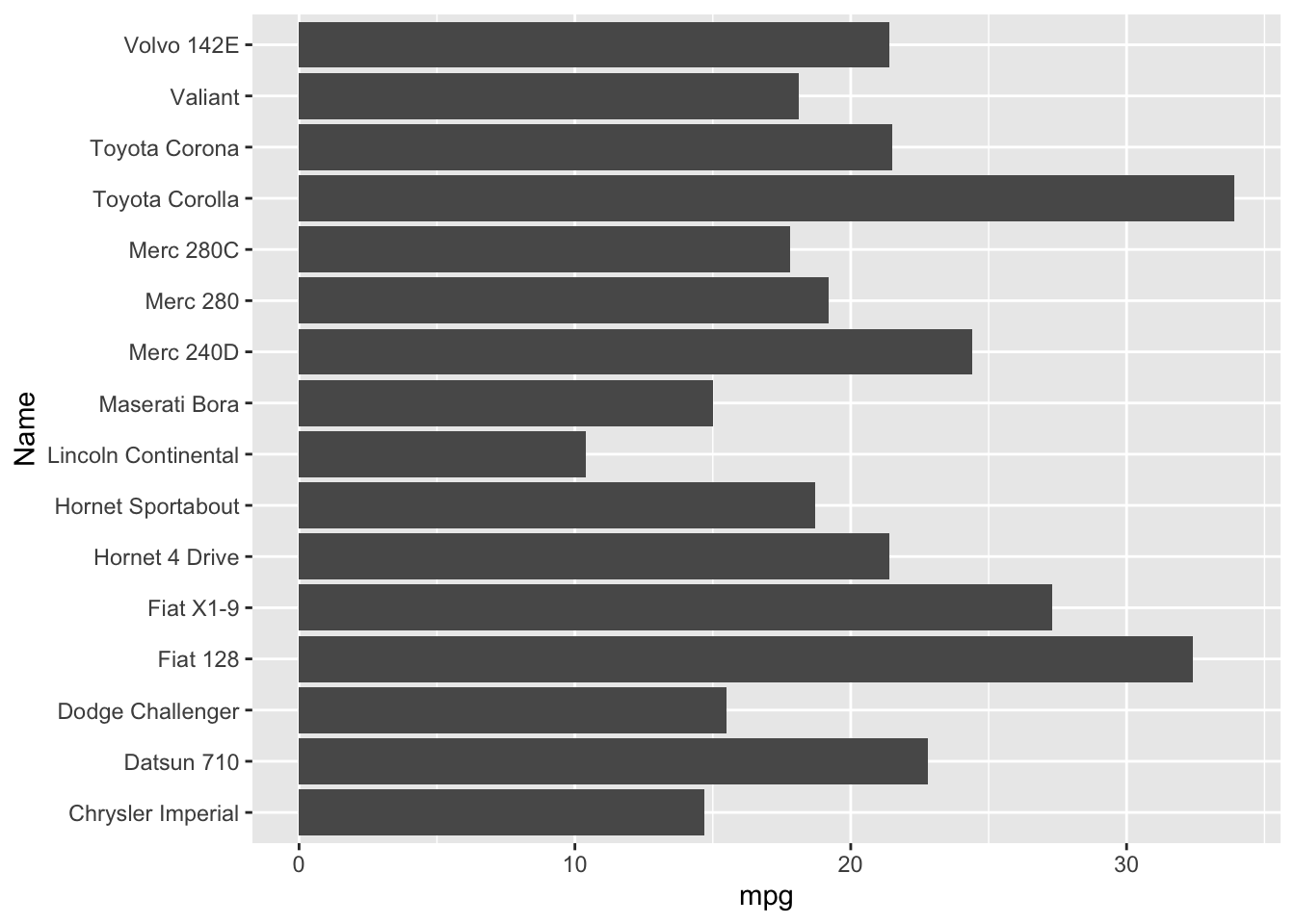
Now take out the coord_flip() argument and see what happens.
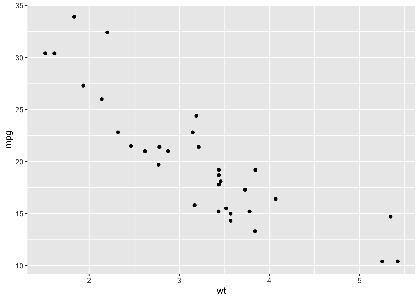
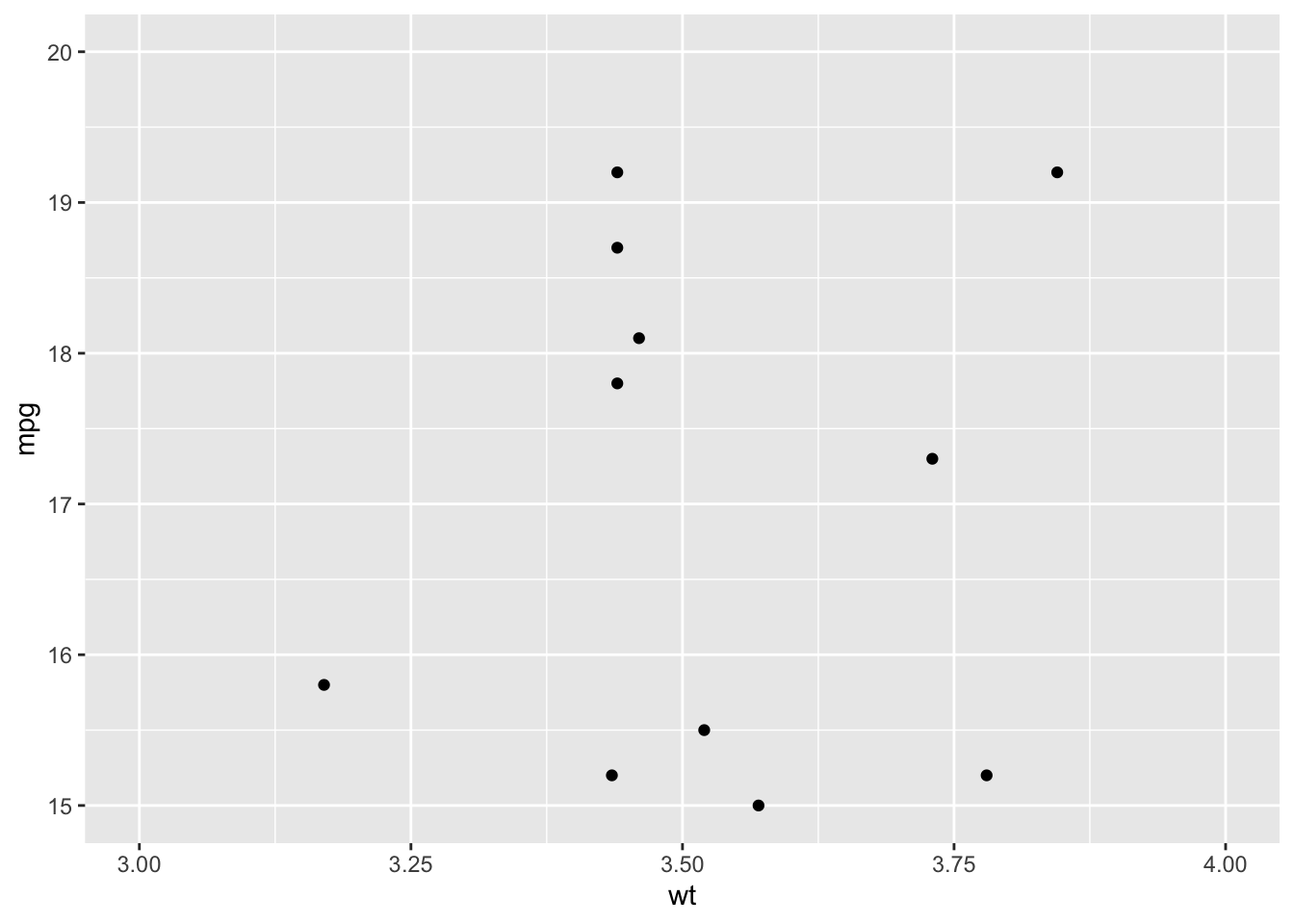
What if you want to zoom in a plot. Inside the coord_cartesian function, you can use the xlim and ylim arguments to specify what ranges of data you want to show. Here is an example.
Say, now that you are plotting a variable that isn’t linear. A great example for this is the spread of the coronavirus, especially during its first stages. Here is how the plot would look like by default.
# US COVID-19 case counts for 2020, from Our World in Data (CC-BY).
# Full global dataset: https://github.com/owid/covid-19-data
Corona <- read.csv("covid_us_2020.csv")

# read.csv reads the dates in as plain text, so we tell R they are dates
Corona$date <- as.Date(Corona$date)

Corona %>%
  filter(date < as.Date("2020-05-13")) %>%
  filter(total_cases > 0) %>%   # log of zero is undefined, so start once cases appear
  ggplot(aes(date, total_cases)) +
  geom_line()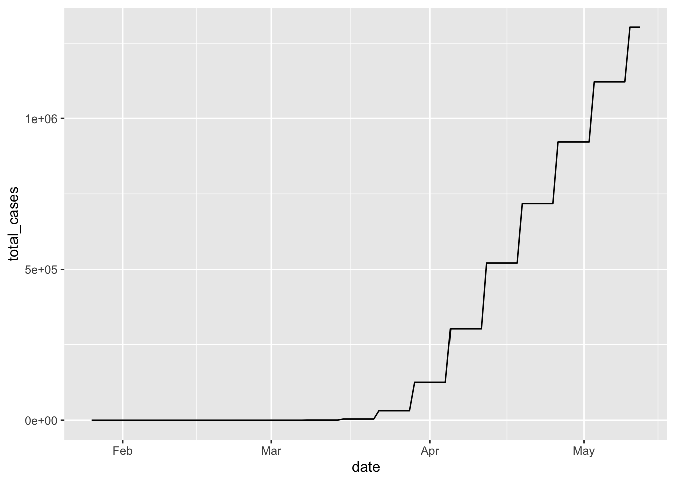
Now let’s add scale_y_log10, and see how that improves the plot.
Corona %>%
  filter(date < as.Date("2020-05-13")) %>%
  filter(total_cases > 0) %>%
  ggplot(aes(date, total_cases)) +
  geom_line() +
  scale_y_log10()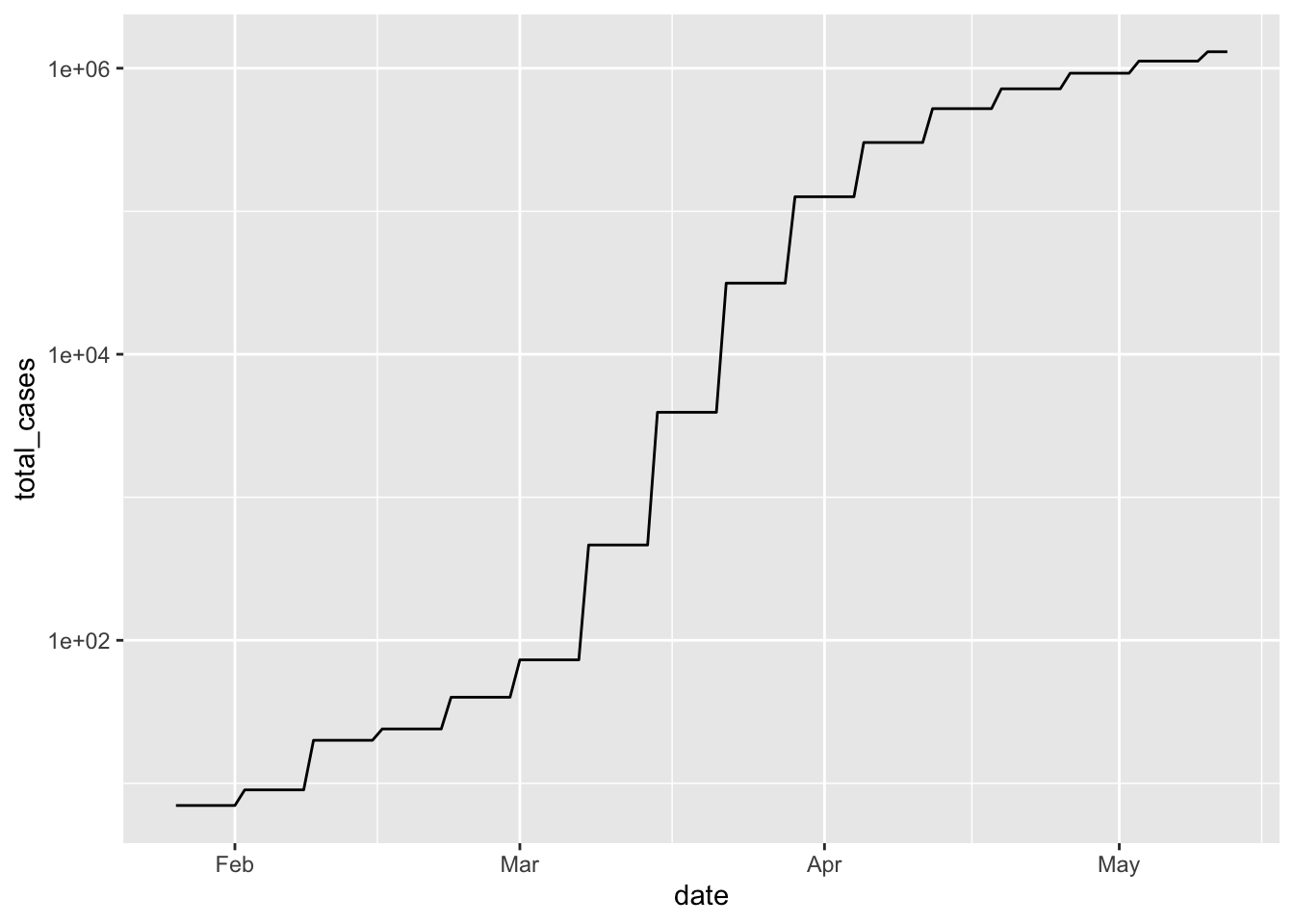
4.7 Non-data aspects of your ggplot
Now let’s return to our first graph looking at mpg and wt. ggplot makes it easy to make these graphs look really nice and professional. What can we do to prep them to present to others?
## `geom_smooth()` using method = 'loess' and formula = 'y ~ x'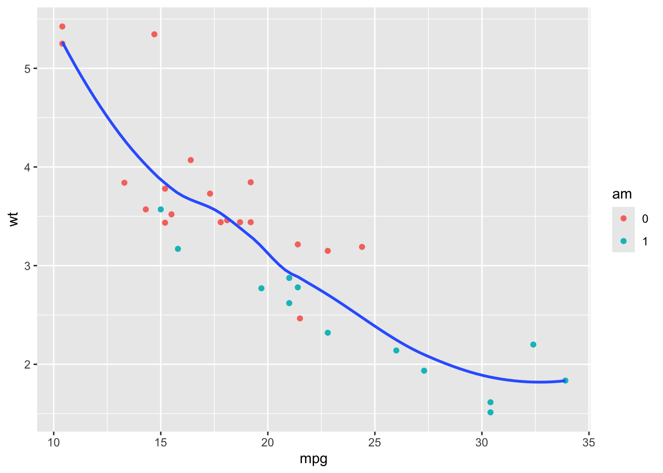
There are a few different ways to change the descriptive text on your ggplots, but one easy way is using labs() (short for “labels”). For example, we can add a title:
d %>%
ggplot(aes(mpg, wt)) +
  geom_point(aes(color = am)) +
geom_smooth(se = FALSE) +
labs(
title = "Automatic cars tend to be heavier than manual cars"
)## `geom_smooth()` using method = 'loess' and formula = 'y ~ x'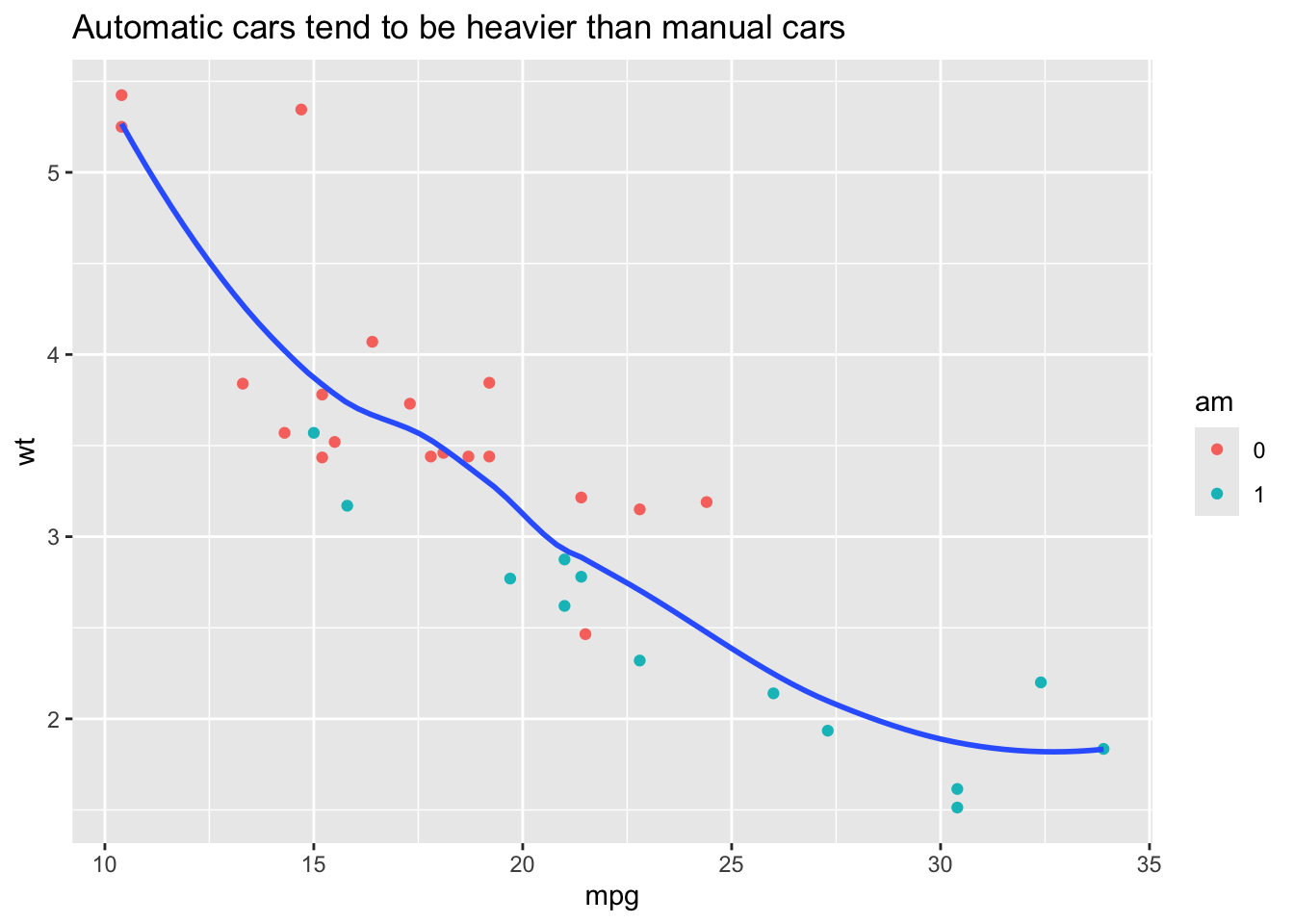
We can add a subtitle:
d %>%
ggplot(aes(mpg, wt)) +
  geom_point(aes(color = am)) +
  geom_smooth(se = FALSE) +
  labs(
    title = "Automatic cars tend to be heavier than manual cars",
    subtitle = "Car weight and transmission type significantly affect mpg"
  )
## `geom_smooth()` using method = 'loess' and formula = 'y ~ x'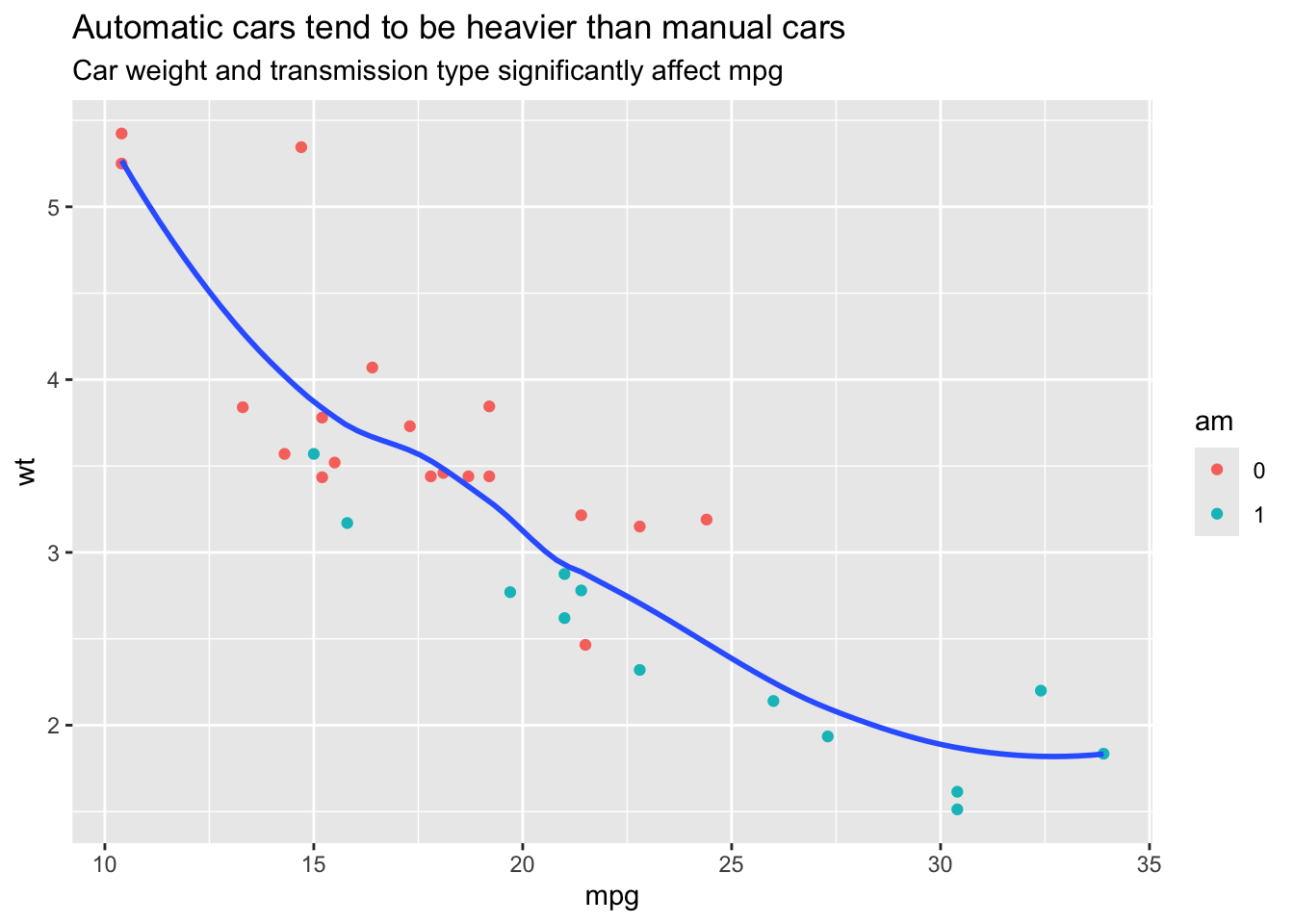
We can even add a caption for reference information (can you find it?):
d %>%
ggplot(aes(mpg, wt)) +
  geom_point(aes(color = am)) +
  geom_smooth(se = FALSE) +
  labs(
    title = "Automatic cars tend to be heavier than manual cars",
    subtitle = "Car weight and transmission type significantly affect mpg",
    caption = "Data from fueleconomy.gov"
  )
## `geom_smooth()` using method = 'loess' and formula = 'y ~ x'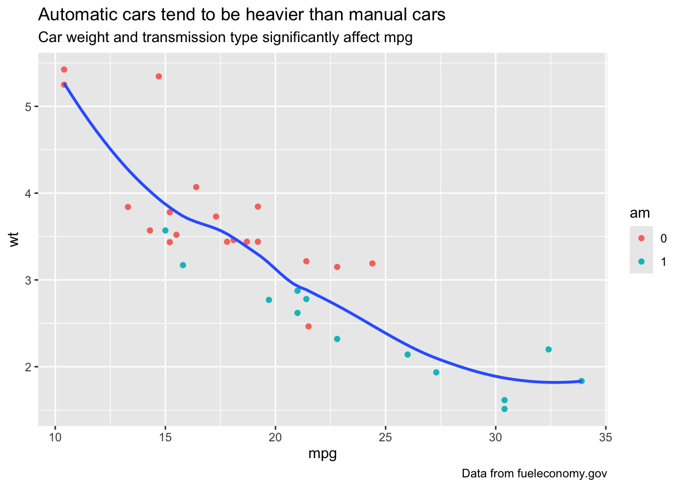
Of course, as would be true for any good graph, we can add labels for the x and y axes:
d %>%
ggplot(aes(mpg, wt)) +
  geom_point(aes(color = am)) +
  geom_smooth(se = FALSE) +
  labs(
    title = "Automatic cars tend to be heavier than manual cars",
    subtitle = "Car weight and transmission type significantly affect mpg",
    caption = "Data from fueleconomy.gov",
    x = "Average Gas Mileage (mpg)",
    y = "Car Weight (in 1000s of pounds)"
  )
## `geom_smooth()` using method = 'loess' and formula = 'y ~ x'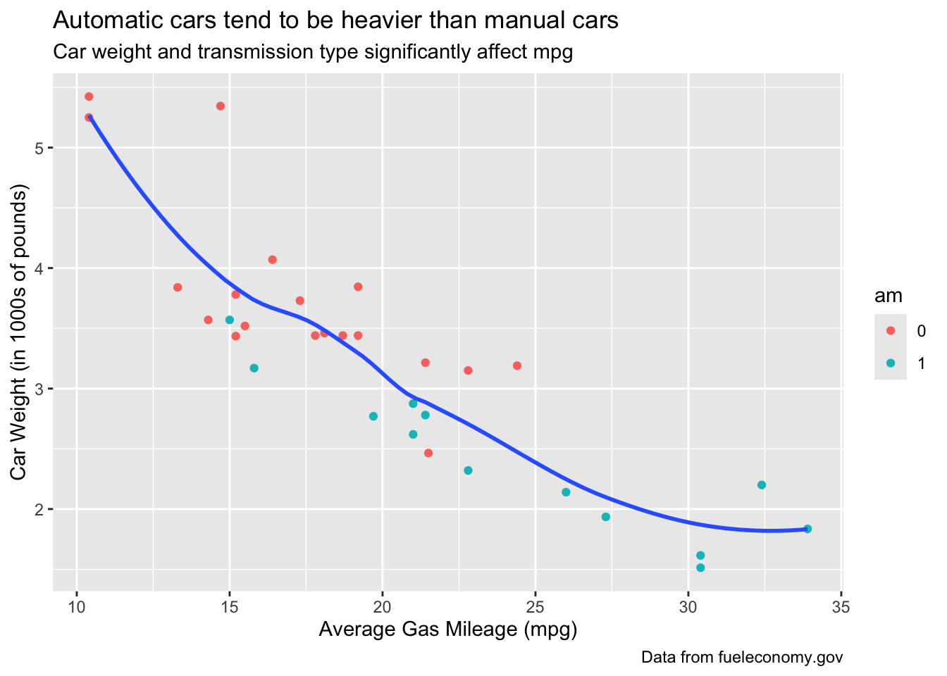
We can also change the label for legend representing the “z” variable–that is, the factor variable that divides the data into two groups.
d %>%
ggplot(aes(mpg, wt)) +
  geom_point(aes(color = am)) +
  geom_smooth(se = FALSE) +
  labs(
    title = "Automatic cars tend to be heavier than manual cars",
    subtitle = "Car weight and transmission type significantly affect mpg",
    caption = "Data from fueleconomy.gov",
    x = "Average Gas Mileage (mpg)",
    y = "Car Weight (in 1000s)",
    color = "Transmission Type"
  )
## `geom_smooth()` using method = 'loess' and formula = 'y ~ x'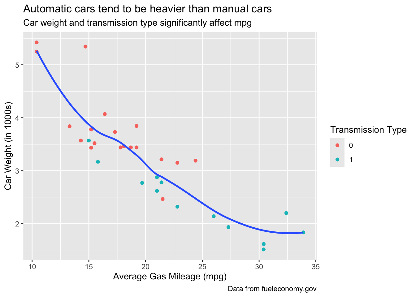
Along with the label for the legend, we can, with a little effort outside of ggplot, change the names for each of its constituent levels, as well:
d %<>% mutate(
  am = factor(am, labels = c("Automatic", "Manual"))
)

d %>%
ggplot(aes(mpg, wt)) +
  geom_point(aes(color = am)) +
  geom_smooth(se = FALSE) +
  labs(
    title = "Automatic cars tend to be heavier than manual cars",
    subtitle = "Car weight and transmission type significantly affect mpg",
    caption = "Data from fueleconomy.gov",
    x = "Average Gas Mileage (mpg)",
    y = "Car Weight (in 1000s)",
    color = "Transmission Type"
  )
## `geom_smooth()` using method = 'loess' and formula = 'y ~ x'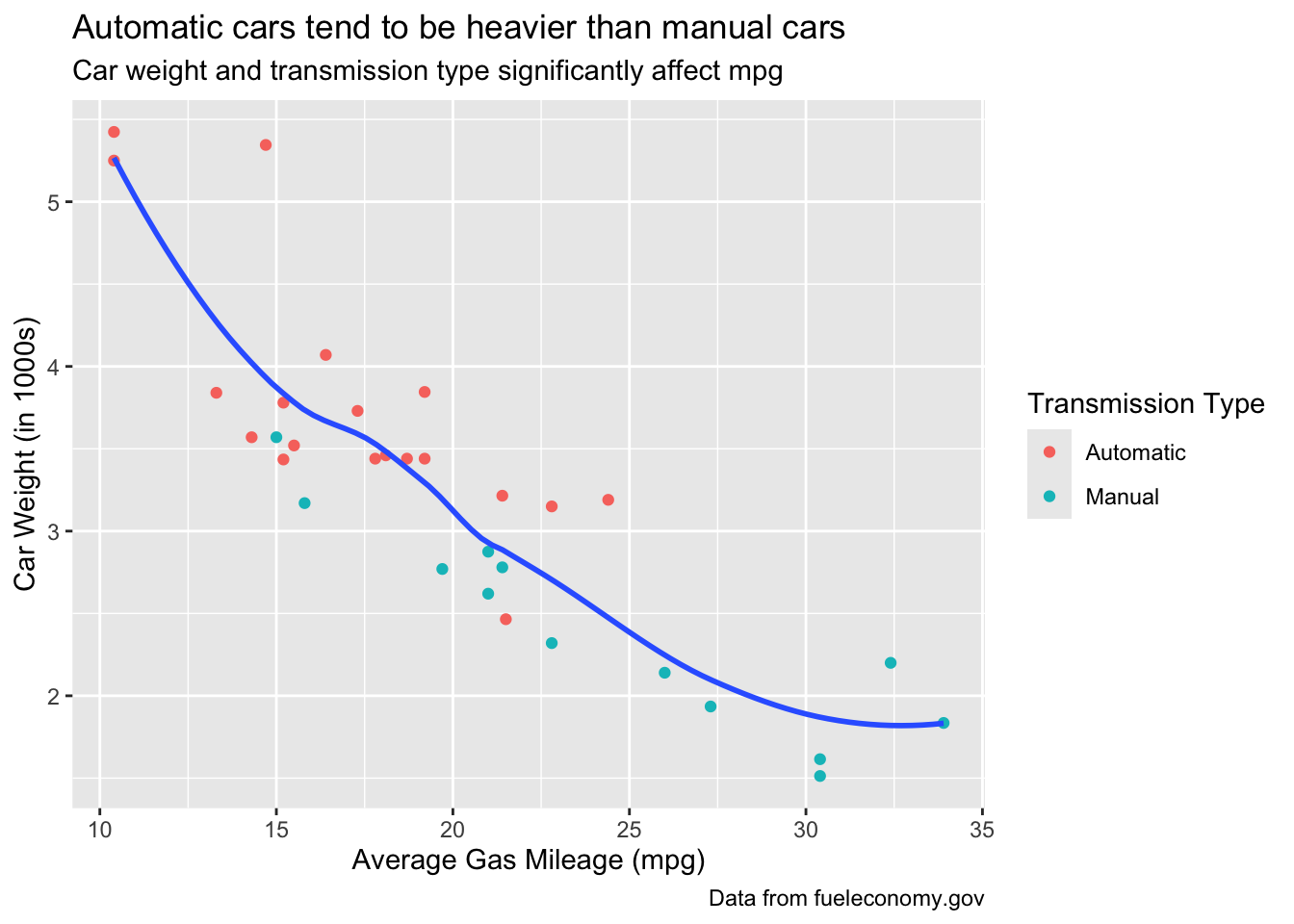
What if you want to change the position of the legend, or remove it completely? Easy! Just use the legend.position argument inside the theme function. Try legend.position = "none" and see what happens.
d %>%
ggplot(aes(mpg, wt)) +
  geom_point(aes(color = am)) +
  geom_smooth(se = FALSE) +
  labs(
    title = "Automatic cars tend to be heavier than manual cars",
    subtitle = "Car weight and transmission type significantly affect mpg",
    caption = "Data from fueleconomy.gov",
    x = "Average Gas Mileage (mpg)",
    y = "Car Weight (in 1000s)",
    color = "Transmission Type"
  )+
  theme(legend.position = "bottom")
## `geom_smooth()` using method = 'loess' and formula = 'y ~ x'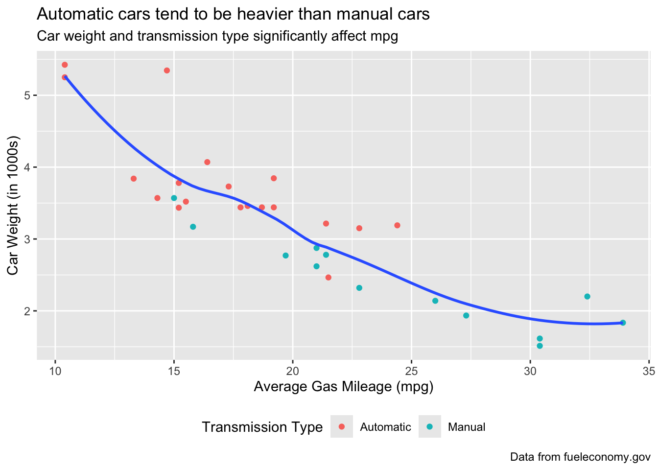
Besides the descriptive text, the other major aspect of a graph’s presentation is its background. ggplot2 has some preset themes that you can add to your graphs to change how they look. Check some of them out below.
theme() can also be used to tweak aspects of your graph’s theme manually.
d %>%
ggplot(aes(mpg, wt)) +
  geom_point(aes(color = am)) +
  geom_smooth(se = FALSE) +
  labs(
    title = "Automatic cars tend to be heavier than manual cars",
    subtitle = "Car weight and transmission type significantly affect mpg",
    caption = "Data from fueleconomy.gov",
    x = "Average Gas Mileage (mpg)",
    y = "Car Weight (in 1000s)",
    color = "Transmission Type"
  ) +
  theme_classic()
## `geom_smooth()` using method = 'loess' and formula = 'y ~ x'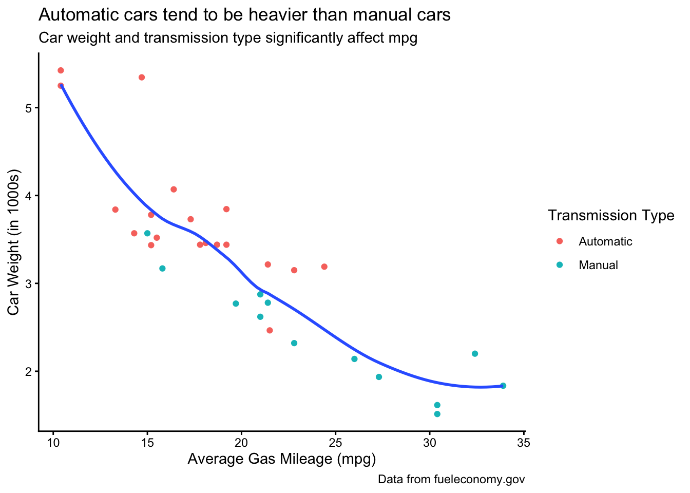
d %>%
ggplot(aes(mpg, wt)) +
  geom_point(aes(color = am)) +
  geom_smooth(se = FALSE) +
  labs(
    title = "Automatic cars tend to be heavier than manual cars",
    subtitle = "Car weight and transmission type significantly affect mpg",
    caption = "Data from fueleconomy.gov",
    x = "Average Gas Mileage (mpg)",
    y = "Car Weight (in 1000s)",
    color = "Transmission Type"
  ) +
  theme_minimal()
## `geom_smooth()` using method = 'loess' and formula = 'y ~ x'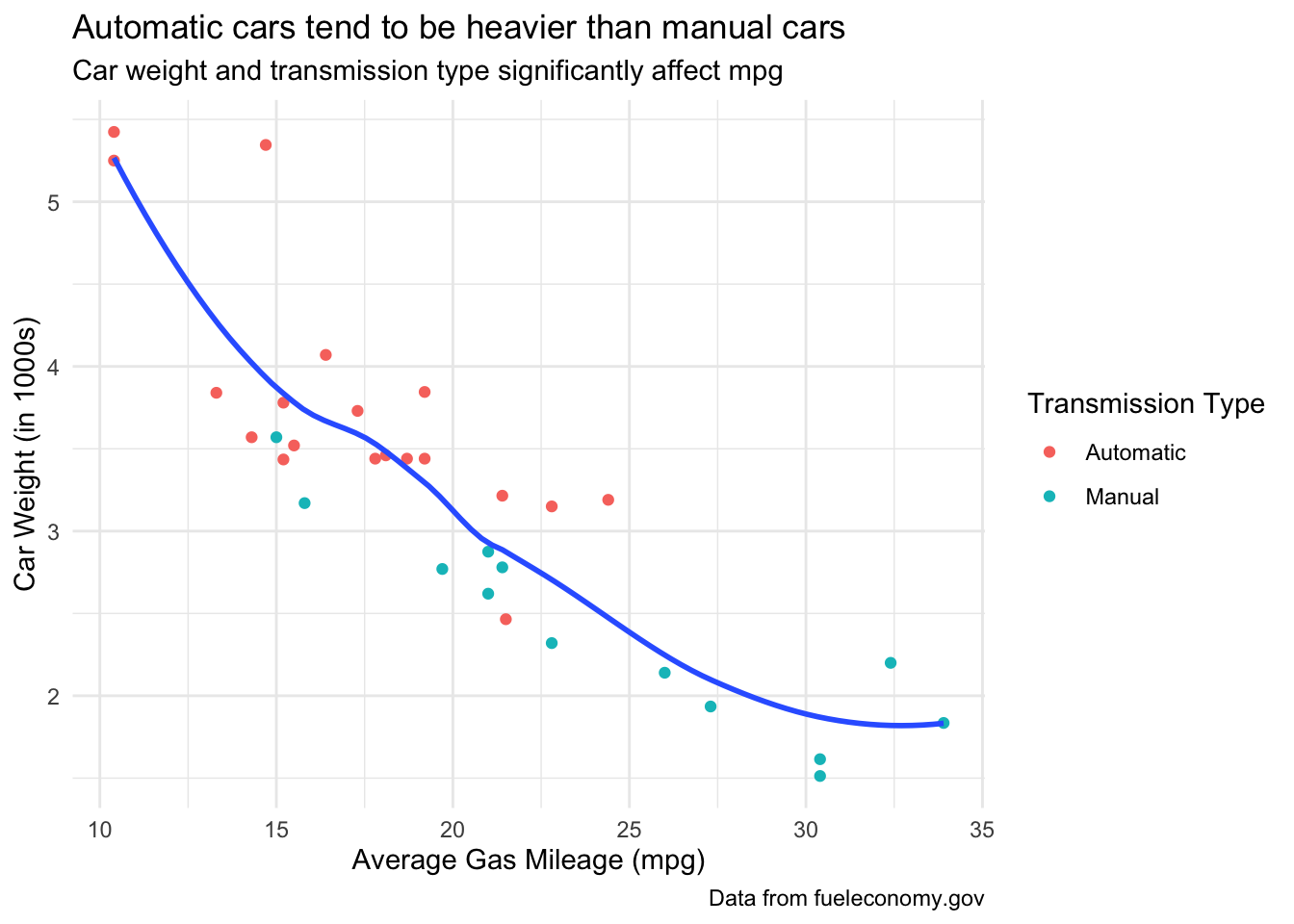
d %>%
ggplot(aes(mpg, wt)) +
  geom_point(aes(color = am)) +
  geom_smooth(se = FALSE) +
  labs(
    title = "Automatic cars tend to be heavier than manual cars",
    subtitle = "Car weight and transmission type significantly affect mpg",
    caption = "Data from fueleconomy.gov",
    x = "Average Gas Mileage (mpg)",
    y = "Car Weight (in 1000s)",
    color = "Transmission Type"
  ) +
  theme_light()
## `geom_smooth()` using method = 'loess' and formula = 'y ~ x'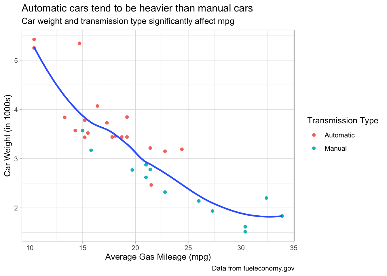
d %>%
ggplot(aes(mpg, wt)) +
  geom_point(aes(color = am)) +
  geom_smooth(se = FALSE) +
  labs(
    title = "Automatic cars tend to be heavier than manual cars",
    subtitle = "Car weight and transmission type significantly affect mpg",
    caption = "Data from fueleconomy.gov",
    x = "Average Gas Mileage (mpg)",
    y = "Car Weight (in 1000s)",
    color = "Transmission Type"
  ) +
  theme_dark()
## `geom_smooth()` using method = 'loess' and formula = 'y ~ x'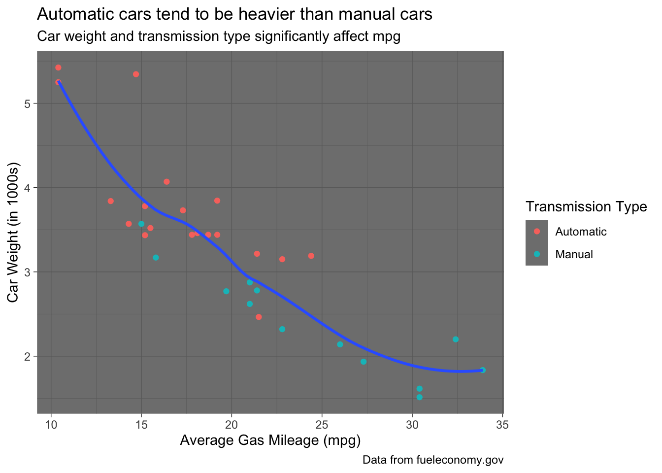
d %>%
ggplot(aes(mpg, wt)) +
  geom_point(aes(color = am)) +
  geom_smooth(se = FALSE) +
  labs(
    title = "Automatic cars tend to be heavier than manual cars",
    subtitle = "Car weight and transmission type significantly affect mpg",
    caption = "Data from fueleconomy.gov",
    x = "Average Gas Mileage (mpg)",
    y = "Car Weight (in 1000s)",
    color = "Transmission Type"
  ) +
  theme_test()
## `geom_smooth()` using method = 'loess' and formula = 'y ~ x'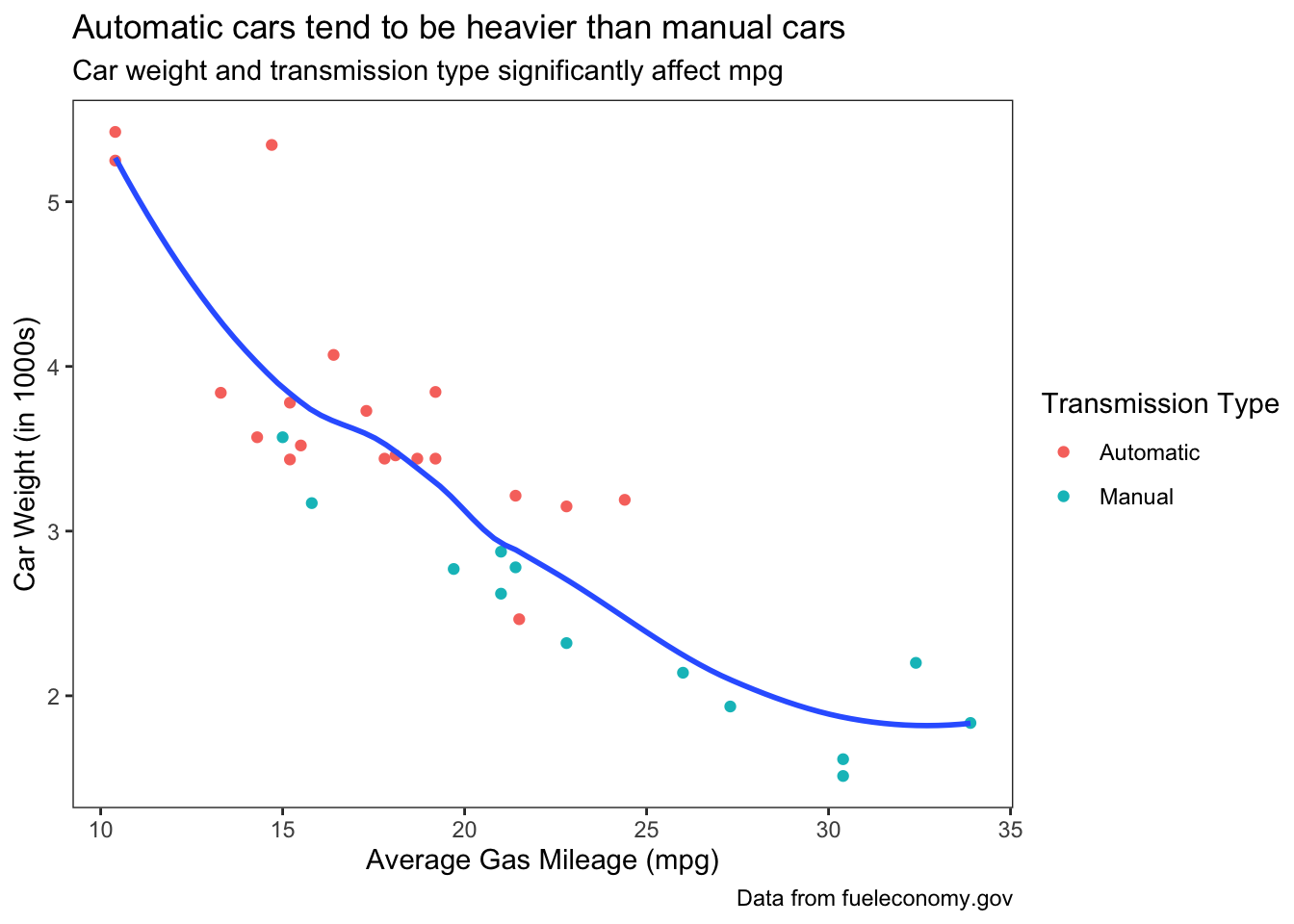
And there are even more themes you can get from other packages, like sjPlot and ggthemes:
#install.packages("sjPlot")

d %>%
ggplot(aes(mpg, wt)) +
  geom_point(aes(color = am)) +
  geom_smooth(se = FALSE) +
  labs(
    title = "Automatic cars tend to be heavier than manual cars",
    subtitle = "Car weight and transmission type significantly affect mpg",
    caption = "Data from fueleconomy.gov",
    x = "Average Gas Mileage (mpg)",
    y = "Car Weight (in 1000s)",
    color = "Transmission Type"
  ) +
  sjPlot::theme_sjplot()
## `geom_smooth()` using method = 'loess' and formula = 'y ~ x'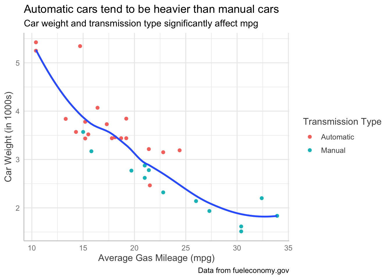
Practice
Putting it all together: pick any two variables from d and build a plot you would be happy to show someone. Give it a title that states what the plot shows, label both axes including their units, rename the legend, choose a theme, and move the legend to the bottom.
Answer
d %>%
ggplot(aes(x = mpg, y = wt)) +
  geom_point(aes(color = am)) +
  geom_smooth(se = FALSE) +
  labs(
    title = "Heavier cars get worse gas mileage",
    x = "Average Gas Mileage (mpg)",
    y = "Car Weight (in 1000s of pounds)",
    color = "Transmission Type"
  ) +
  theme_minimal() +
  theme(legend.position = "bottom")
## `geom_smooth()` using method = 'loess' and formula = 'y ~ x'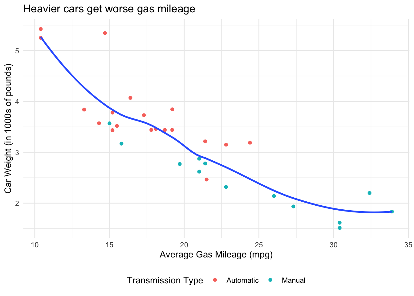
4.8 Review: End Notes
Today, we covered:
- Geoms for univariate and descriptive plots
- Common aesthetics, and which geoms they apply to
- Faceting a plot by group
- Coordinate systems and axis scaling
- Non-data elements: labels, legends and themes
4.8.1 Quick reference: everything we used today
Geoms for univariate and descriptive plots
| Geom | What It Does | When It’s Useful |
|---|---|---|
geom_bar() |
To plot a bar graph/histogram for a single categorical variable | Checking how many observations fall in each group before you analyze them |
geom_freqpoly() |
To plot frequencies by class of a variable | Comparing several distributions at once–lines overlay more readably than bars |
geom_histogram() |
To plot distribution/frequencies of single continuous variable | A first look at any continuous variable: its center, spread, and skew. Set binwidth = rather than accepting the default 30 bins |
geom_density() |
To plot distribution of single or various continuous variables | The same job as a histogram when you care about shape rather than counts |
geom_violin() |
To plot distributions. Similar to a density plot, but on both sides. Useful for comparing distributions among factors | Comparing the shape of a distribution across groups, not just their means |
geom_boxplot() |
To plot the median, quartiles and outliers of a variable | Spotting outliers and comparing medians across groups. Wrap a numeric x variable in factor() to get one box per level |
geom_count() |
To plot covariation between two discrete variables, sizing each point by how many observations fall there | Two categorical variables, where a scatterplot would just overplot |
geom_qq() |
To plot residuals with a QQ plot | Checking the normality assumption before running a model |
Aesthetics
| Aesthetic | What It Does |
|---|---|
color = |
Separates groups by color of the observations. On bars, colors the border |
shape = |
Separates groups by shape of the observations. Does not apply to geom_smooth() |
size = |
Separates groups by size of the observations |
alpha = |
In datasets with many overlapping data points, makes less overlapping observations more transparent and more overlapping observations more solid, in order to see where your data clusters most heavily |
linetype = |
Separates groups with different line types: solid, dotted, etc. |
fill = |
For bars, the color of the inside of the bar. Color would do the border |
Set an aesthetic inside aes() to map it to a variable; set it outside aes() to fix
it to one value for every observation. Aesthetics given in ggplot() apply to every layer;
aesthetics given in a geom apply only to that layer.
Splitting a plot into panels
| Function | What It Does |
|---|---|
facet_wrap(~ x) |
One panel per level of x, wrapped into rows. Use nrow = to control the layout |
facet_grid(x ~ y) |
A grid of panels, x down the rows and y across the columns. Clearer than facet_wrap() for two variables |
Axes, coordinates and scaling
| Function | What It Does |
|---|---|
coord_flip() |
Swaps the x and y axes. Useful when x-axis labels are long |
coord_cartesian(xlim =, ylim =) |
Zooms in on a region of the plot without dropping data |
scale_y_log10() |
Puts the y axis on a log scale, so exponential growth reads as a straight line |
Non-data elements
| Function | What It Does |
|---|---|
labs() |
Sets title =, subtitle =, caption =, axis labels x = / y =, and the legend title (name it after the aesthetic, e.g. color =) |
factor(x, labels = c(...)) |
Renames the levels of a factor, which renames them in the legend too. Labels apply in level order–check the order before you assign them |
theme(legend.position =) |
Moves the legend: "bottom", "top", "left", "right", or "none" to remove it |
theme_classic(), theme_minimal(), theme_light(), theme_dark(), theme_test() |
Preset looks for everything that isn’t your data. See the full set in the ggplot2 theme reference |
4.8.2 Feedback
As a learner, your superpower is knowing what is and isn’t working for your learning. If you have 2 minutes, we would love if you shared your superpower with us!
Scan the QR code below with your phone to provide brief feedback on this workshop:

4.8.3 What’s an R Markdown again?
This is the main kind of document that I use in RStudio, and I think it’s one of the primary advantages of RStudio over base R console. R Markdown allows you to create a file with a mix of R code and regular text, which is useful if you want to have explanations of your code alongside the code itself. This document, for example, is an R Markdown document. It is also useful because you can export your R Markdown file to an html page or a pdf, which comes in handy when you want to share your code or a report of your analyses to someone who doesn’t have R. If you’re interested in learning more about the functionality of R Markdown, you can visit this webpage
R Markdowns use chunks to run code. A chunk is designated by starting with {r}and ending with This is where you will write your code. A new chunk can be created by pressing COMMAND + ALT + I on Mac, or CONTROL + ALT + I on PC.
You can run lines of code by highlighting them, and pressing COMMAND + ENTER on Mac, or CONTROL + ENTER on PC. If you want to run a whole chunk of code, you can press COMMAND + ALT + C on Mac, or ALT + CONTROL + ALT + C on PC. Alternatively, you can run a chunk of code by clicking the green right-facing arrow at the top-right corner of each chunk. The downward-facing arrow directly left of the green arrow will run all code up to that point.
4.8.4 Some useful resources to continue your learning
A useful resource, in my opinion, is the stackoverflow website. Because this is a general-purpose resource for programming help, it will be useful to use the R tag ([R]) in your queries. A related resource is the statistics stackexchange, which is like Stack Overflow but focused more on the underlying statistical issues.
One of the best resources for learning how to use R well, in a “tidy” way, is R for Data Science (R4DS).